Most 'prompt example' pages show you a sentence and an image and leave you to guess which words did the work. This one is written from the inside of a library: 782 published prompts, 1,134 generated images across three models, every prompt stored as five separate components before it was ever flattened into a sentence. That means we can say what the prompts that work here actually have in common, rather than repeating advice that was written for Stable Diffusion in 2023.
What 782 prompts have in common
| Measured | Result |
|---|---|
| Median prompt length | 74 words (mean 77) |
| Shortest / longest published | 31 words / 268 words |
| Prompts with all five components filled | 782 of 782 — subject, setting, lighting, camera, style |
| Prompts carrying a negative prompt | 782 of 782 |
| Most common negative terms | text, watermark, signature, logo, letters, words, caption — in every single one |
| Anatomy-related negatives | extra limbs (10), deformed hands (6), extra fingers (6) |
That last pair of rows is the most useful finding, and it contradicts the standard negative-prompt list you will find elsewhere. In this library the negative prompt is a text-suppression tool used universally, and an anatomy tool used in under two percent of cases. The old 'bad anatomy, bad hands, extra fingers, mutated' boilerplate appears in single digits, because on these three models it does almost nothing. The typography suppression, on the other hand, earns its place on every prompt.
Example 1: the shortest prompts are not the weakest
The single most-copied prompt in the library is 42 words. It is not a paragraph, it has no quality-word stack, and it names exactly one lighting idea and one framing idea:
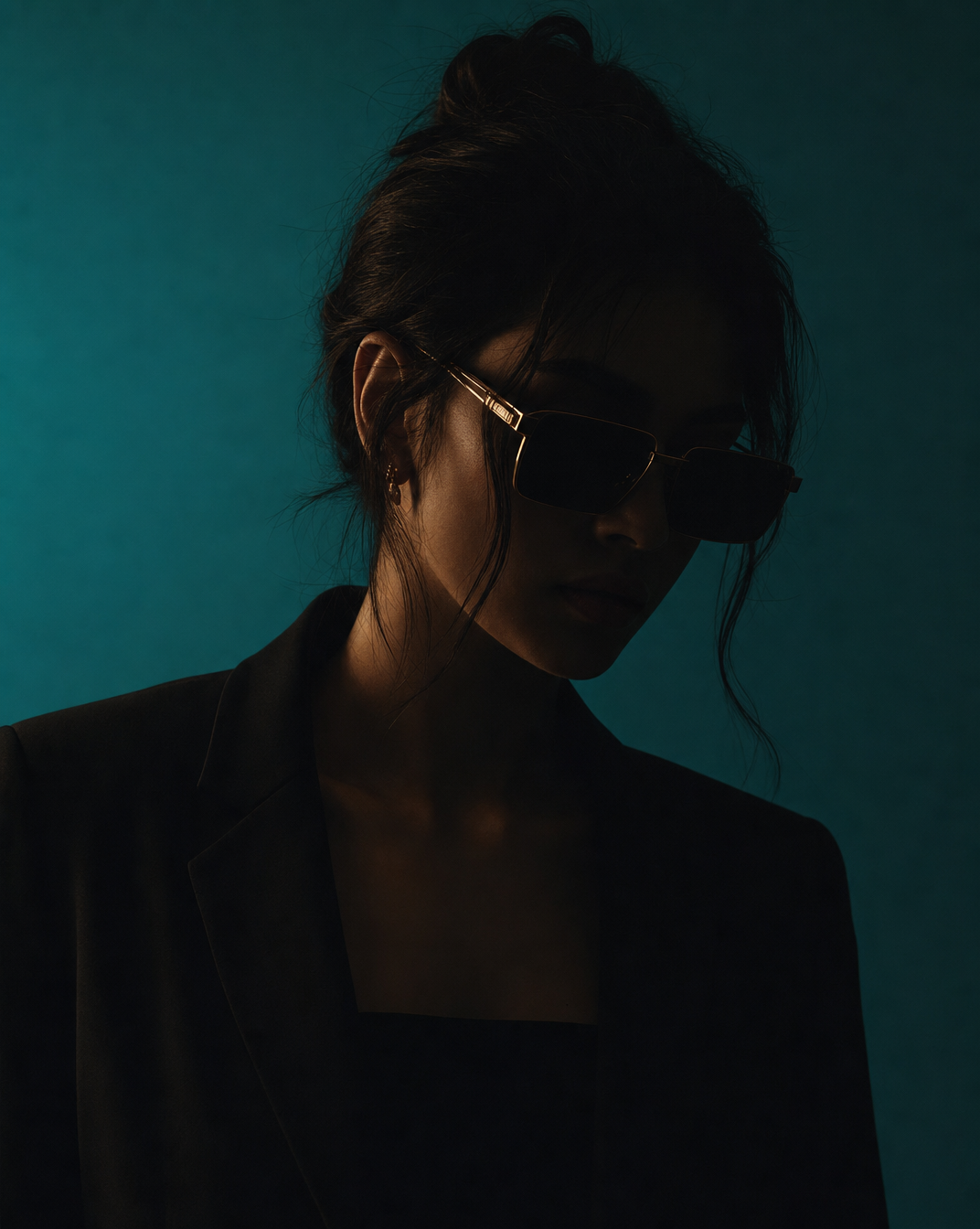
"Futuristic portrait of a woman wearing high-end minimal fashion, set against a vivid teal background, hyperrealistic scene, the woman mostly obscured by dark shadows with only faint details visible, wearing modern angular fashion sunglasses, dramatic cinematic lighting, high contrast, editorial photography style"
The load-bearing clause is 'mostly obscured by dark shadows with only faint details visible'. It is an instruction about what should NOT be legible in the frame, and it is the reason the image reads as a deliberate photograph rather than a well-lit stock portrait. Remove it and you get a competent, forgettable studio shot. That is the pattern worth stealing: one specific, slightly counter-intuitive constraint beats five adjectives.
Example 2: what a 69-word prompt spends its words on
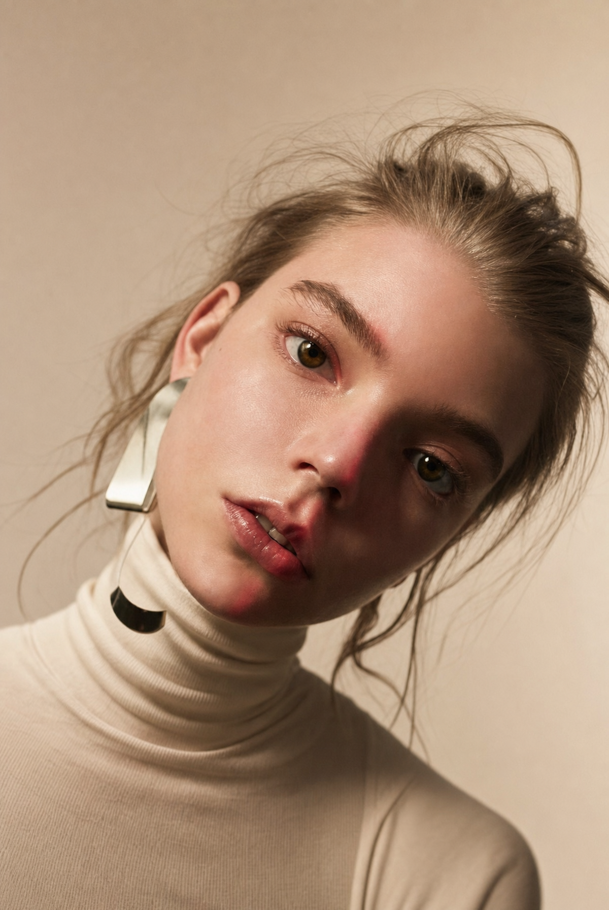
The moody editorial portrait above is stored as five components, and reading them separately shows where the words actually go:
| Component | Actual stored text |
|---|---|
| Subject | Young woman in a close-up studio portrait |
| Setting | Plain warm-beige studio background |
| Lighting | Soft directional key light with sculptural shadows; moody cinematic contrast |
| Camera | Close framing, shallow depth of field, crisp focus on eyes and cheekbones |
| Style | Editorial fashion photography, minimal makeup, natural skin texture emphasis, intimate moody composition |
Note how little of it describes the person. Four words identify the subject; the remaining sixty-five describe the light, the frame, and the finish. That ratio is consistent across the library and it is the single biggest difference between prompts that produce photographs and prompts that produce renders. A model already knows what a young woman looks like. It does not know where you want the key light.
Does length correlate with quality? Not the way people assume
We bucketed all 782 prompts by length and compared how often visitors copy them relative to how often they view them — an imperfect but honest proxy for 'this one is worth taking away':
| Prompt length | Prompts | Copy rate (copies per view) |
|---|---|---|
| Under 55 words | 80 | 1.56% |
| 55–74 words | 316 | 1.04% |
| 75–99 words | 293 | 0.99% |
| 100+ words | 93 | 1.53% |
The curve is U-shaped, not rising. Short prompts win because they are legible and easy to adapt; very long prompts win because the people who read them wanted a fully-specified scene. The middle — 55 to 99 words — is where prompts end up when they were padded rather than designed. If your prompt is 80 words, it is worth asking whether it is 80 words of decisions or 40 words of decisions plus 40 words of adjectives.
Copy rate is a behavioural signal from this site, not a quality score. It tells you what visitors found reusable; it says nothing about whether an image is technically better. We publish it because it is real data we actually have, not because it settles the question.
How to use these examples
- 1.Open any prompt page here. The full prompt text, the negative prompt, the model and the resulting image are all on the page — nothing is held back.
- 2.Read the five components before the flattened sentence. The component view is where the reasoning is visible.
- 3.Copy the structure, replace the content. Keep the ordering and the light/camera share of the words; swap the subject and setting for yours.
- 4.Change one component at a time when it comes out wrong. Changing three at once tells you nothing about which one mattered.
- The best way to write image prompts — The ordering rule behind every example above
- Does the same prompt work on every generator? — 68 prompts run through all three models
- 168 portrait prompts — The largest single set here, with images and parameters
- Browse by model — See the same kind of prompt across all three engines we publish with