Why this works
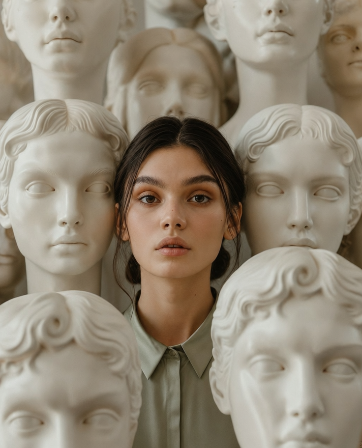
“Centered among multiple pale classical marble busts” and “symmetrical composition” make the close portrait feel formally balanced while the repeated stone faces add the specific eerie, contemplative tension. “Soft neutral lighting,” “creamy beige and ivory tones,” and the muted sage-green satin blouse create a restrained white, tan, gray palette, while “shallow depth of field” keeps the woman and her realistic skin texture ahead of the softly blurred gallery background. The sleek dark brown low bun and subtle loose strands provide a precise, controlled focal silhouette against the pale busts.
FAQ
→How do I make the woman feel more prominent than the marble busts?
Replace “centered among multiple pale classical marble busts” with “the woman dominates the foreground, with only two partial marble busts at the far edges,” and change “marble busts softly blurred behind her” to “background busts heavily blurred and low contrast.” Keep “portrait-closeup” and “shallow depth of field” to preserve her visual priority.
→How do I shift the mood from calm and eerie to warmer and more approachable?
Replace “a calm eerie, contemplative mood” with “a warm, quietly confident mood,” and change “soft neutral lighting” to “gentle warm window light with subtle golden highlights.” Swap “creamy beige and ivory tones” for “warm cream, honey, and muted sage tones” while retaining “realistic skin texture.”
→How do I build a series of variations without losing this portrait’s identity?
Keep the fixed anchors “photorealistic editorial portrait,” “symmetrical composition,” “sleek dark brown low bun,” and “muted sage-green satin blouse,” then vary one controlled block at a time: replace “surreal gallery-like space” with “neoclassical library,” “winter conservatory,” or “empty museum corridor.” For consistent framing, retain “portrait-closeup” and “shallow depth of field” in every version.
Learn the technique behind this
- Why can't AI spell, and how do I get readable text in an image? — Older diffusion models had no character-level representation of text, so they produced letterform-shaped texture instead of words.
- Which aspect ratio should I use, and how does it change the image? — Aspect ratio determines what the model composes, not how it's cropped afterwards.
- Why does AI get hands and faces wrong, and how do I fix it? — Hands fail because they're small in frame, extremely variable in pose, and self-occluding — the model has less usable signal per pixel than for any other body part.
Related prompts
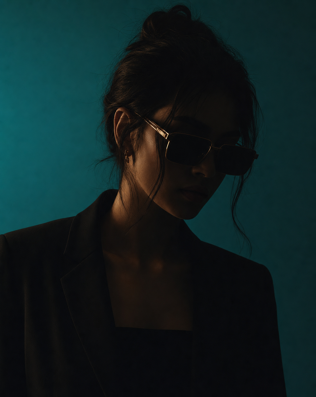
Woman in Teal Light, Shadowed Fashion Portrait
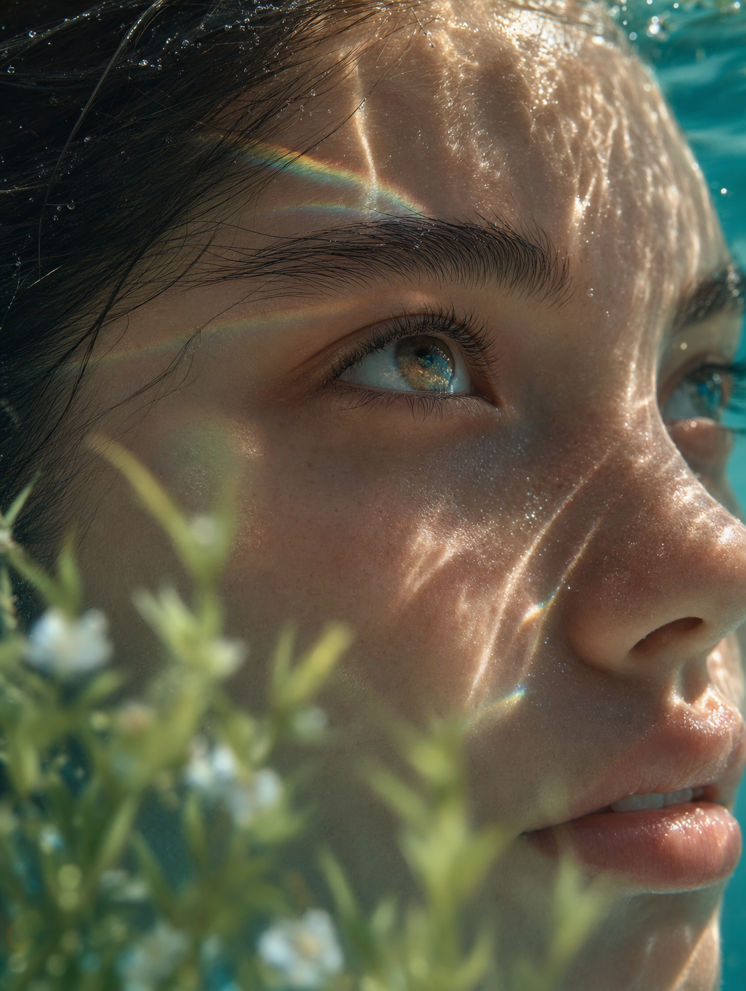
Dreamy Macro Portrait in Cool Water
Charcoal turtleneck with red eye-beam
Moody editorial portrait with warm light