Why this works
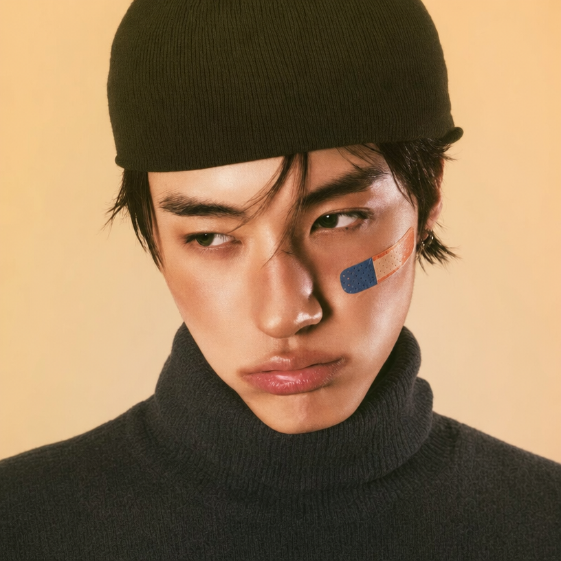
The close-up crop and “looking slightly off to the side” make the portrait feel intimate and pensive, while the “warm pensive expression” and “understated mood” keep the emotion controlled rather than theatrical. “Warm beige studio background” and “natural warm color grading” create the dominant beige harmony, with the dark olive beanie and charcoal-gray turtleneck adding quiet contrast. “Soft, even lighting,” “realistic skin texture,” and “shallow depth of field” keep attention on the face and cheek sticker without introducing hard shadows or a distracting setting.
FAQ
→How do I change this prompt to make the portrait feel more dramatic and cinematic?
Replace “soft, even lighting” with “dramatic split lighting with deep directional shadows,” change “warm beige studio background” to “dark charcoal studio background,” and replace “natural warm color grading” with “cool teal-and-amber cinematic color grading.” Keep “close-up crop” if you want the face to remain dominant.
→How do I make the blue-and-orange cheek sticker more prominent?
Replace “a small blue-and-orange sticker on his cheek” with “a prominent blue-and-orange graphic sticker covering the upper cheek,” and add “sharp focus on the sticker and eye area.” To preserve the portrait format, keep “close-up crop” and “shallow depth of field,” but specify that the cheek remains within the focal plane.
→How do I turn this into a cohesive series of related portraits?
Keep “editorial magazine style,” “realistic skin texture,” “soft, even lighting,” and “natural warm color grading” unchanged, then vary only the subject details: replace “dark olive knit beanie and a charcoal-gray turtleneck” with coordinated looks such as “rust cardigan over a cream shirt” or “navy wool coat over a gray crewneck.” Use a consistent background phrase such as “warm beige studio background” and rotate expressions or gazes, including “direct confident gaze,” “eyes lowered,” or “looking toward camera-left.”
Learn the technique behind this
- Why can't AI spell, and how do I get readable text in an image? — Older diffusion models had no character-level representation of text, so they produced letterform-shaped texture instead of words.
- How should a prompt be structured, and does word order matter? — A prompt that behaves predictably names one subject first, then what it is doing, then where, then the light, then the lens or medium, then the style.
- Do negative prompts work, and what should go in one? — Negative prompts work on models that support a separate negative conditioning channel — mainly Stable Diffusion and FLUX-family models.
Related prompts
Cobalt Boots in Sleek Studio Edit
Teal fashion editorial in monster-filled lift
Sunlit editorial on striped beach towel
Silhouette Influencer by Sunlit Window