
Why this works
The centered composition is anchored by “a glowing location pin centered above illuminated street grids,” giving the image an immediate focal hierarchy and strong sense of order. “Cool teal and violet with subtle magenta accents” supplies the futuristic color harmony, while the dominant blue and navy tones keep the palette controlled rather than neon-heavy. “Shallow depth of field with luminous bokeh” separates the crisp pin from the map, and “crisp edges and dramatic contrast” preserves its graphic clarity against the softer urban grid.
FAQ
→How do I make the street grid more prominent than the location pin?
Replace “glowing location pin centered above illuminated street grids” with “a smaller glowing location pin offset to the upper right, with the illuminated street grids dominating the frame.” Change “cinematic close-up” to “wide aerial view” and reduce “shallow depth of field” to “deep focus” so more of the map remains legible.
→How do I shift this from a cool high-tech mood to a warmer, more urgent one?
Replace “cool teal and violet with subtle magenta accents” with “hot amber, red, and orange illumination with sharp crimson highlights.” Swap “luminous bokeh” for “hard directional light with glowing warning reflections” and add “dense atmospheric haze” after “dramatic contrast” to make the location pin feel urgent.
→How do I create a series of related map variations without losing the same visual identity?
Keep “photorealistic cinematic digital visualization,” “crisp edges,” “dramatic contrast,” and the centered pin structure unchanged. For each variation, replace only “illuminated street grids and map-like urban layout” with specific settings such as “coastal highway interchange,” “dense downtown transit network,” or “mountain research outpost,” then vary the accent phrase from “subtle magenta accents” to “subtle cyan accents” or “subtle amber accents.”
Learn the technique behind this
- Why can't AI spell, and how do I get readable text in an image? — Older diffusion models had no character-level representation of text, so they produced letterform-shaped texture instead of words.
- How should a prompt be structured, and does word order matter? — A prompt that behaves predictably names one subject first, then what it is doing, then where, then the light, then the lens or medium, then the style.
- Do negative prompts work, and what should go in one? — Negative prompts work on models that support a separate negative conditioning channel — mainly Stable Diffusion and FLUX-family models.
Related prompts

DJ in neon haze at low angle
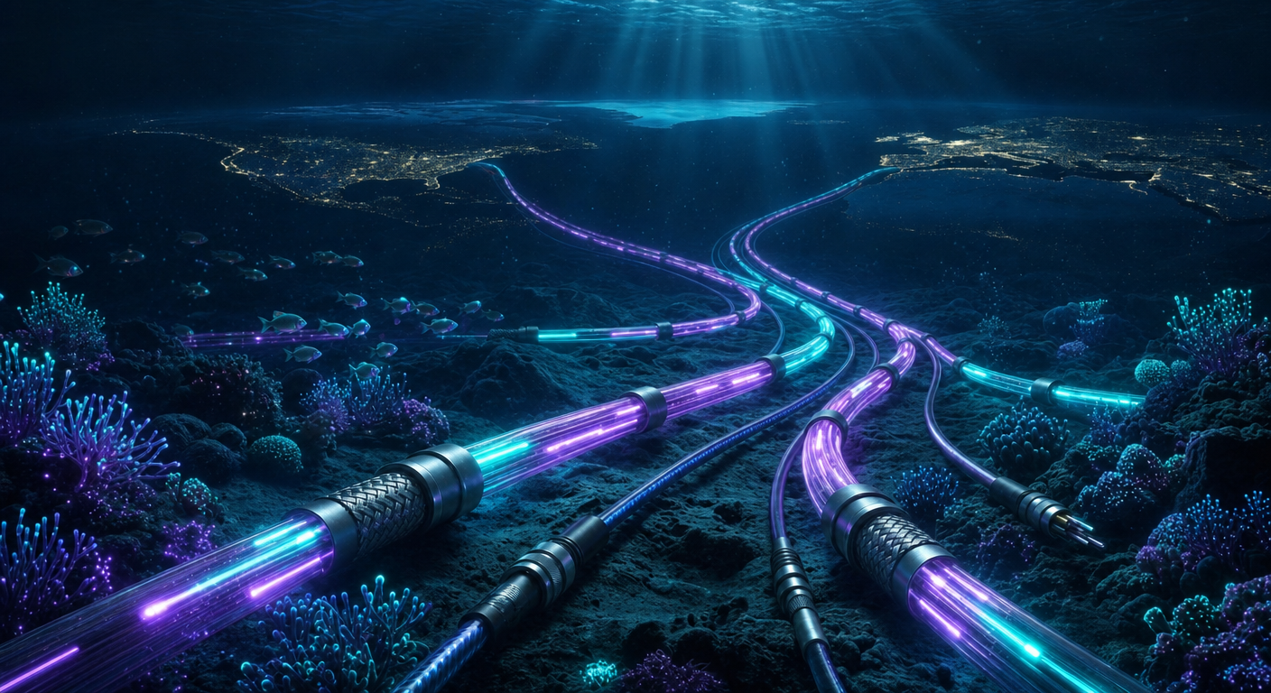
Glowing Fiber-Optic Cables With Purple Data Lines

Cyan Hologram, Sleek Robotic Hand
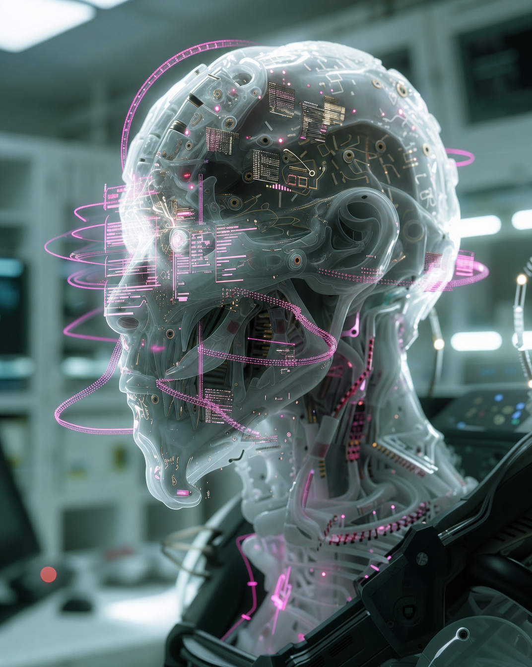
Cyborg head with magenta holograms and translucent skull