Why this works
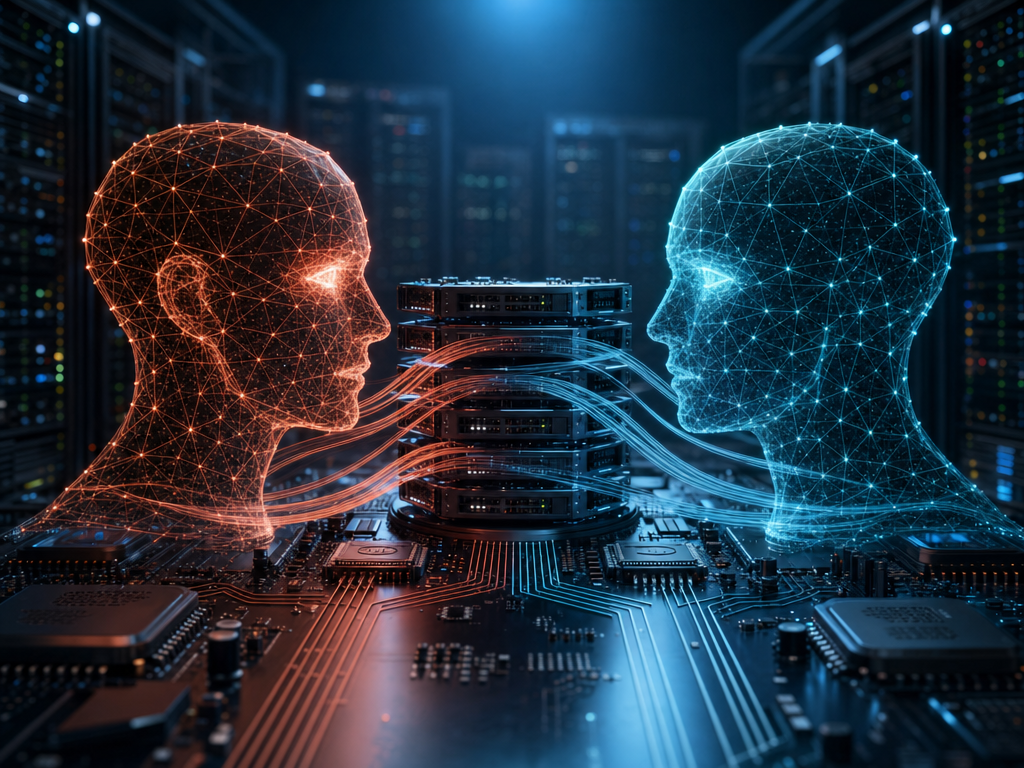
The symmetrical, confrontational composition comes directly from “two glowing holographic AI heads facing each other at eye level” and the camera instruction “centered on the two heads,” while “dramatic perspective” adds depth around that central pairing. The tense color contrast is load-bearing: “warm orange-red” versus “cool teal-blue” separates the figures against “dark industrial server racks,” and “cinematic high-contrast lighting” with “blue-hour ambience” preserves the black, orange, and teal palette. “Layered, ribbon-like paths” gives the data streams a readable bridge between the heads, while “shallow depth of field” keeps the racks and interface panels secondary to the wireframe faces.
FAQ
→How do I make one AI head more prominent than the other?
Replace “two glowing holographic AI heads facing each other at eye level” with “a large warm orange-red holographic AI head in the foreground, with a smaller cool teal-blue head receding in the background.” Change “symmetrical” or the centered two-head framing to “asymmetrical composition with the left head dominant,” and keep “shallow depth of field” so the secondary head softens further.
→How do I change the tense cyberpunk mood into a calmer, more collaborative scene?
Replace “tense high-tech atmosphere” with “calm, collaborative high-tech atmosphere,” and change “cinematic high-contrast lighting” to “soft diffused blue-hour lighting.” Replace “luminous data streams arc between them” with “gentle, evenly flowing data streams connect them,” while retaining the orange-red and teal-blue heads for a controlled complementary color relationship.
→How do I create a series of variations without losing the core visual identity?
Keep the fixed phrases “two glowing holographic AI heads facing each other at eye level,” “fine wireframe polygons,” and “layered, ribbon-like luminous data streams,” then swap only the setting and interface language. For example, replace “futuristic server room” and “dark industrial server racks” with “flooded orbital command deck” and “curved observation windows,” or replace “abstract shield and lock iconography” with “medical diagnostic symbols,” while preserving “blue-hour cinematic color grading” and the orange-red/teal-blue head pairing.
Learn the technique behind this
- Why can't AI spell, and how do I get readable text in an image? — Older diffusion models had no character-level representation of text, so they produced letterform-shaped texture instead of words.
- Why does the model ignore parts of my prompt? — Ignored instructions are almost always conflicts, counts, or spatial relationships — three things current models handle badly — rather than the model failing to read you.
- How should a prompt be structured, and does word order matter? — A prompt that behaves predictably names one subject first, then what it is doing, then where, then the light, then the lens or medium, then the style.
Related prompts

DJ in neon haze at low angle

Glowing Fiber-Optic Cables With Purple Data Lines

Cyan Hologram, Sleek Robotic Hand
Cyborg head with magenta holograms and translucent skull