Why this works
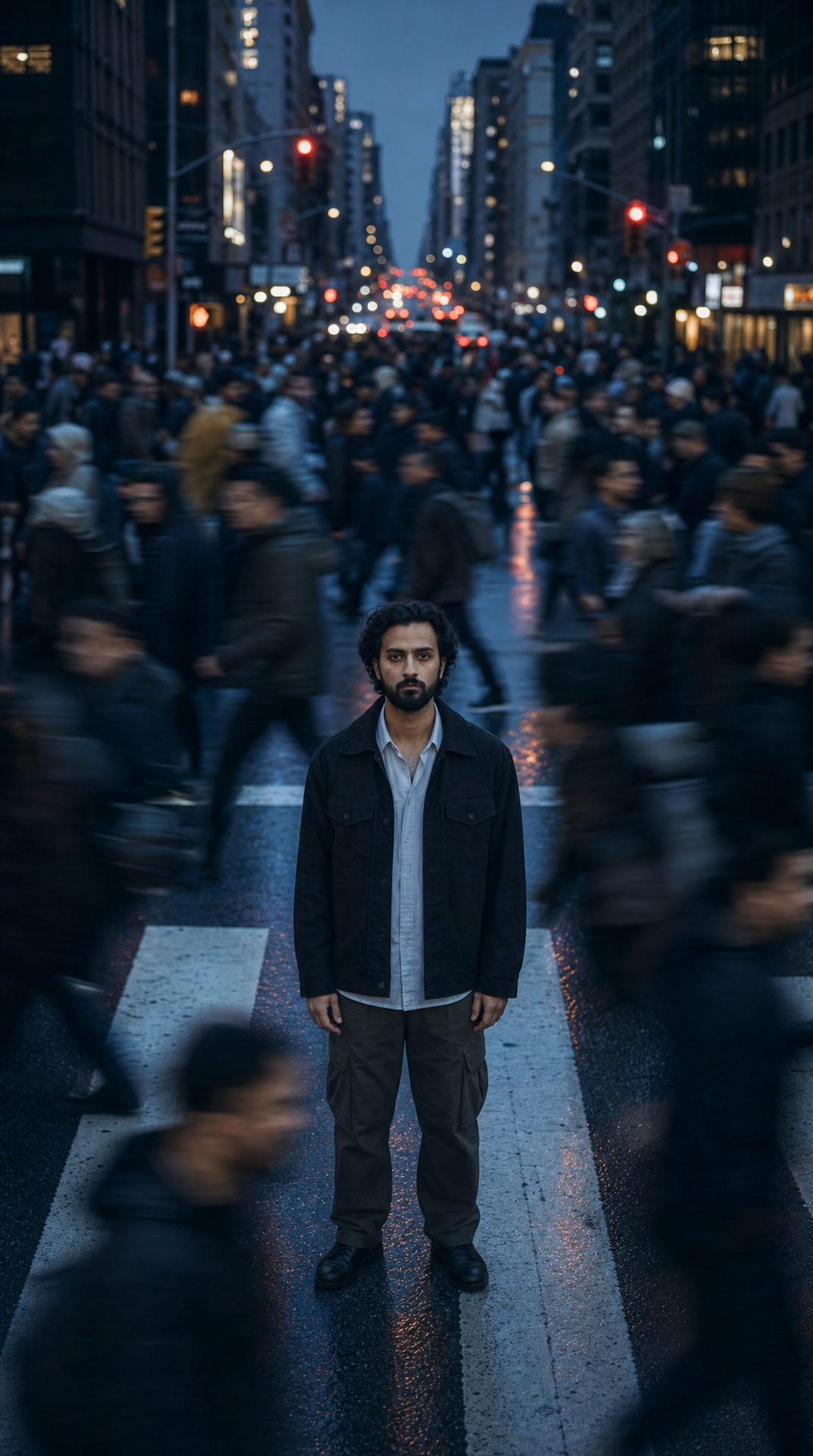
The phrase “exact center of a busy downtown crosswalk” creates a rigid, portrait-oriented focal axis, while “vertical composition” supports the man’s full-body presence against the tall buildings. “Shallow depth of field keeps the man crisp and sharply detailed” makes his stillness visually dominant, and “surrounding pedestrians rush past in smeared motion blur” supplies the surreal tension through direct contrast. “Dusk blue-hour lighting,” “cooler color palette,” and “subtle wet-street reflections” compress the scene into the observed black-and-gray range, while “glowing traffic signals softened in the background bokeh” adds small points of color without competing with the subject.
FAQ
→How do I make the image feel warmer and less tense?
Replace “dusk blue-hour lighting” and “cooler color palette” with “late golden-hour sunlight” and “warm amber and copper tones.” Change “tense contemplative atmosphere” to “calm, hopeful atmosphere,” and replace “moody overcast feel” with “clear air and gentle sunlit reflections.”
→How do I make the man more prominent than the surrounding motion?
Keep “exact center” and “sharp subject focus,” but replace “shallow depth of field” with “extreme shallow depth of field” and add “full-body subject occupying most of the vertical frame.” Change “surrounding pedestrians rush past in smeared motion blur” to “dense peripheral crowd reduced to elongated ghostlike streaks,” preserving motion while pushing it farther from the man.
→How do I turn this into a series set in different cities?
Replace “downtown city crosswalk with tall buildings and softly glowing traffic signals” with a repeatable location slot such as “rainy Tokyo intersection with illuminated signage,” “foggy London crosswalk with red buses,” or “sunlit New York avenue with yellow taxis.” Keep the fixed phrases “a lone man remains perfectly still,” “exact center,” “vertical composition,” and “sharp subject focus” so each variation retains the same visual structure.
Learn the technique behind this
- Why can't AI spell, and how do I get readable text in an image? — Older diffusion models had no character-level representation of text, so they produced letterform-shaped texture instead of words.
- Which aspect ratio should I use, and how does it change the image? — Aspect ratio determines what the model composes, not how it's cropped afterwards.
- How do I keep one consistent style across a whole set of images? — Style consistency is more achievable than character consistency because style lives in describable attributes.
Related prompts
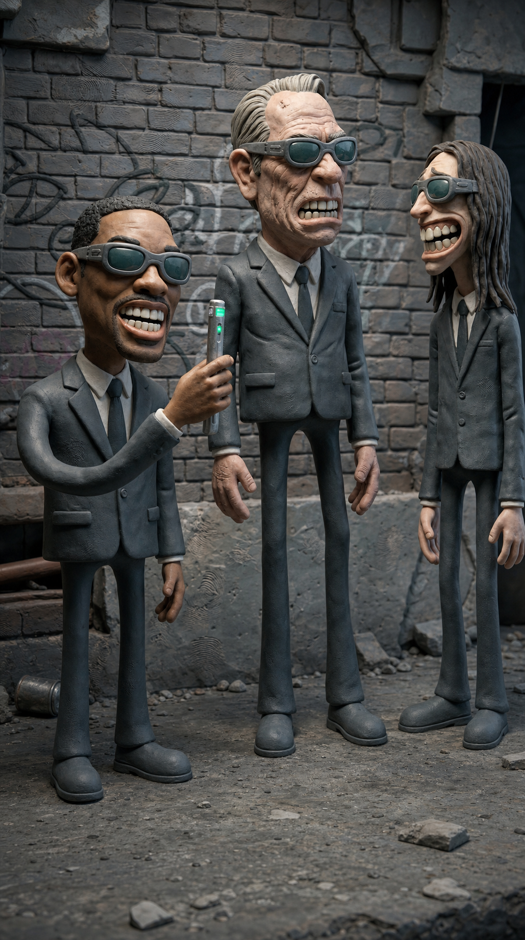
Grotesque Claymation Gangsters in Gritty Alley
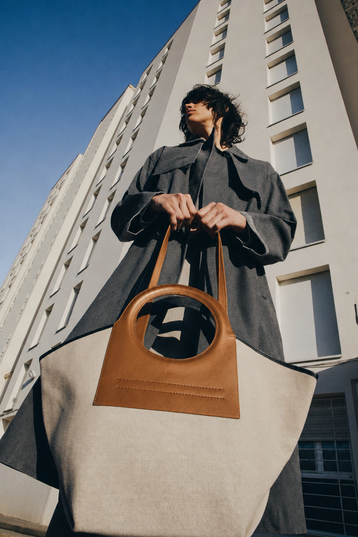
Charcoal coat with tan-handled tote
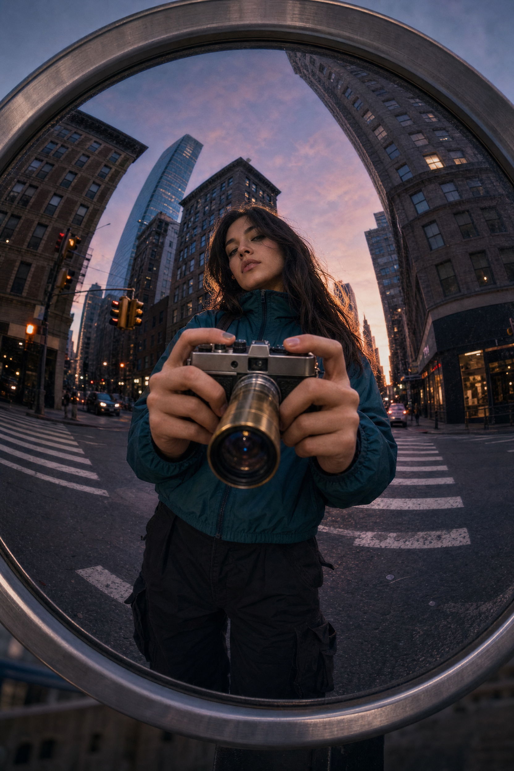
Woman in Teal Jacket Capturing Twilight Reflection
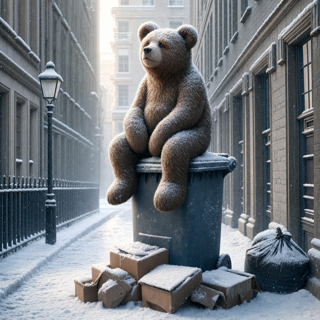
Stuffed Bear on Winter Dumpster at Dawn