Same prompt, generated with each model separately — click one to see how it holds up.
Why this works
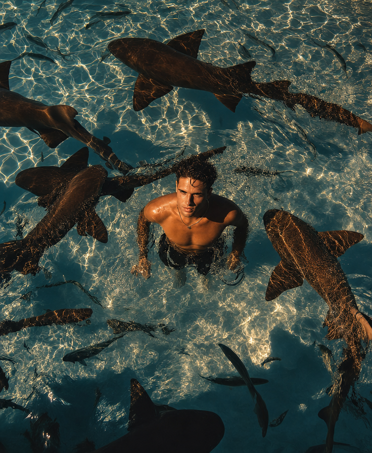
“Top-down overhead framing” turns the man and sharks into a readable circular composition, while “sharks circling close to the man” supplies the immediate tension and scale contrast. The deeper “teal-blue palette” gives the water visual weight, and “golden-hour warm sunlight” against “high-contrast rippling caustic highlights” creates the image’s blue-gold color tension across the otherwise natural palette. “Photorealistic” and “documentary-style realism” keep the surreal situation grounded in observed detail rather than fantasy illustration.
FAQ
→How do I make the sharks feel more dominant and threatening?
Replace “sharks swimming around him” with “four large sharks occupying most of the frame, their dorsal fins and bodies clearly visible around and beneath him,” and change “sharks circling close to the man” to “tight, aggressive circle with the nearest shark passing within arm’s reach.” Keep “top-down overhead framing” so their arrangement remains legible.
→How do I make the scene feel more ominous instead of adventurous?
Replace “golden-hour warm sunlight” with “low, storm-filtered late-evening light,” and change “tense surreal adventurous mood” to “foreboding, claustrophobic survival mood.” Reduce the cheerful contrast in “natural colors” by adding “desaturated teal water, muted beige skin tones, and deep black shadows,” while retaining “high-contrast rippling caustic highlights” for uneasy surface distortion.
→How do I create a series of variations without losing the core image?
Keep “shirtless man standing in shallow, crystal-clear sea water,” “sharks circling close to the man,” and “top-down overhead framing” fixed, then vary one load-bearing phrase per image: replace “golden-hour warm sunlight” with “overcast dawn,” “moonlit night,” or “harsh midday sun,” and swap “deeper teal-blue palette” for “emerald green,” “steel blue,” or “murky gray-green.” This preserves the subject and composition while producing clearly different lighting and color studies.
Learn the technique behind this
- Why can't AI spell, and how do I get readable text in an image? — Older diffusion models had no character-level representation of text, so they produced letterform-shaped texture instead of words.
- How do I keep one consistent style across a whole set of images? — Style consistency is more achievable than character consistency because style lives in describable attributes.
- How should a prompt be structured, and does word order matter? — A prompt that behaves predictably names one subject first, then what it is doing, then where, then the light, then the lens or medium, then the style.
Related prompts
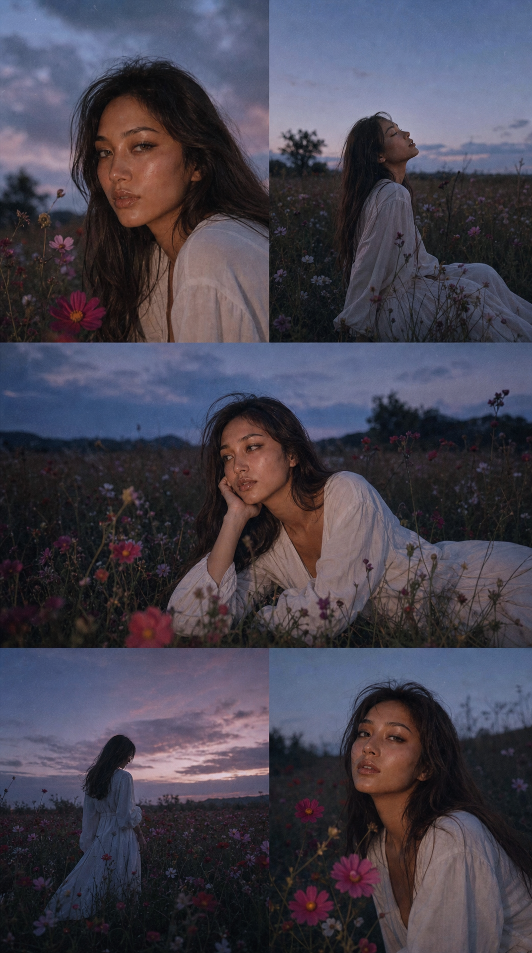
Solitary Woman in Twilight Wildflower Meadow
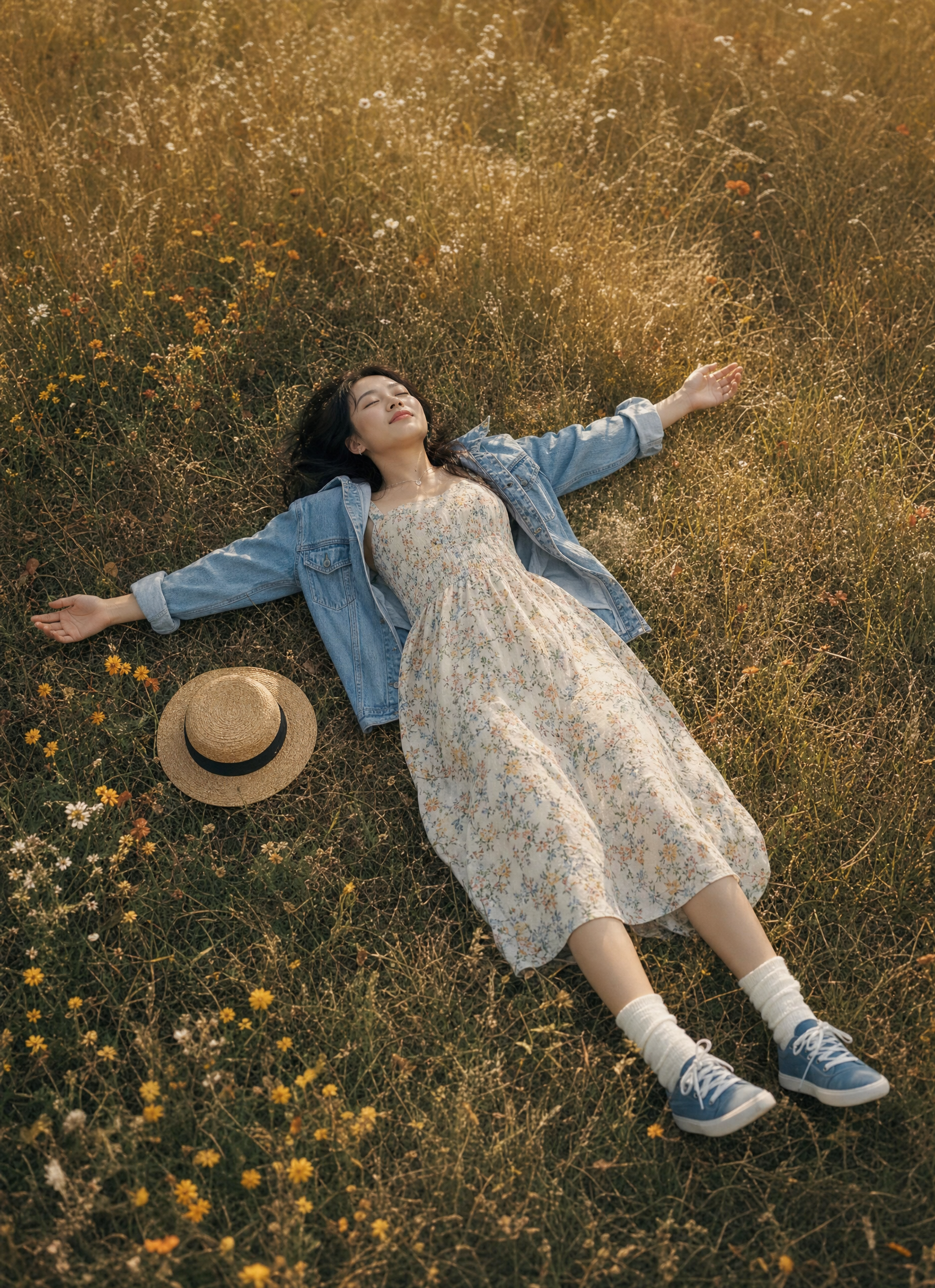
Woman Relaxing in Golden Autumn Field
Man on sand dune in blue hour

Golden-hour surf under dramatic clouds