Why this works
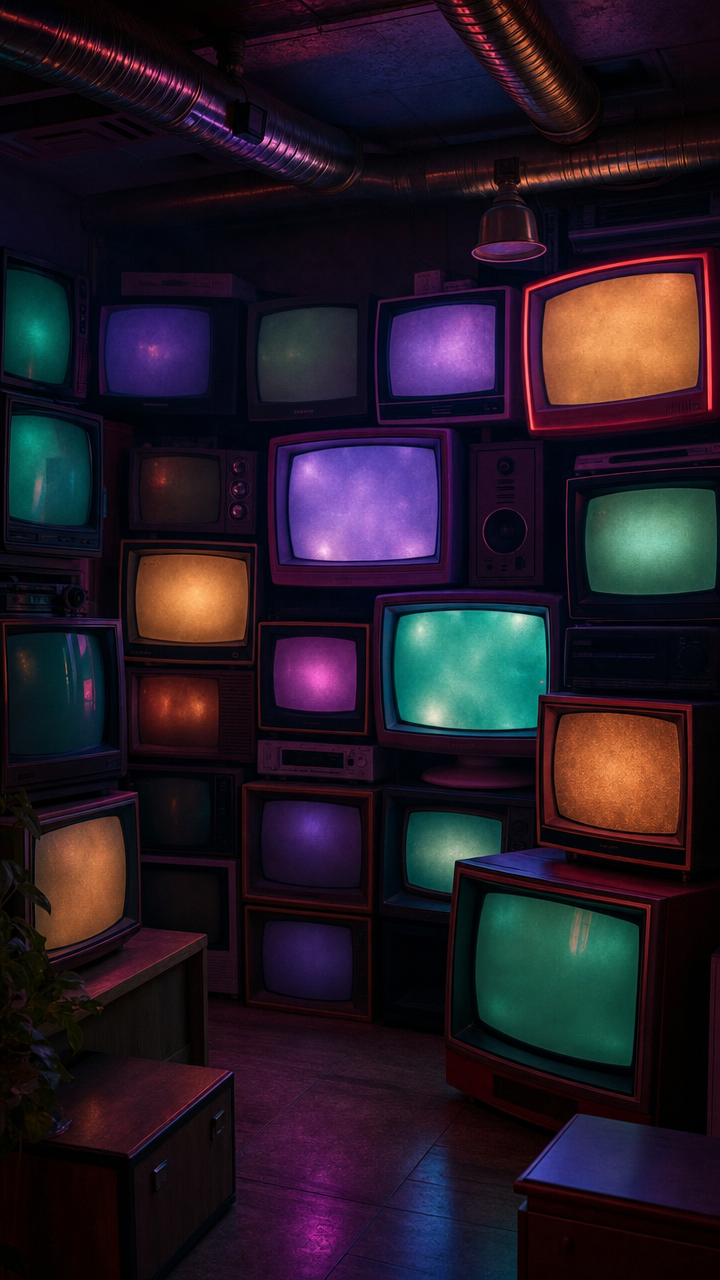
The dense wall of stacked vintage CRT televisions gives the wide-shot composition a strong repeated structure, while “cinematic vertical composition with slightly wider framing” preserves the industrial room and exposed ceiling ducts around it. The mood comes from the specific combination of “darker red-magenta rim lighting,” “subtle haze,” and “deep shadows,” while teal, violet, and warm amber screen glow supplies the purple, teal, and orange color harmony without flattening the contrast. “Crisp reflections on the TV glass” and “high contrast” make each screen readable, keeping the photorealistic retro-futurist scene tactile rather than purely graphic.
FAQ
→How do I make the CRT wall feel more imposing and central?
Replace “slightly wider framing” with “tight vertical framing dominated by the CRT wall,” and change “stacked vintage CRT televisions forming a dense wall of screens” to “towering CRT television wall filling nearly the entire frame.” Reduce “exposed ceiling ducts” to “only a narrow strip of ceiling ducts at the top edge” so the screens become the clear focal point.
→How do I shift this from moody nostalgia toward a harsher dystopian tone?
Replace “moody nostalgic electric feel” with “oppressive dystopian surveillance atmosphere,” and change “subtle haze” to “thick smoky industrial haze with suspended dust.” Keep the “darker red-magenta rim lighting,” but replace “teal, violet, and warm amber” with “cold desaturated blue screens interrupted by warning-red displays” for a less inviting palette.
→How do I build a consistent series with different subjects while preserving this visual identity?
Keep “photorealistic,” “retro-futuristic neon interior,” “cinematic vertical composition with slightly wider framing,” “darker red-magenta rim lighting,” “subtle haze,” “deep shadows,” and “crisp reflections and glass highlights” unchanged. Replace only “stacked vintage CRT televisions forming a dense wall of screens” with a parallel subject such as “stacked cassette players forming a dense industrial archive wall,” then retain the gritty industrial room and teal, violet, and warm-amber accent glow across each variation.
Learn the technique behind this
- Why can't AI spell, and how do I get readable text in an image? — Older diffusion models had no character-level representation of text, so they produced letterform-shaped texture instead of words.
- Which aspect ratio should I use, and how does it change the image? — Aspect ratio determines what the model composes, not how it's cropped afterwards.
- How should a prompt be structured, and does word order matter? — A prompt that behaves predictably names one subject first, then what it is doing, then where, then the light, then the lens or medium, then the style.