Why this works
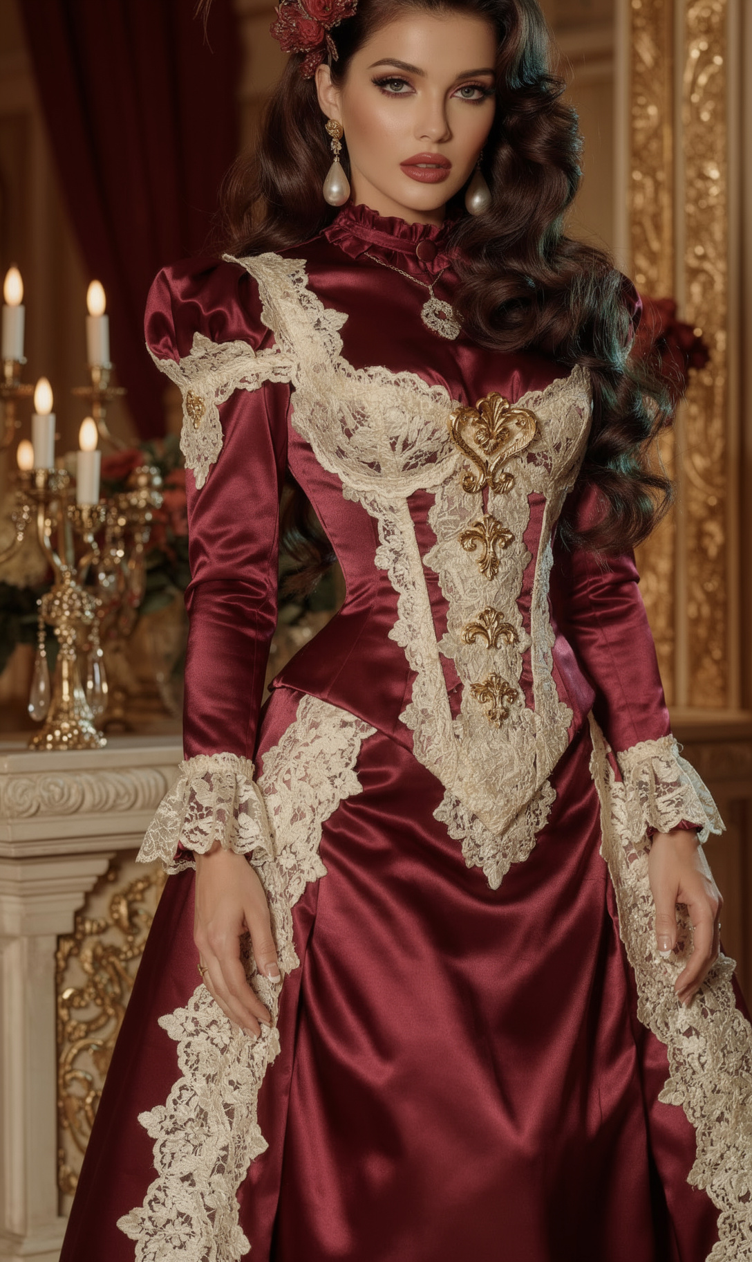
The “tight editorial framing” and “shallow depth of field” keep attention on the woman’s crisp facial detail, while “highly textured fabrics” makes the corset stitching, lace weave, and satin sheen carry visual interest. “Luxurious baroque interior with gilded decor and tall arched mirrors” supplies the vertical full-body setting and decadent scale, and “soft candlelight” with “cool crimson and muted gold tones” balances the warm beige, brown, and gold image palette with restrained contrast. The “dramatic, poised body angle,” “teardrop pearl drop earrings,” and explicit “no chandelier earrings” establish a controlled, elegant silhouette rather than a cluttered jewelry statement.
FAQ
→How do I make the portrait feel darker and more mysterious?
Replace “soft candlelight” with “low-key candlelight from one side with deep pools of shadow,” and change “gentle teal highlights in the shadows” to “faint desaturated blue-green rim light.” Add “near-black burgundy background” after “tall arched mirrors” to reduce the beige and gold dominance.
→How do I make the corset and fabric details more prominent?
Replace “Tight editorial framing” with “mid-length fashion editorial framing from waist to head, centered on the corset,” and change “shallow depth of field” to “moderate depth of field with the corset, lace, gloves, and face all sharply resolved.” Add “close inspection of corset stitching, cream lace weave, gold filigree, and satin glove sheen” to the texture instruction.
→How do I create a coordinated series with different settings?
Keep the subject phrase “burgundy corset lingerie with cream lace and gold filigree, satin opera gloves, teardrop pearl drop earrings” unchanged, then replace “luxurious baroque interior with gilded decor and tall arched mirrors” with settings such as “decadent Art Deco hotel lounge with brass screens” or “moody Venetian palace corridor with faded frescoes.” Preserve “cool crimson and muted gold tones” across each version so the setting changes while the series retains a consistent color identity.
Learn the technique behind this
- Why can't AI spell, and how do I get readable text in an image? — Older diffusion models had no character-level representation of text, so they produced letterform-shaped texture instead of words.
- Why does AI get hands and faces wrong, and how do I fix it? — Hands fail because they're small in frame, extremely variable in pose, and self-occluding — the model has less usable signal per pixel than for any other body part.
- How do I keep one consistent style across a whole set of images? — Style consistency is more achievable than character consistency because style lives in describable attributes.
Related prompts
Cobalt Boots in Sleek Studio Edit

Teal fashion editorial in monster-filled lift

Sunlit editorial on striped beach towel

Silhouette Influencer by Sunlit Window