Why this works
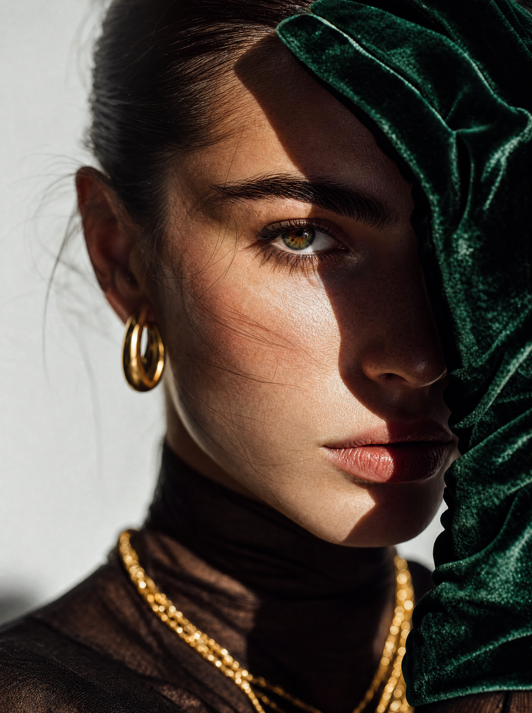
The portrait-closeup framing is made explicit by “close-up fashion portrait” and “close-up framing,” keeping the face, deep green velvet gloves, and layered gold jewelry dominant rather than letting the beige setting compete. “Dramatic side lighting with strong shadows” supplies the moody structure, while “vivid, realistic fabric highlights” makes the green velvet readable against the image’s black, gray, and warm beige neutrals. The color harmony comes from “deep green velvet,” “layered gold jewelry,” and “warm beige background,” with “shallow depth of field” and “crisp micro-textures” combining soft background separation with detailed skin, hair, metal, and fabric.
FAQ
→How do I make the jewelry the main focal point instead of the face?
Replace “close-up fashion portrait” and “close-up framing” with “tight jewelry-focused crop centered on the neck, ears, and hands,” and change “shallow depth of field” to “sharp focus on layered gold jewelry and gold hoop earrings, face slightly softer.” Keep “dramatic side lighting” but add “specular highlights on the gold” so the metal catches attention.
→How do I make this portrait brighter and less moody?
Replace “dramatic side lighting with strong shadows” with “large soft frontal light with gentle fill and minimal shadows,” and replace “elegant moody color grading” with “bright editorial color grading with warm luminous skin tones.” Retain “warm beige background,” but change it to “light cream background” for a cleaner, higher-key result.
→How do I create a coordinated series with different glove colors?
Keep the fixed structure, including “cinematic editorial fashion photography,” “close-up framing,” and “minimalist warm beige background,” while replacing “deep green velvet gloves” one variation at a time with “cobalt blue velvet gloves,” “burgundy velvet gloves,” or “black satin gloves.” For consistent results, leave “layered gold jewelry,” “gold hoop earrings,” “dramatic side lighting,” and “shallow depth of field” unchanged across the series.
Learn the technique behind this
- Why can't AI spell, and how do I get readable text in an image? — Older diffusion models had no character-level representation of text, so they produced letterform-shaped texture instead of words.
- How should a prompt be structured, and does word order matter? — A prompt that behaves predictably names one subject first, then what it is doing, then where, then the light, then the lens or medium, then the style.
- Why does the model ignore parts of my prompt? — Ignored instructions are almost always conflicts, counts, or spatial relationships — three things current models handle badly — rather than the model failing to read you.
Related prompts

Teal fashion editorial in monster-filled lift
Cobalt Boots in Sleek Studio Edit
Silhouette Influencer by Sunlit Window

Sunlit editorial on striped beach towel