Why this works
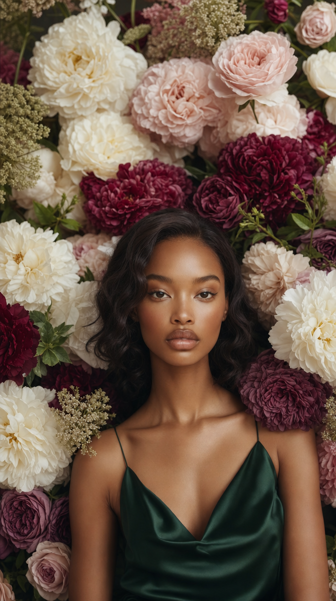
The color harmony traces directly to 'deep burgundy dahlias, rich plum roses, blush garden roses, and ivory ranunculus' — that specific jewel-tone list is what produces the pink, crimson, and olive palette rather than a generic 'flowers' tag. 'Soft, diffused natural window lighting' is the load-bearing phrase for the serene mood and the subtle petal shadows; swap it for hard studio light and the calm reads as sterile instead. The 'shallow depth of field' and 'densely layered floral frame' together force the portrait-closeup composition, pushing the blooms out of focus so they wrap her like a wall of color rather than compete with her face. 'Serene, contemplative gaze' is doing the emotional work that the emerald dress and flowers alone can't — remove it and the same setting could easily read as playful or dramatic instead.
FAQ
→How do I make the flowers feel more overwhelming and less like a background frame?
Change 'densely layered floral frame' to something like 'flowers pressing in close, partially obscuring her shoulders and jaw' and drop 'shallow depth of field' to a near-macro instruction so a few blooms stay sharp in the foreground. That shifts the flowers from framing device to active subject sharing the frame with her.
→How do I shift this from romantic and serene to something moodier or more dramatic?
Swap 'serene, contemplative gaze' for 'intense, unflinching stare' and replace 'soft, diffused natural window lighting' with 'hard directional light with deep shadows, chiaroscuro style.' Keep the jewel-tone flower list as is since burgundy and plum already lean dark, they just need harsher light to read as dramatic instead of soft.
→How do I turn this into a series with different dress colors while keeping the same feel?
Keep every phrase intact except 'emerald green silk slip dress' — cycle that through 'ivory silk slip dress,' 'deep burgundy velvet slip dress,' or 'dusty blue silk slip dress' to match or contrast the floral palette. Changing only the dress color while leaving 'blush garden roses, ivory ranunculus' etc. untouched keeps the lighting, framing, and mood consistent across the set.
Learn the technique behind this
- Why can't AI spell, and how do I get readable text in an image? — Older diffusion models had no character-level representation of text, so they produced letterform-shaped texture instead of words.
- How should a prompt be structured, and does word order matter? — A prompt that behaves predictably names one subject first, then what it is doing, then where, then the light, then the lens or medium, then the style.
- Why does AI get hands and faces wrong, and how do I fix it? — Hands fail because they're small in frame, extremely variable in pose, and self-occluding — the model has less usable signal per pixel than for any other body part.
Related prompts
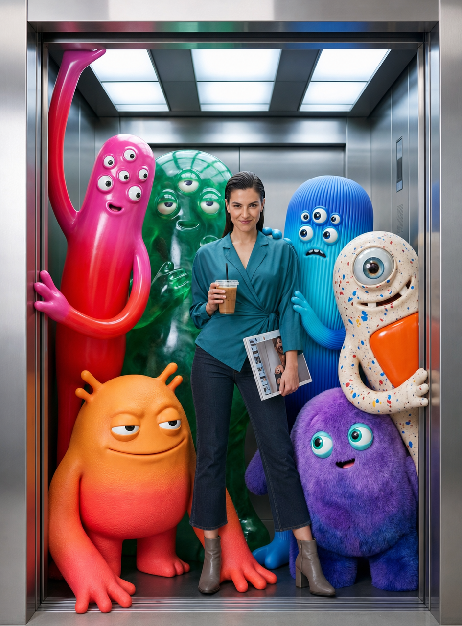
Teal fashion editorial in monster-filled lift
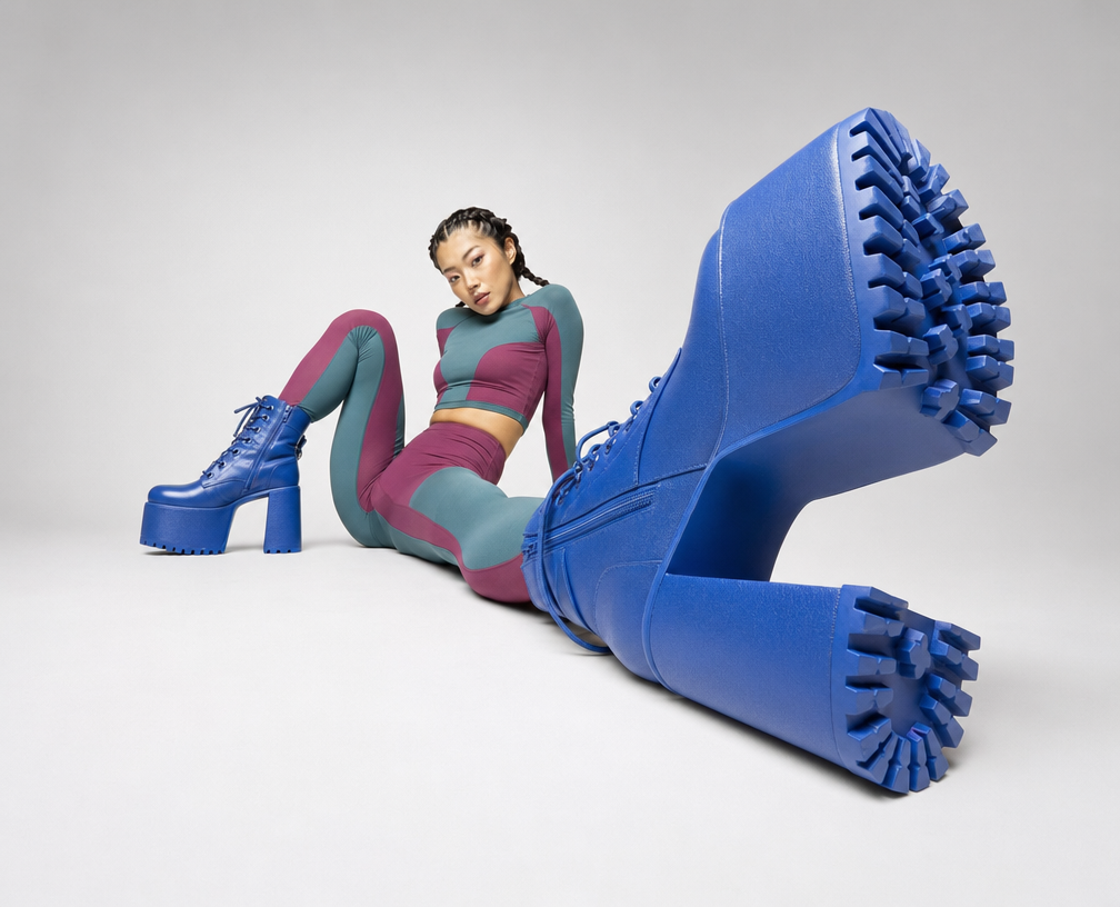
Cobalt Boots in Sleek Studio Edit
Sunlit editorial on striped beach towel
Silhouette Influencer by Sunlit Window