Why this works
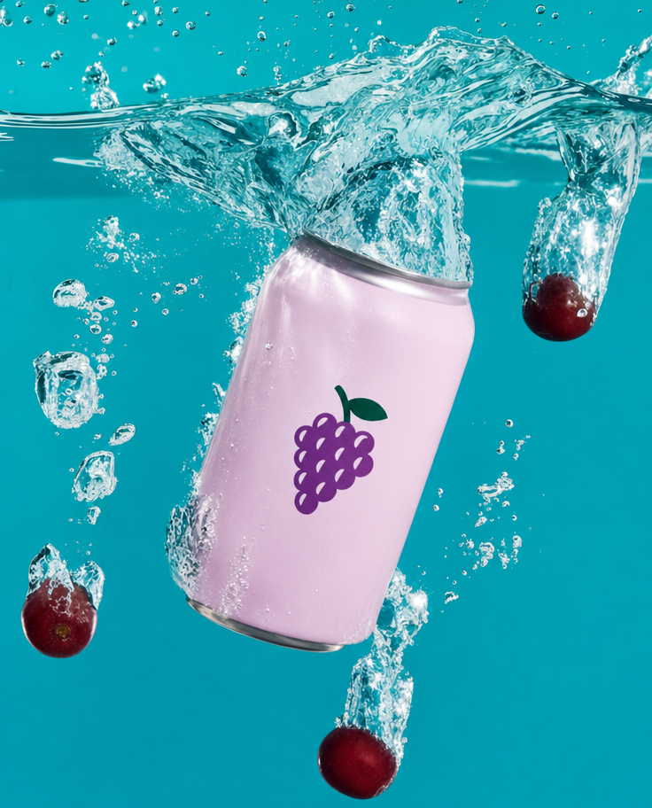
“Centered composition” and “product-focused framing” keep the can as the visual anchor, while the “dynamic splash frozen around the can” creates a controlled burst without losing the clean advertising layout. The mood comes from the explicit “vibrant, refreshing, playful” styling, reinforced by “vivid teal liquid” against the can’s white, pink, purple, and red label colors. “Glossy condensation beads,” “bright studio lighting,” and “crisp refractions and water caustics” supply the tactile chill, sharp highlights, and underwater depth.
FAQ
→How do I make the grape can feel more dominant and imposing?
Keep “centered composition,” but replace “small grape pieces” and the broad “dynamic splash frozen around the can” with “large can occupying 70% of the frame, towering foreground product, tightly cropped splash.” Add “low-angle product view” and “minimal background detail” to reduce competition from the teal liquid and droplets.
→How do I turn this playful commercial image into a darker, more luxurious version?
Replace “vivid teal liquid” with “deep emerald-black liquid,” and change “bright studio lighting” to “controlled low-key lighting with a narrow rim light.” Replace “vibrant, refreshing, playful mood” with “moody, premium, restrained mood,” while keeping “glossy condensation beads” and “crisp refractions” so the can remains tactile and sharply defined.
→How do I create a matching series with different flavors while preserving this composition?
Keep “centered composition,” “product-focused framing,” “underwater,” and “frozen splash,” then replace “grape sparkling tonic” and “small grape pieces” with a new flavor and matching garnish, such as “lemon sparkling tonic with thin lemon slices.” Swap “vivid teal liquid” for a flavor-specific field such as “bright citrus yellow liquid,” and update the label colors while retaining “white, pink, purple, red” only if they belong to the new packaging.
Learn the technique behind this
- Why can't AI spell, and how do I get readable text in an image? — Older diffusion models had no character-level representation of text, so they produced letterform-shaped texture instead of words.
- How should a prompt be structured, and does word order matter? — A prompt that behaves predictably names one subject first, then what it is doing, then where, then the light, then the lens or medium, then the style.
- Do negative prompts work, and what should go in one? — Negative prompts work on models that support a separate negative conditioning channel — mainly Stable Diffusion and FLUX-family models.
Related prompts
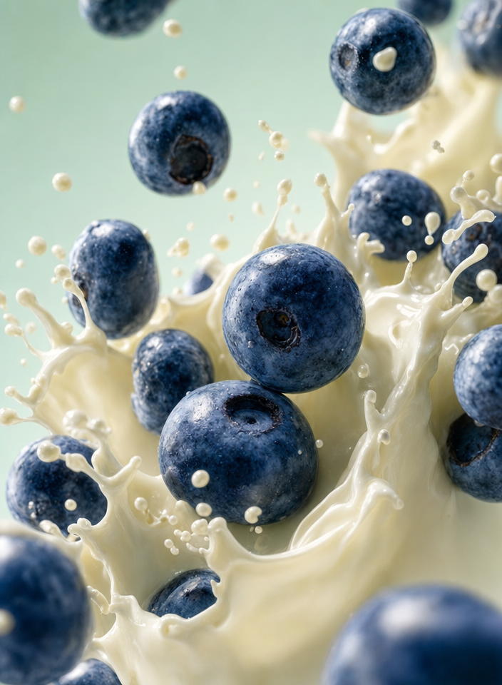
Blueberries Bursting Into Vanilla Cream
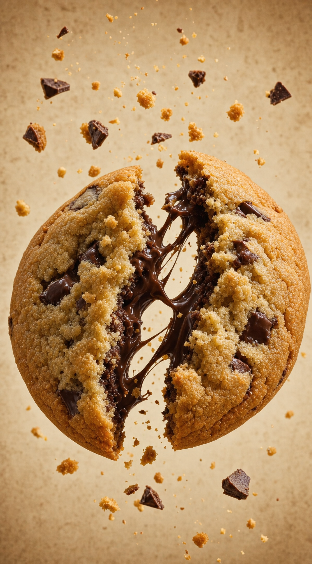
Chocolate Filled Cookie Splitting Midair With Dark Drip

Partially Peeled Banana on Blue
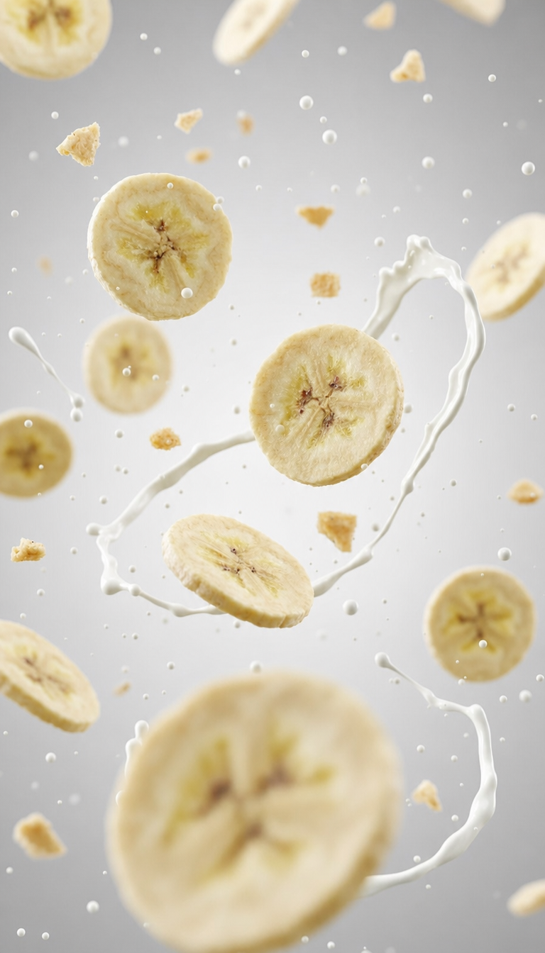
Banana slices in cool milk splash background