Why this works
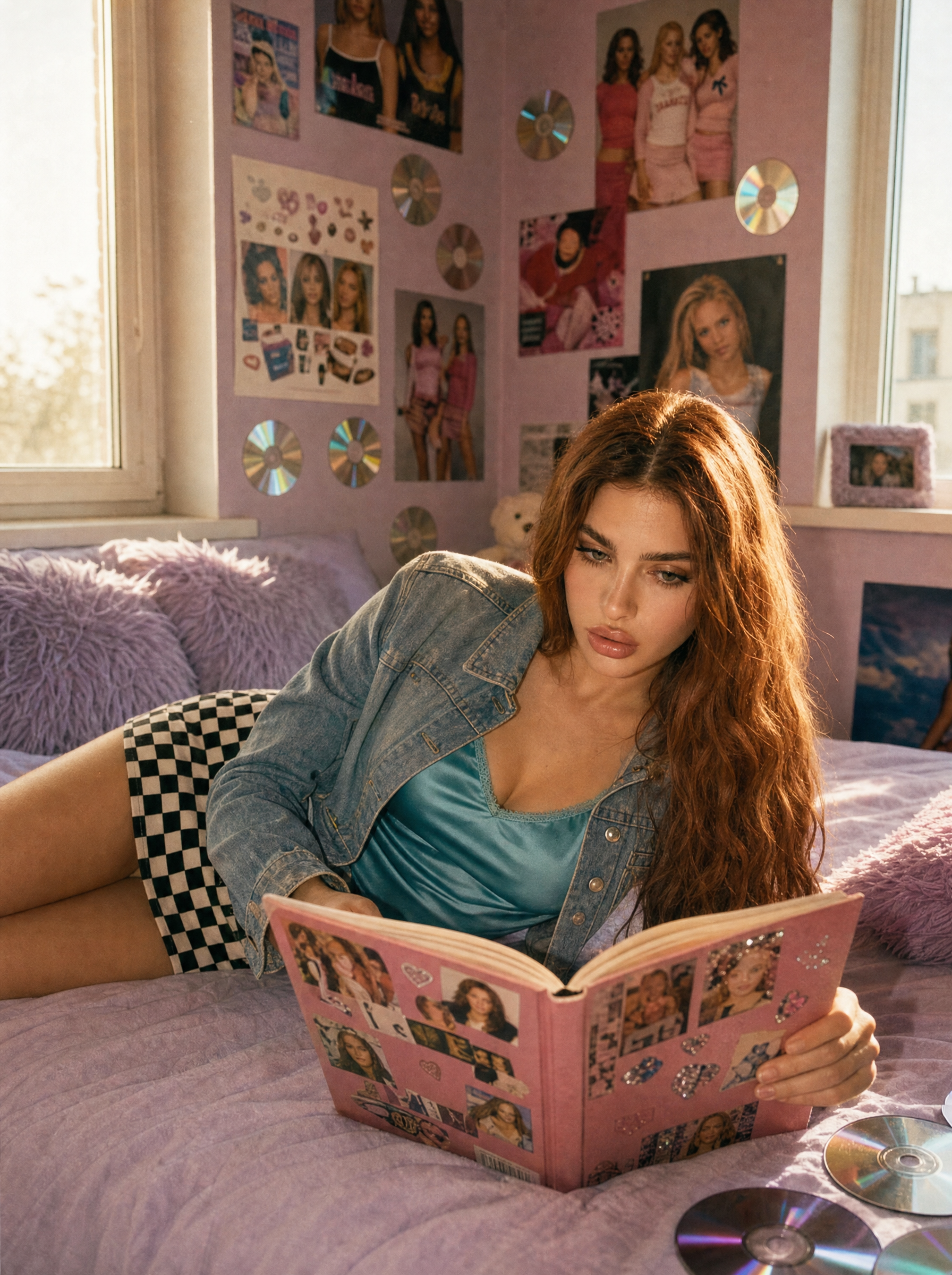
“Lavender bed,” “plush lavender faux-fur pillows,” and “glossy lavender fashion magazine” create a coordinated pastel field, while the teal camisole and “black-and-white checkerboard mini skirt” provide crisp graphic contrast. The “nostalgic Y2K bedroom,” “early-2000s pop culture posters,” and “reflective CD decorations” carry the period identity, with “soft morning window light” and a “warm, dreamy glow” establishing the gentle mood. “Portrait-full-body” and “cinematic editorial composition” keep the lounging pose and outfit readable together, while “shallow depth of field,” “realistic skin texture,” and “subtle film grain” prioritize the model without losing the tactile bedroom details.
FAQ
→How do I make the magazine and reading action more central?
Replace “lounging on a lavender bed, reading a glossy lavender fashion magazine” with “seated upright in the center of the frame, holding an open glossy lavender fashion magazine toward the camera, eyes focused on the page.” Change “portrait-full-body” to “three-quarter portrait” and add “magazine sharply in focus in the foreground” so the prop becomes a clear compositional anchor.
→How do I shift this from dreamy nostalgia to a darker, edgier Y2K mood?
Replace “soft morning window light creates a warm, dreamy glow” with “cool blue nighttime window light with sharp flash accents and deep shadows.” Swap “lavender bed” and “plush lavender faux-fur pillows” for “black satin bedding and metallic silver pillows,” and replace “Kodak Portra–inspired color” with “high-contrast cyan-magenta club-photo color grading.”
→How do I build a coordinated variation series without losing the fashion-editorial look?
Keep “photorealistic editorial fashion photo,” “cinematic editorial composition,” “realistic skin texture,” and “subtle film grain” unchanged, then vary one controlled set at a time: replace “lavender” with “bubblegum pink,” “icy blue,” or “lime green,” and change the “teal satin camisole” to a matching contrasting color. For setting continuity, retain “early-2000s pop culture posters and reflective CD decorations” while swapping only the bed color and magazine cover.
Learn the technique behind this
- Why can't AI spell, and how do I get readable text in an image? — Older diffusion models had no character-level representation of text, so they produced letterform-shaped texture instead of words.
- Which aspect ratio should I use, and how does it change the image? — Aspect ratio determines what the model composes, not how it's cropped afterwards.
- How do I keep one consistent style across a whole set of images? — Style consistency is more achievable than character consistency because style lives in describable attributes.
Related prompts
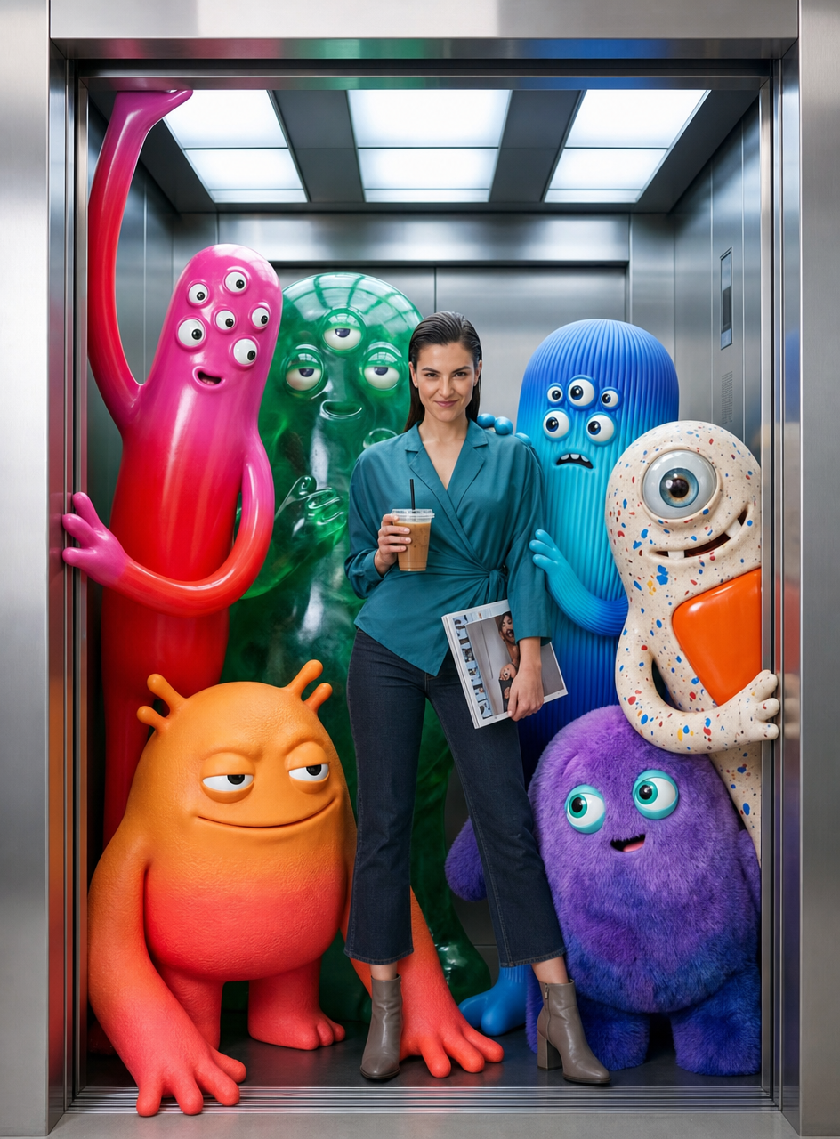
Teal fashion editorial in monster-filled lift
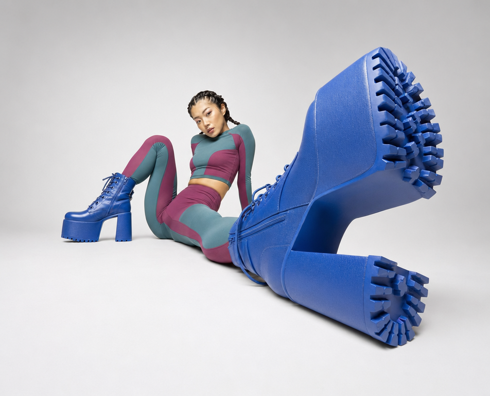
Cobalt Boots in Sleek Studio Edit
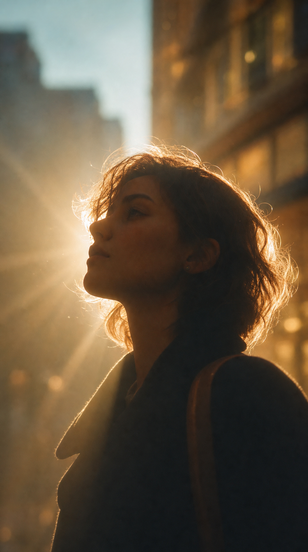
Silhouette Influencer by Sunlit Window

Sunlit editorial on striped beach towel