Why this works
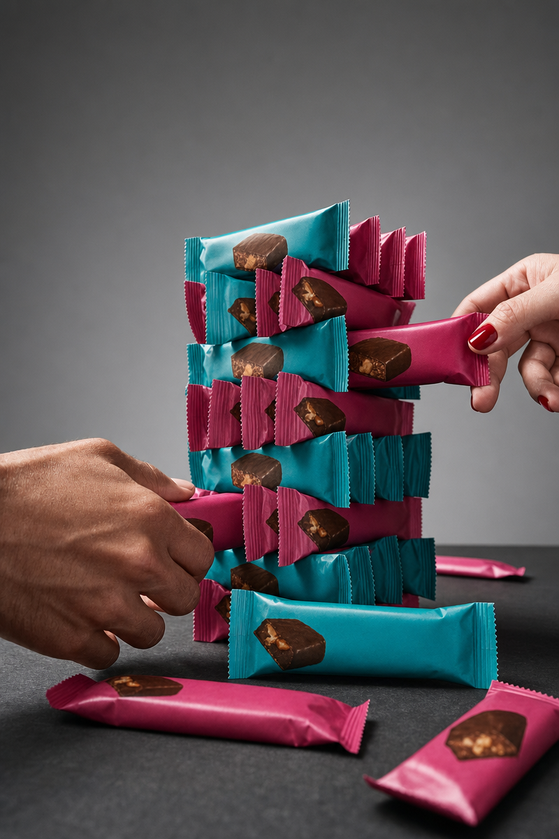
The centered tower and opposite-reaching hands make the rivalry immediately legible, while “clean modern advertising composition” keeps the frame controlled rather than chaotic. “Teal and magenta,” moderated by “a more subdued color palette for a premium feel,” creates a punchy pink-teal-black harmony without losing polish. “High-contrast studio lighting with crisp specular highlights” gives the wrappers commercial snap, and “sharp focus on the stacked wrappers” plus “shallow depth of field” makes the package tower the visual anchor against the gray seamless background.
FAQ
→How do I make the competitive rivalry feel more intense?
Replace “suggesting a playful competitive rivalry” with “a tense tug-of-war over the tower, hands gripping toward the top wrapper,” and change “two human hands reaching toward the tower from opposite sides” to “two hands pulling the tower from opposite sides, fingers visibly tense.” Keep “centered” composition so the confrontation stays symmetrical.
→How do I make one protein bar wrapper more prominent?
Replace “sharp focus on the stacked wrappers” with “sharp focus on the top teal-and-magenta wrapper, with the lower wrappers softly receding,” and add “top wrapper slightly larger and angled toward camera.” Keep “shallow depth of field” to separate that package from the stack and background.
→How do I build a variation with a different product setting?
Replace “premium commercial studio setup with a neutral gray seamless background and dark slate tabletop” with “bright modern gym counter, softly blurred fitness equipment in the background, pale concrete surface.” Retain “commercial studio photography,” “crisp specular highlights,” and “ultra-detailed wrapper texture” so the new setting still reads as polished product advertising.
Learn the technique behind this
- Why can't AI spell, and how do I get readable text in an image? — Older diffusion models had no character-level representation of text, so they produced letterform-shaped texture instead of words.
- Why does AI get hands and faces wrong, and how do I fix it? — Hands fail because they're small in frame, extremely variable in pose, and self-occluding — the model has less usable signal per pixel than for any other body part.
- How should a prompt be structured, and does word order matter? — A prompt that behaves predictably names one subject first, then what it is doing, then where, then the light, then the lens or medium, then the style.
Related prompts
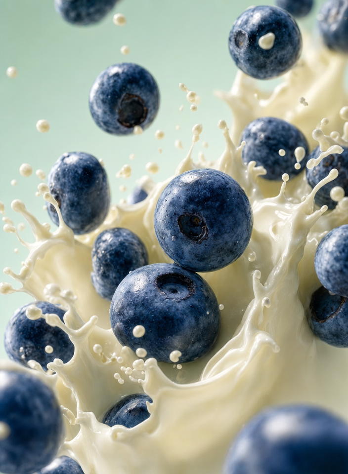
Blueberries Bursting Into Vanilla Cream
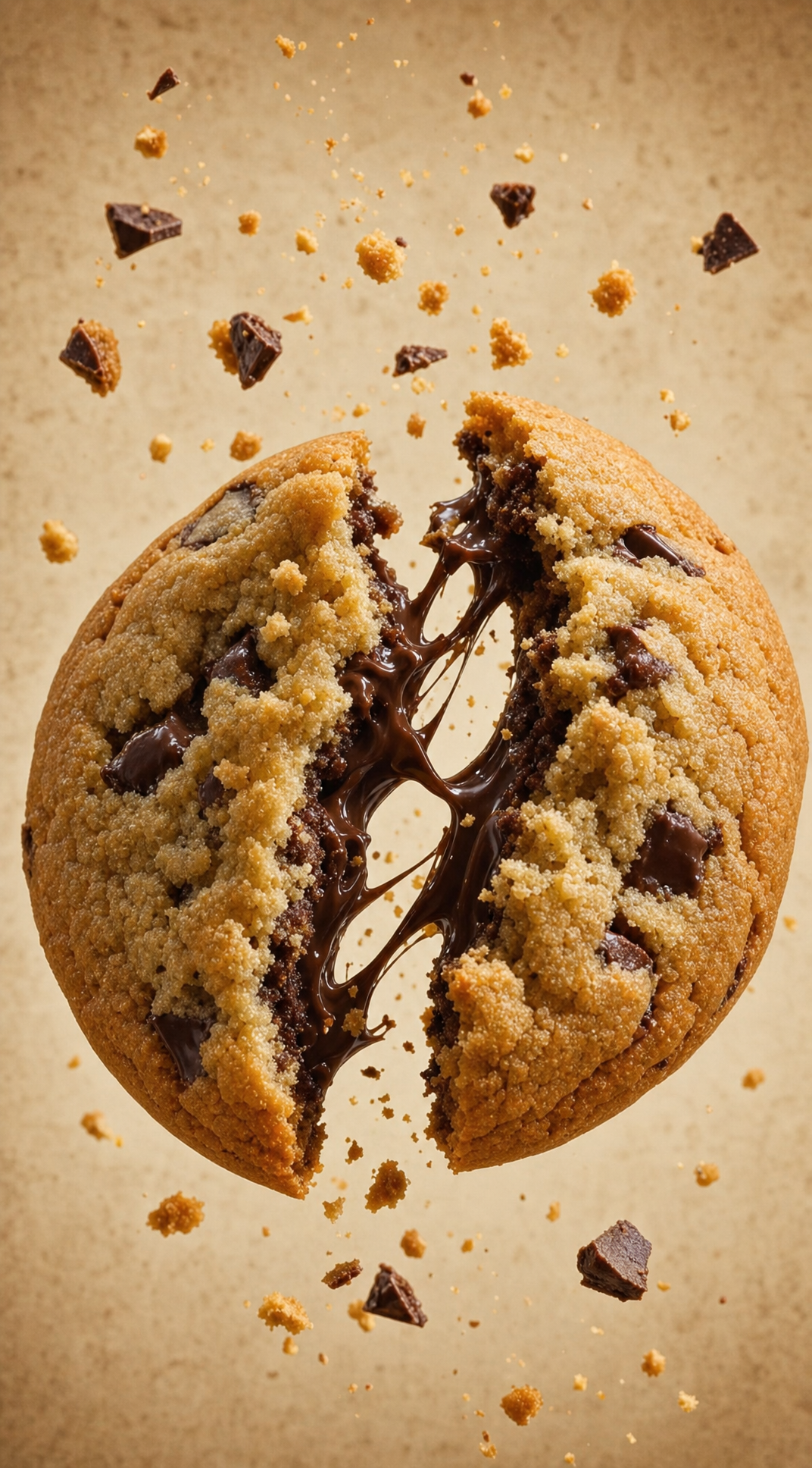
Chocolate Filled Cookie Splitting Midair With Dark Drip
Partially Peeled Banana on Blue
Banana slices in cool milk splash background