Why this works
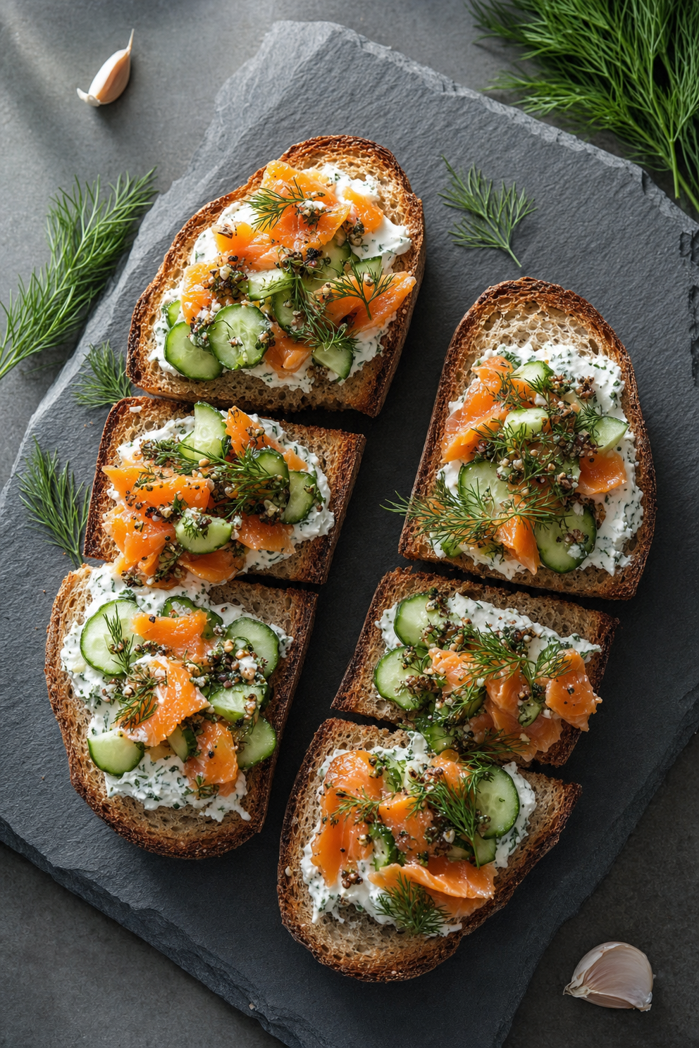
The phrase “smoked salmon and cucumber crostini on artisan bread slices” establishes distinct brown, orange, and green layers, while “slate-gray serving board” gives the warm ingredients a subdued neutral ground. “Bright natural light with soft shadows” keeps the scene fresh without flattening the creamy textures, and “shallow depth of field to emphasize textures” makes the whipped cream cheese, salmon, and bread read as tactile. The “45-degree angle composition” supports an intimate editorial view, while “dill fronds placed neatly along the edges” creates controlled framing instead of the visual scatter of loose sprigs.
FAQ
→How do I make the crostini feel more luxurious and dramatic?
Replace “bright natural light with soft shadows” with “low, directional window light with deeper soft-edged shadows,” and change “cozy yet elegant rustic atmosphere” to “moody, refined restaurant editorial styling.” Keep “high-end editorial food styling” so the presentation remains polished rather than casual.
→How do I make the smoked salmon more prominent than the bread and garnish?
Change “shallow depth of field to emphasize textures” to “tight shallow focus locked on the smoked salmon folds,” and replace “smoked salmon and cucumber crostini on artisan bread” with “generous ribbons of smoked salmon cascading over each crostini.” Reduce the garnish instruction to “two small dill fronds per board edge” so the dill does not compete with the salmon.
→How do I turn this into a consistent series of seasonal crostini images?
Keep “45-degree angle composition,” “slate-gray serving board,” “bright natural light with soft shadows,” and “dill fronds placed neatly along the edges” unchanged as the visual constants. Swap only “smoked salmon and cucumber” for alternatives such as “roast beetroot and goat cheese” or “pear and blue cheese,” then replace “cooler greens, softer salmon” with a matching restrained palette such as “muted beet reds, cream, and sage green.”
Learn the technique behind this
- Why can't AI spell, and how do I get readable text in an image? — Older diffusion models had no character-level representation of text, so they produced letterform-shaped texture instead of words.
- Do negative prompts work, and what should go in one? — Negative prompts work on models that support a separate negative conditioning channel — mainly Stable Diffusion and FLUX-family models.
- Which aspect ratio should I use, and how does it change the image? — Aspect ratio determines what the model composes, not how it's cropped afterwards.
Related prompts
Blueberries Bursting Into Vanilla Cream
Chocolate Filled Cookie Splitting Midair With Dark Drip

Partially Peeled Banana on Blue
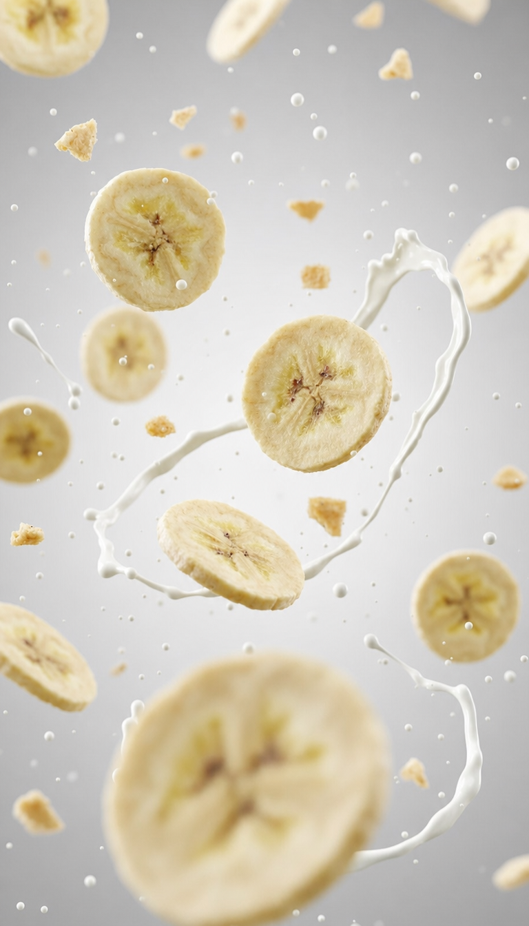
Banana slices in cool milk splash background