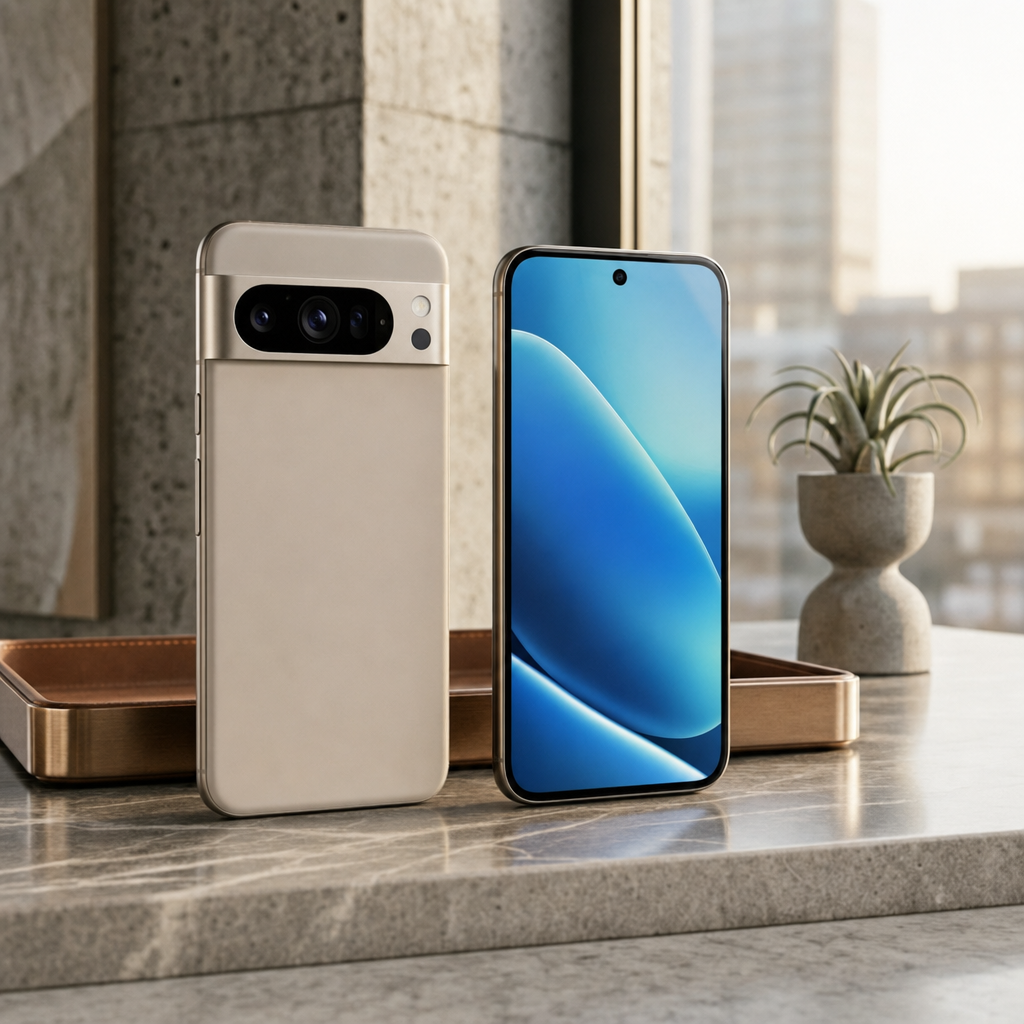
Why this works
The centered arrangement of “two modern smartphones standing upright” makes the paired products immediately legible, while “ample negative space” gives the premium advertising composition room to breathe. The beige-and-blue color contrast comes directly from “sand-beige matte finish” and the “vivid blue-and-teal abstract screen,” grounded by the “polished light-gray marble tabletop” and warm brown interior tones. “Soft morning daylight from the side” supplies the calm modern mood, and “subtle rim lighting” plus “realistic glass and metal reflections” separates the phones from the minimalist interior without losing their material detail. “Shallow depth of field” keeps attention on the devices while allowing the tall window and luxury setting to read as context rather than competition.
FAQ
→How do I make the front-facing blue phone the clear hero product?
Replace “two modern smartphones standing upright” with “one front-facing smartphone in the foreground, slightly larger and centered, with a second phone receding behind it.” Change “the other displaying the front with a vivid blue-and-teal abstract screen” to “the hero phone displaying a vivid blue-and-teal abstract screen, screen fully visible and sharply focused,” and add “secondary phone softly blurred.”
→How do I shift this from calm luxury to a darker, more dramatic tech mood?
Replace “soft morning daylight from the side” with “dramatic cool-blue side lighting with deep controlled shadows,” and change “sleek minimalist luxury interior” to “dark minimalist luxury interior with charcoal stone and smoked glass.” Keep “subtle rim lighting,” but replace it with “strong cyan rim lighting along the phone edges” for a more emphatic silhouette.
→How do I create a coordinated series with different phone finishes and screen colors?
Keep the structural phrases “commercial product photography,” “two modern smartphones standing upright,” “centered,” and “ample negative space” unchanged. Swap “sand-beige matte finish” for a controlled finish list such as “obsidian-black gloss, brushed silver, forest-green matte, or soft lavender glass,” and replace “vivid blue-and-teal abstract screen” with matching palettes such as “orange-and-red geometric screen” or “violet-and-pink fluid gradient,” while retaining “realistic glass and metal reflections” for visual consistency.
Learn the technique behind this
- Why can't AI spell, and how do I get readable text in an image? — Older diffusion models had no character-level representation of text, so they produced letterform-shaped texture instead of words.
- How should a prompt be structured, and does word order matter? — A prompt that behaves predictably names one subject first, then what it is doing, then where, then the light, then the lens or medium, then the style.
- Why does the model ignore parts of my prompt? — Ignored instructions are almost always conflicts, counts, or spatial relationships — three things current models handle badly — rather than the model failing to read you.
Related prompts
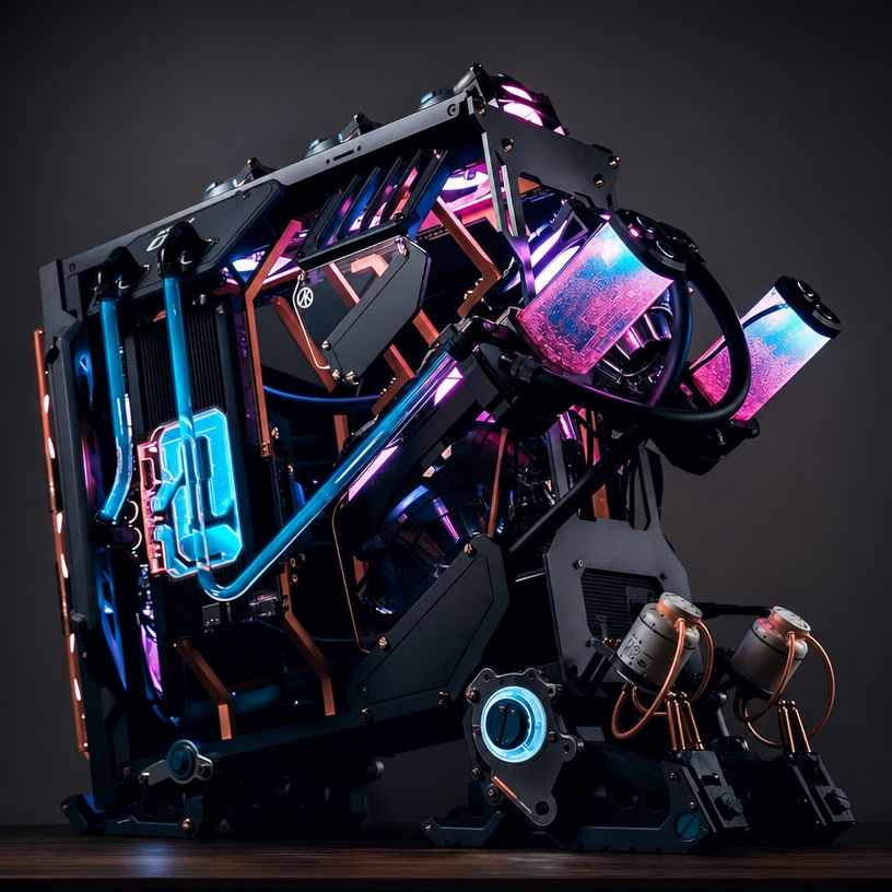
Open-Frame Futuristic PC With Blue LEDs
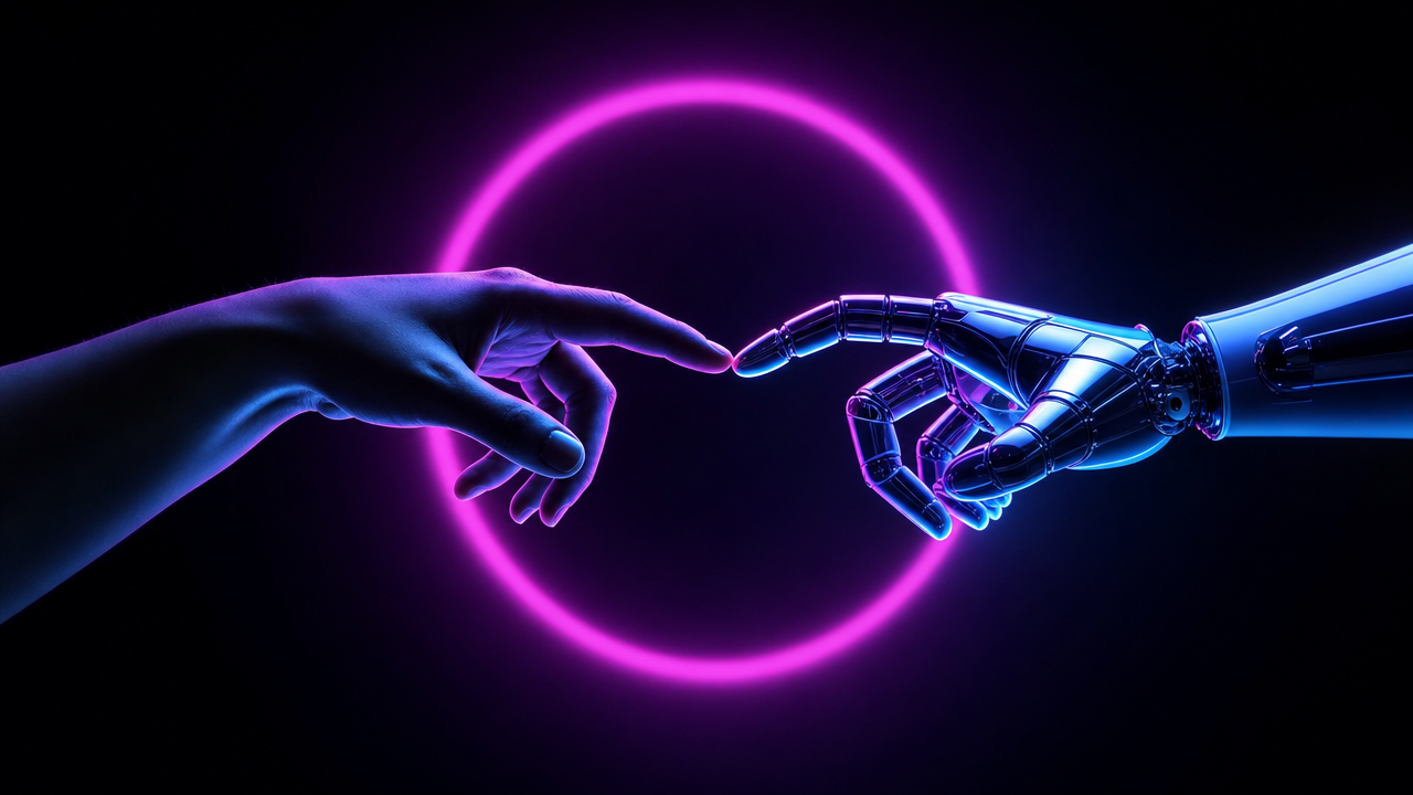
Magenta-Cyan Hands Nearly Touch

Magenta-Cyan Holographic Control Room

Blue holographic cube on server room pedestal