Why this works
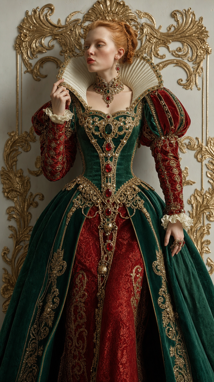
“Baroque queen of hearts,” “ornate gilded flourishes,” and the “deep emerald-green and ruby-red embroidered gown with gold filigree accents” establish the regal, opulent fantasy, while the rendered red, gold, and brown palette reinforces that theatrical warmth. The “tightly framed fashion portrait” conflicts slightly with the full-body composition, but “dramatic high-fashion composition” keeps the figure dominant and directs attention to the “fine stitching and metallic thread sheen.” “Crisp studio editorial lighting with soft falloff” and “shallow depth of field” preserve sharp textile detail against a softened playing-card set, giving the portrait controlled depth rather than a flat costume photograph.
FAQ
→How do I make the queen’s face and upper costume more central?
Replace “portrait-full-body” and “tightly framed fashion portrait” with “waist-up couture portrait, face and jeweled harness centered,” and add “direct eye contact” after “regal woman.” Keep “shallow depth of field” so the facial expression and streamlined bodice remain sharper than the backdrop.
→How do I shift the image from warm theatrical red and gold toward a cooler emerald court aesthetic?
Change “deep emerald-green and ruby-red embroidered gown” to “deep emerald-green and midnight-blue embroidered gown,” replace “gold filigree accents” with “antique silver filigree accents,” and add “cool teal studio fill light.” Retain “playing-card themed studio backdrop,” but specify “muted brown and crimson background flourishes” so the set supports the cooler costume instead of overpowering it.
→How do I create a coordinated series of alternate queen portraits from this prompt?
Keep “photorealistic high-fashion editorial portrait,” “crisp studio editorial lighting with soft falloff,” and “dramatic high-fashion composition” unchanged, then vary one controlled block per image: replace “Baroque queen of hearts” with “Baroque queen of spades,” “queen of diamonds,” or “queen of clubs,” and swap the gown colors to “black and silver,” “ivory and champagne gold,” or “deep green and copper.” Match each version with a corresponding playing-card emblem in the “extravagant playing-card themed studio backdrop.”
Learn the technique behind this
- Why can't AI spell, and how do I get readable text in an image? — Older diffusion models had no character-level representation of text, so they produced letterform-shaped texture instead of words.
- How do I keep the same character across multiple images? — Text prompts alone won't hold a face across images — a description defines a type, not a person.
- How should a prompt be structured, and does word order matter? — A prompt that behaves predictably names one subject first, then what it is doing, then where, then the light, then the lens or medium, then the style.
Related prompts

Teal fashion editorial in monster-filled lift
Cobalt Boots in Sleek Studio Edit

Silhouette Influencer by Sunlit Window

Sunlit editorial on striped beach towel