Why this works
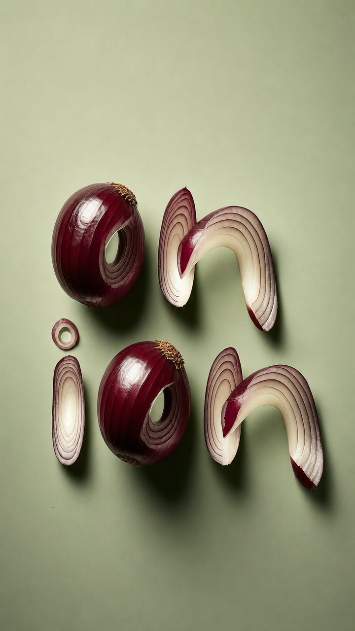
“Sliced red onions arranged into playful lowercase letterform shapes” supplies both the subject and the typographic structure, while “bold graphic composition” and “clean, branding-style framing” keep the overhead flatlay legible rather than incidental. The playful, modern tone comes from “playful lowercase letterform shapes,” “smooth muted sage-green background,” and “vibrant contrast”; the actual image’s red, brown, and gray balance gives that contrast a more grounded, editorial feel. “Soft directional studio lighting,” “glossy slice highlights,” and “crisp realistic shadows” are the load-bearing phrases for dimensional slices and readable separation, while “studio product-style framing, sharp focus” preserves the high-detail commercial finish.
FAQ
→How do I make one lowercase letterform more prominent than the others?
Replace “sliced red onions arranged into playful lowercase letterform shapes” with “a single oversized lowercase letter ‘g’ formed from sliced red onions, centered as the dominant subject, with smaller onion fragments around it.” Keep “bold graphic composition” and “clean, branding-style framing” to retain the poster-like structure.
→How do I shift the image from playful and vibrant to moody and premium?
Replace “playful lowercase letterform shapes” with “elegant lowercase letterform shapes with restrained spacing,” and change “smooth muted sage-green background” to “deep charcoal-gray background.” Replace “vibrant contrast” with “quiet tonal contrast,” while keeping “richer deep burgundy and creamy ivory” and “soft directional studio lighting” for the refined palette and controlled highlights.
→How do I build a series using different ingredients while preserving this visual identity?
Keep “overhead-flatlay,” “studio product-style framing,” “bold graphic composition,” “clean, branding-style framing,” and “ultra-high detail” unchanged. Replace “sliced red onions” with a repeated subject such as “thin citrus peels,” “curled pasta,” or “fresh herbs,” and replace “richer deep burgundy and creamy ivory” with two defining colors for each ingredient; retain “smooth muted sage-green background” and “crisp realistic shadows” so the set remains visually consistent.
Learn the technique behind this
- Why can't AI spell, and how do I get readable text in an image? — Older diffusion models had no character-level representation of text, so they produced letterform-shaped texture instead of words.
- Which aspect ratio should I use, and how does it change the image? — Aspect ratio determines what the model composes, not how it's cropped afterwards.
- How do I keep one consistent style across a whole set of images? — Style consistency is more achievable than character consistency because style lives in describable attributes.
Related prompts
Blueberries Bursting Into Vanilla Cream
Chocolate Filled Cookie Splitting Midair With Dark Drip
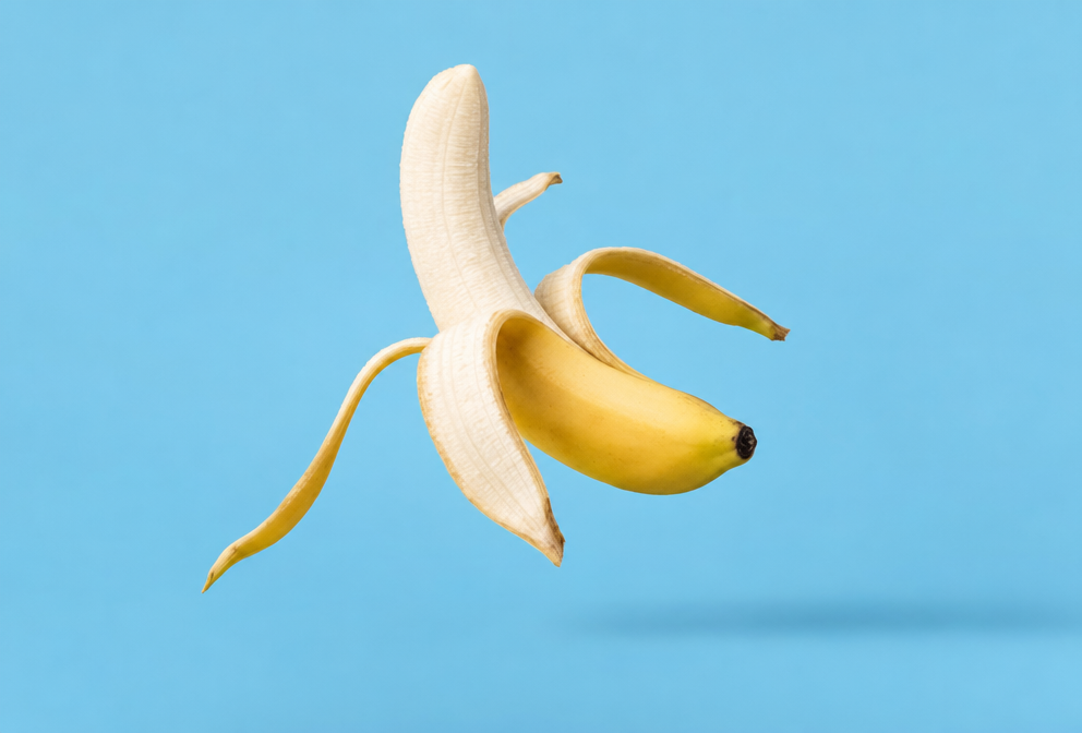
Partially Peeled Banana on Blue
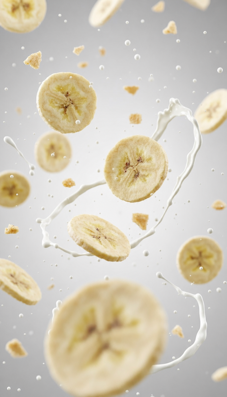
Banana slices in cool milk splash background