Why this works
The centered overhead framing comes directly from “Overhead view” and “clean and centered,” giving the short faceted glass a controlled icon-like presence against the smooth cool grey stone. “Softer golden side lighting with subtle rim highlights” supplies the warm orange highlights that contrast with the grey and black-dominant tonal field, while “crisp, glossy reflections and condensation” makes the glass feel tactile and premium. “Darker maroon cocktail” and “shallow, natural-looking ice speculars” keep the color and focus restrained rather than turning the image into a brightly saturated drink advertisement.
FAQ
→How do I make the cocktail feel warmer and more inviting?
Replace “darker maroon cocktail” with “ruby-red cocktail with glowing amber translucency,” and change “softer golden side lighting” to “rich sunset-gold lighting with warm reflected fill.” Keep “cool grey stone surface” if you want the warmer drink to remain the visual focal point through contrast.
→How do I make the ice and condensation more prominent?
Replace “shallow, natural-looking ice speculars” with “bright, clearly defined ice speculars,” and expand “subtle natural condensation” to “dense beads of condensation with a few visible droplets running down the glass.” Change “sharp focus on glass and ice” to “tack-sharp focus on the front ice cubes and condensation” so those details carry more visual weight.
→How do I turn this into a consistent series of luxury cocktail images?
Keep the fixed phrases “overhead view,” “clean and centered composition,” “smooth cool grey stone surface,” and “softer golden side lighting with subtle rim highlights.” Swap only “Campari-style cocktail” and the glass description for variants such as “pale-gold gin cocktail in a tall ribbed Collins glass,” “clear whisky cocktail in a heavy cut-crystal tumbler,” or “deep green herbal cocktail in a rounded coupe,” while retaining “photorealistic commercial product photography” and “luxury beverage advertising.”
Learn the technique behind this
- Why can't AI spell, and how do I get readable text in an image? — Older diffusion models had no character-level representation of text, so they produced letterform-shaped texture instead of words.
- Do negative prompts work, and what should go in one? — Negative prompts work on models that support a separate negative conditioning channel — mainly Stable Diffusion and FLUX-family models.
- Which aspect ratio should I use, and how does it change the image? — Aspect ratio determines what the model composes, not how it's cropped afterwards.
Related prompts
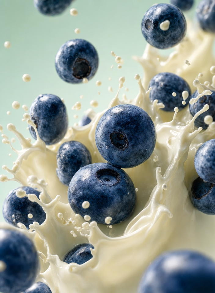
Blueberries Bursting Into Vanilla Cream
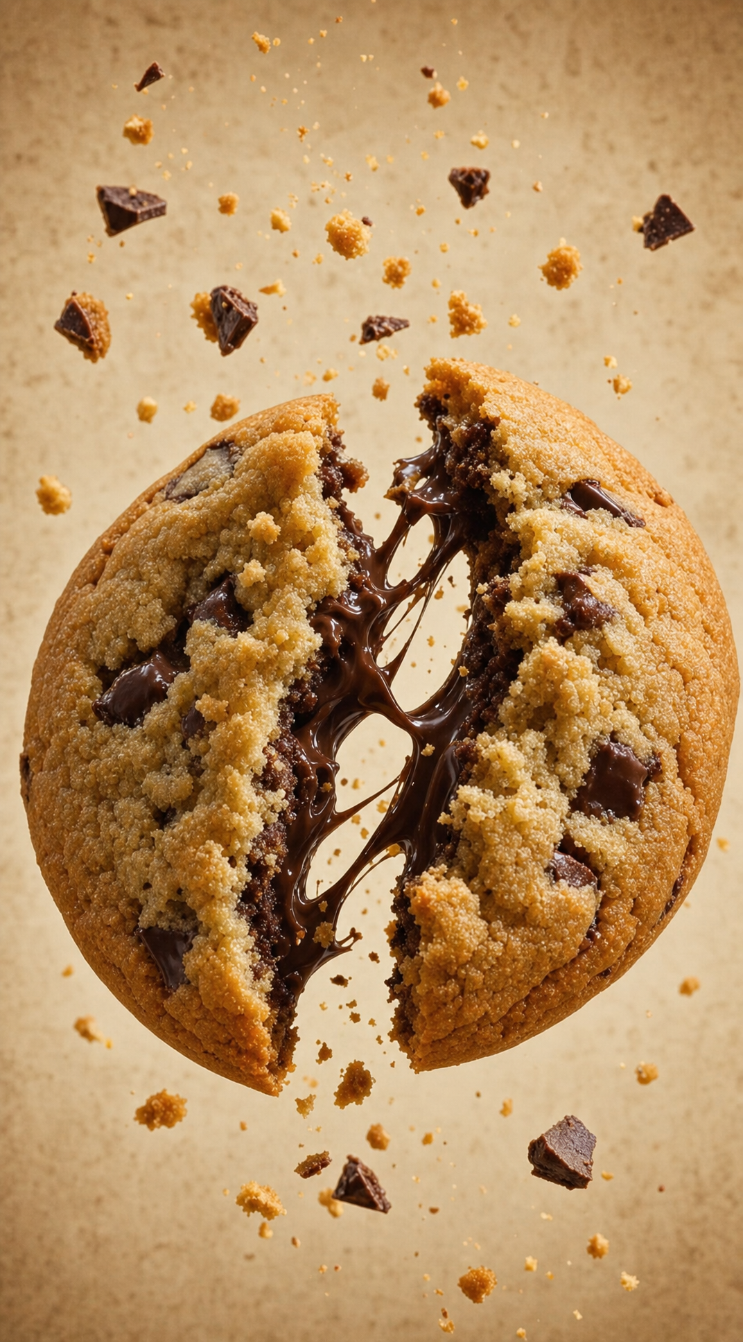
Chocolate Filled Cookie Splitting Midair With Dark Drip
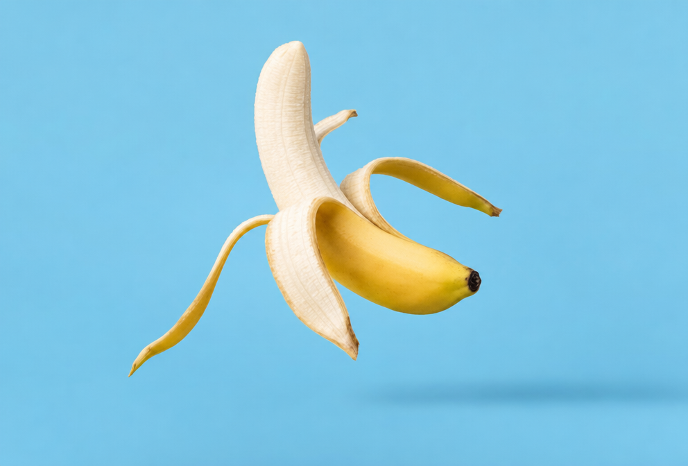
Partially Peeled Banana on Blue
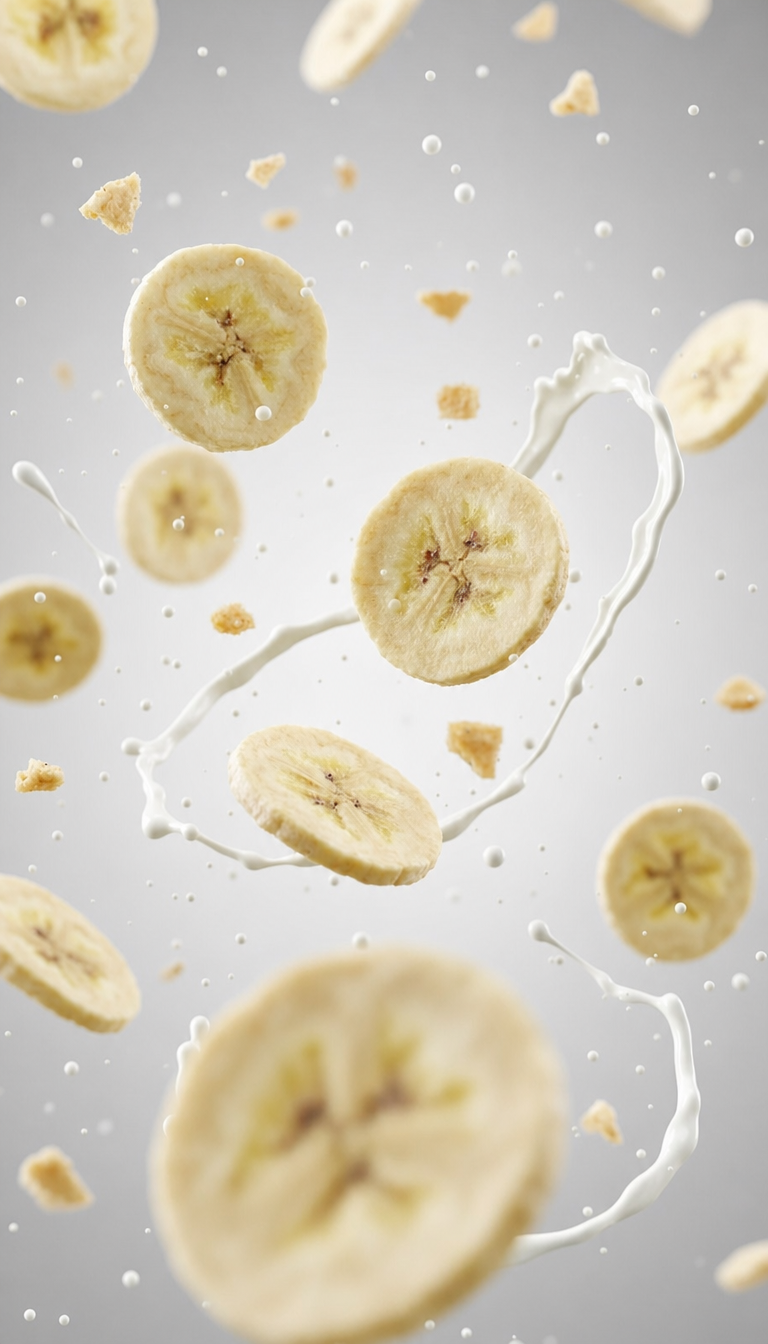
Banana slices in cool milk splash background