Why this works
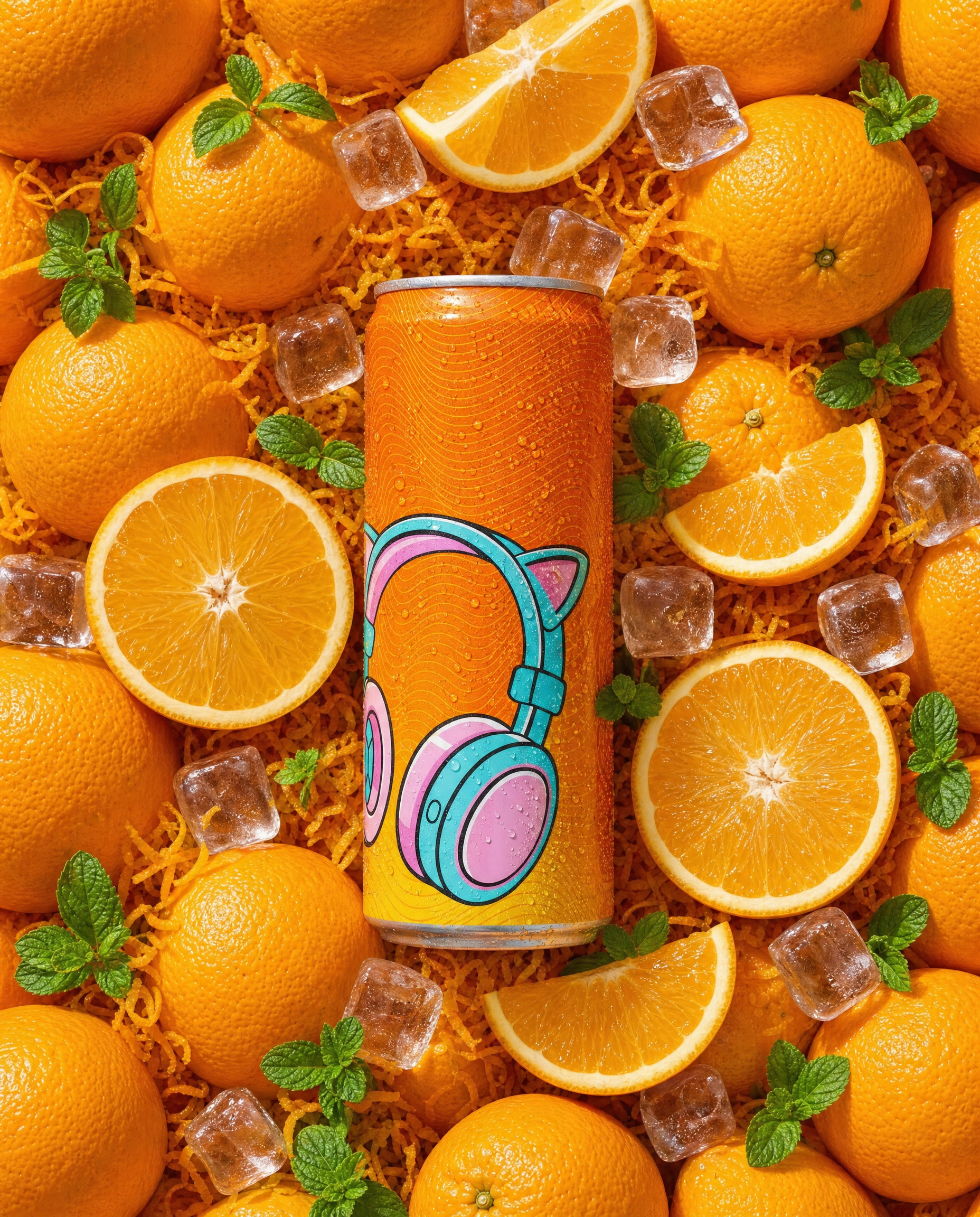
“Overhead top-down view, centered composition” makes the orange soda can the unmistakable focal point, while “clean advertising framing” keeps the zest, whole oranges, half-moon slices, mint leaves, and ice arranged without visual clutter. The fresh, summery tone comes from “vibrant citrus color palette” and “bright clean backdrop,” with the dominant yellow, green, white, and gray tones reinforcing that crisp palette rather than relying on orange alone. “Crisp studio lighting with sharp glossy reflections on the can” and “bright specular highlights on clear ice” supply the commercial polish, while “highly detailed realism” preserves the texture of the zest, fruit peel, condensation, and ice.
FAQ
→How do I make the soda can feel larger and more central in the flat lay?
Keep “orange soda can centered” and “overhead top-down view,” but replace “a bed of orange zest and whole oranges” with “a sparse bed of orange zest and smaller whole oranges pushed to the outer corners.” Change “clear ice cubes scattered near the can edges” to “three oversized clear ice cubes framing the can without overlapping it,” so the supporting elements create scale instead of competing with the label.
→How do I shift this from a bright summer advertisement to a darker, more premium drink image?
Replace “vibrant citrus color palette with a bright clean backdrop” with “deep amber, burnt orange, and charcoal palette on a dark slate backdrop.” Change “crisp studio lighting” to “low-key directional lighting from one side with controlled shadows,” while keeping “sharp glossy reflections on the can” and replacing “bright specular highlights on clear ice” with “small, restrained highlights on melting ice.”
→How do I create a series of matching variations with different citrus flavors?
Keep “overhead top-down view, centered composition, clean advertising framing,” “highly detailed realism,” and the same lighting language unchanged. For a lemon version, replace every “orange” reference with “lemon,” change “orange zest” to “fine lemon zest,” and replace “mint leaves” with “small basil leaves”; for grapefruit, use “pink grapefruit,” “ruby grapefruit zest,” and “pale green thyme leaves,” while preserving “glossy can label with realistic reflections” across all versions.
Learn the technique behind this
- Why can't AI spell, and how do I get readable text in an image? — Older diffusion models had no character-level representation of text, so they produced letterform-shaped texture instead of words.
- How do I keep one consistent style across a whole set of images? — Style consistency is more achievable than character consistency because style lives in describable attributes.
- How should a prompt be structured, and does word order matter? — A prompt that behaves predictably names one subject first, then what it is doing, then where, then the light, then the lens or medium, then the style.
Related prompts
Blueberries Bursting Into Vanilla Cream
Chocolate Filled Cookie Splitting Midair With Dark Drip
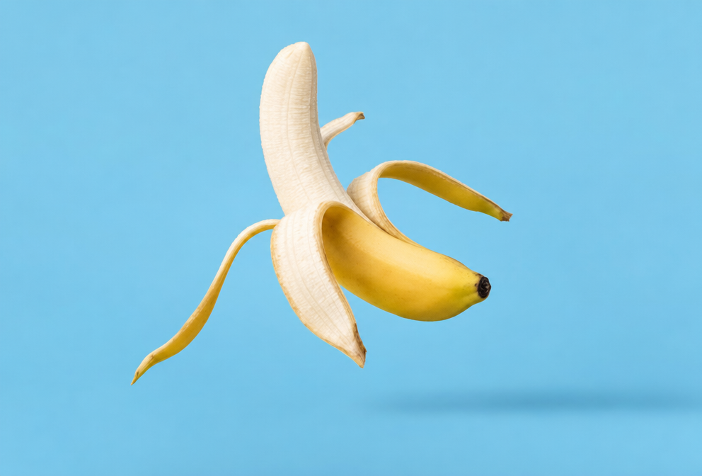
Partially Peeled Banana on Blue
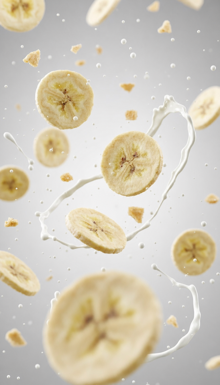
Banana slices in cool milk splash background