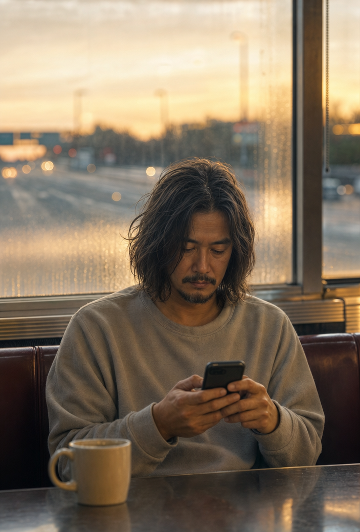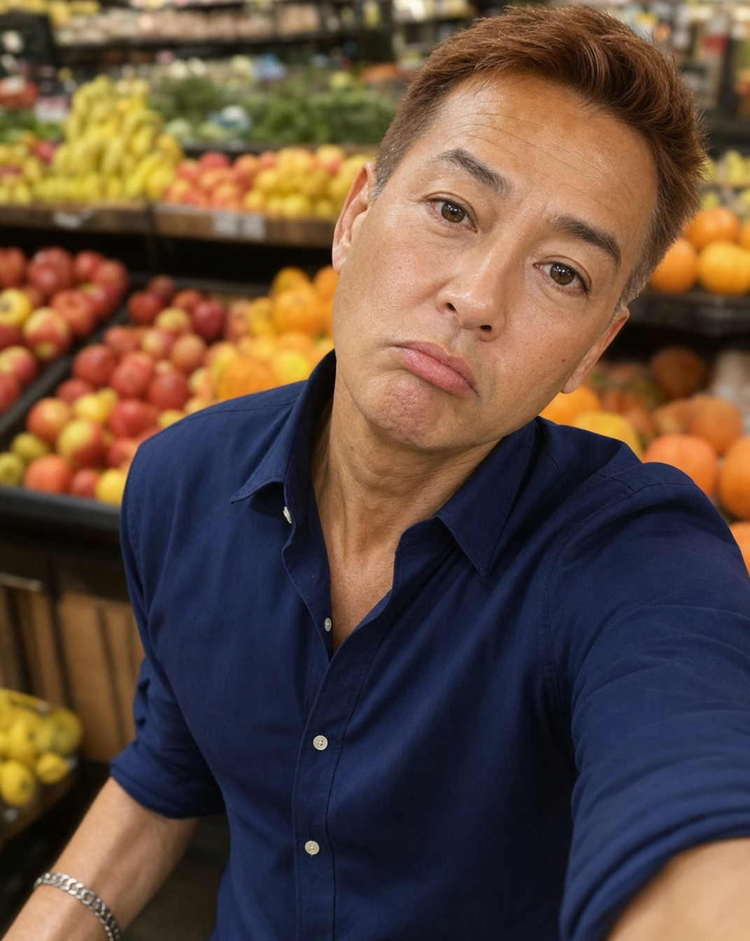
Same prompt, generated with each model separately — click one to see how it holds up.
Why this works
The phrase 'direct flash lighting with harder localized shadows' is what produces the blown-out, slightly harsh look on the man's face while the navy shirt reads as near-black in shadowed folds, matching the dominant navy/gold contrast in the actual output. 'Fruit displays softly blurred in the background' does the compositional work of pushing focus onto the face while still letting the orange and yellow produce colors bleed through as soft background color blocks. 'Boosted saturation' plus 'tiny chemical dust imperfections' are the specific words responsible for the warm gold-brown cast and grain, not just 'disposable camera style' alone, which on its own would read more neutral. The 'slight vignette for a spontaneous candid vibe' phrase is what darkens the corners and reinforces the portrait-closeup framing so the eye has nowhere to go but the subject's face.
FAQ
→How do I make the background produce section more prominent instead of blurred?
Replace 'softly blurred in the background' with 'in sharp focus, colorful produce displays visible behind him' and change the camera line from disposable-vignette style to something like 'shot with a wider aperture close to f/8 for deeper focus.' You'll lose some of the candid selfie feel, so keep 'direct flash lighting' to preserve the flash-photo mood even with a sharper background.
→How do I shift this from a raw candid mood to something more polished or editorial?
Swap 'Shot in a disposable camera style with direct flash lighting, harder localized shadows, boosted saturation, tiny chemical dust imperfections' for 'Shot on a mirrorless camera with soft diffused studio lighting, even shadows, natural color grading.' Also drop 'spontaneous candid vibe' and replace with 'composed portrait, studio-quality finish' so the style_modifiers list reads as intentional rather than accidental.
→How do I turn this into a series of variations with different subjects or settings?
Keep the whole camera and lighting block intact since that's what defines the disposable-flash aesthetic, and just swap the subject clause 'middle-aged man with short auburn hair, wearing a navy blue button-up shirt and a simple silver bracelet' for other descriptions like 'young woman with curly black hair wearing a yellow raincoat' and change the setting clause 'grocery store produce section with fruit displays' to 'subway platform with train blur' or 'farmers market stall with flowers.' Reusing 'direct flash lighting with harder localized shadows, boosted saturation, tiny chemical dust imperfections' across each version is what keeps the series visually consistent.
Learn the technique behind this
- Why can't AI spell, and how do I get readable text in an image? — Older diffusion models had no character-level representation of text, so they produced letterform-shaped texture instead of words.
- How should a prompt be structured, and does word order matter? — A prompt that behaves predictably names one subject first, then what it is doing, then where, then the light, then the lens or medium, then the style.
- Why does the model ignore parts of my prompt? — Ignored instructions are almost always conflicts, counts, or spatial relationships — three things current models handle badly — rather than the model failing to read you.
Related prompts
Woman's Selfie with Crimson-Powered Anime Guardian
Blue Tracksuits on Glass Bridge Selfie
Golden-hour café selfie with iced coffee
Warm indoor flashless couple selfie