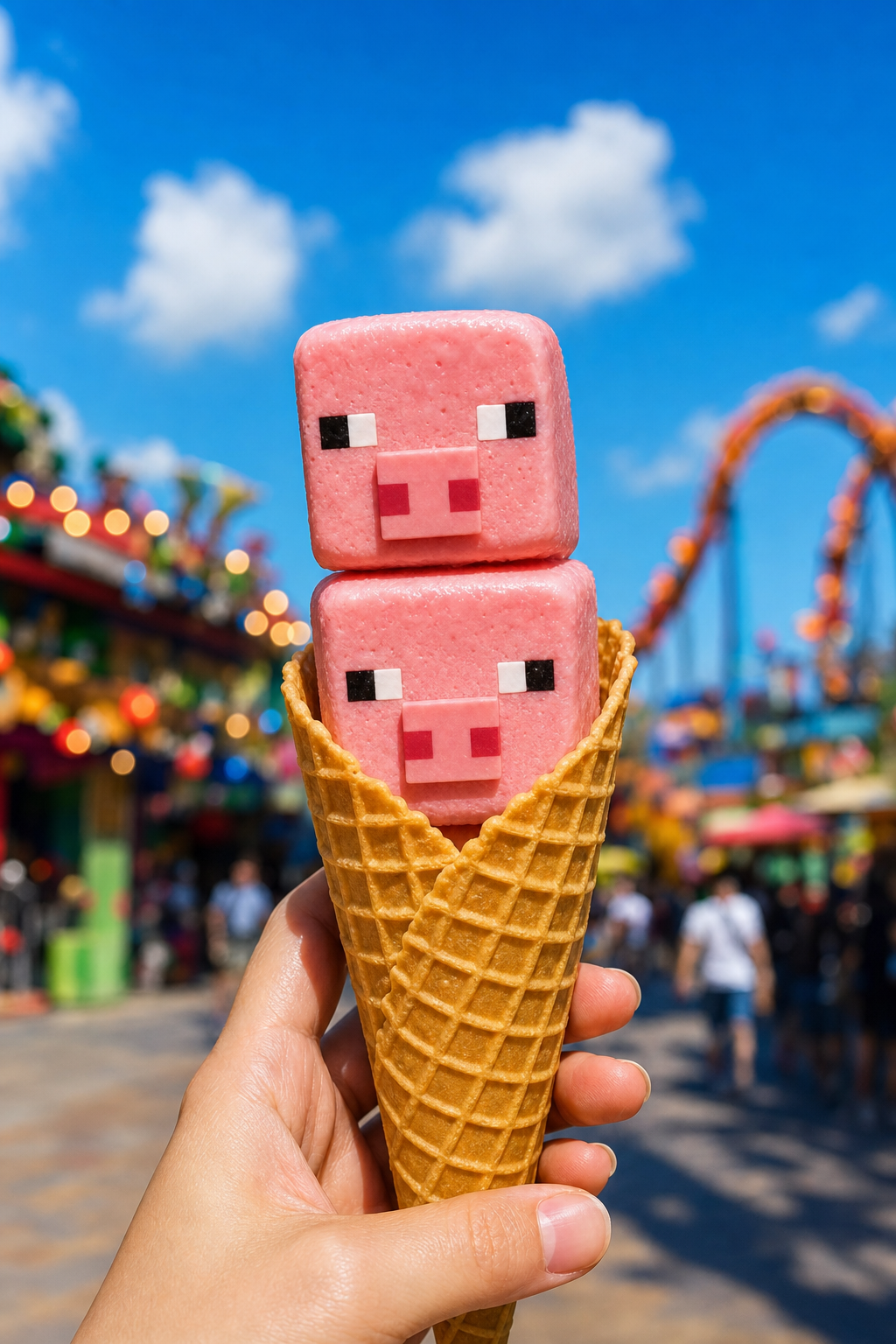
Why this works
The close handheld framing and “two stacked strawberry ice cream scoops” make the cone the immediate portrait-closeup focal point, while “shallow depth of field” pushes the colorful theme-park rides and signage into soft bokeh. “Blocky pig faces with square pixel-like eyes and snouts” supplies the recognizable Minecraft-inspired character, and “bright pink strawberry palette” paired with the golden waffle cone creates a tight pink-and-gold harmony. “Crisp bright summer daylight,” “vivid blue sky with fluffy clouds,” and “slightly glossy, creamy highlights” establish the sunny, playful commercial mood without sacrificing the photorealistic texture.
FAQ
→How do I make one pig-faced scoop more prominent than the other?
Replace “two stacked strawberry ice cream scoops” with “one oversized strawberry ice cream scoop in the foreground, with a smaller pig-faced scoop partially visible behind it,” and change “close handheld framing” to “extreme close-up framing centered on the front scoop.” Keep “square pixel-like eyes and snouts” if both faces should remain legible.
→How do I make the image feel more like an evening theme-park scene?
Replace “crisp bright summer daylight” and “vivid blue sky with fluffy clouds” with “warm sunset light, long soft shadows, and a violet-orange evening sky.” Change “glossy highlights” to “warm rim highlights on the creamy ice cream,” while retaining “colorful theme-park background” and “rides and signage bokeh” for the setting.
→How do I create a series with different game-inspired ice cream characters?
Keep “hand-held waffle cone,” “playful commercial product photography framing,” and “shallow depth of field” fixed across every prompt, then replace “strawberry ice cream scoops shaped like blocky pig faces” with variants such as “vanilla scoops shaped like blocky pixel fox faces” or “mint-chocolate scoops shaped like blocky pixel frog faces.” Swap “bright pink strawberry palette” for a matching palette such as “cream and orange” or “mint green and dark chocolate,” while preserving “no readable text” for consistent clean backgrounds.
Learn the technique behind this
- Why can't AI spell, and how do I get readable text in an image? — Older diffusion models had no character-level representation of text, so they produced letterform-shaped texture instead of words.
- Why does the model ignore parts of my prompt? — Ignored instructions are almost always conflicts, counts, or spatial relationships — three things current models handle badly — rather than the model failing to read you.
- Do negative prompts work, and what should go in one? — Negative prompts work on models that support a separate negative conditioning channel — mainly Stable Diffusion and FLUX-family models.
Related prompts
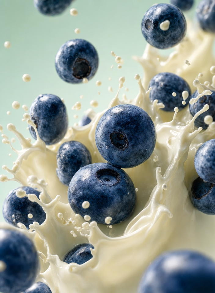
Blueberries Bursting Into Vanilla Cream

Chocolate Filled Cookie Splitting Midair With Dark Drip

Partially Peeled Banana on Blue
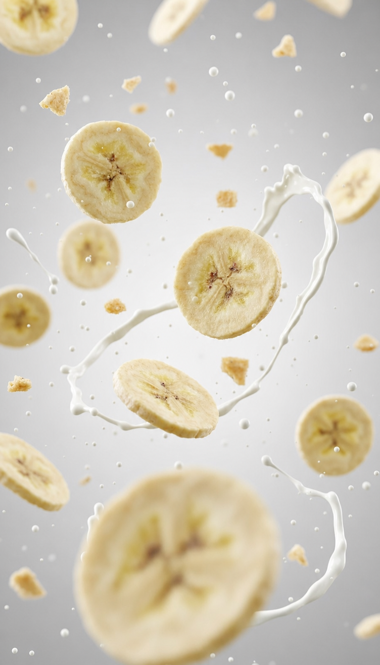
Banana slices in cool milk splash background