Why this works
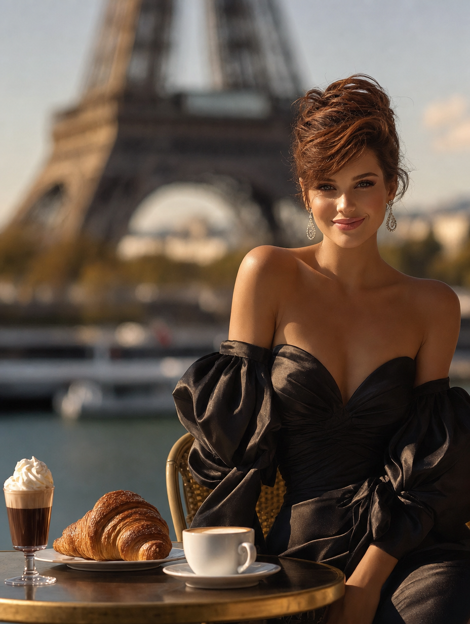
The full-body fashion-editorial framing keeps the woman and the black satin gown dominant, while “the Eiffel Tower softly blurred in the background” supplies Parisian scale without competing with her silhouette. “Soft late-afternoon golden daylight” and the “natural color palette” soften the mostly brown café tones and gray architectural backdrop, producing a restrained romantic mood rather than a highly saturated postcard look. “Shallow depth of field,” “realistic skin texture,” and “ultra-high detail” separate the subject from the setting while preserving tactile details such as satin, croissant pastry, espresso, and ice.
FAQ
→How do I make the Eiffel Tower more prominent while keeping the woman central?
Replace “the Eiffel Tower softly blurred in the background” with “the Eiffel Tower sharply visible behind her, rising prominently through the upper background,” and change “shallow depth of field” to “moderate depth of field.” Keep “portrait-full-body” so the gown remains the primary figure.
→How do I shift this from romantic elegance to a darker, more dramatic editorial mood?
Replace “soft late-afternoon golden daylight” with “moody blue-hour side lighting with controlled shadow,” and replace “natural color palette” with “black, charcoal gray, and muted burgundy tones.” You can retain “black satin off-shoulder gown” and “dramatic puffed sleeves” because those phrases already support the stronger tone.
→How do I create a coordinated series using different Paris café subjects?
Keep the fixed visual structure, including “Photorealistic fashion editorial,” “portrait-full-body,” “soft late-afternoon golden daylight,” and “shallow depth of field,” then swap “a glamorous woman with short auburn hair” and the gown description for each new subject, such as “a silver-haired man in a tailored ivory tuxedo” or “a ballerina in a pale pink tulle dress.” Replace the table items only when they reinforce the variation, for example “a sketchbook and fountain pen” for an artist-focused image.
Learn the technique behind this
- Why can't AI spell, and how do I get readable text in an image? — Older diffusion models had no character-level representation of text, so they produced letterform-shaped texture instead of words.
- How should a prompt be structured, and does word order matter? — A prompt that behaves predictably names one subject first, then what it is doing, then where, then the light, then the lens or medium, then the style.
- Which aspect ratio should I use, and how does it change the image? — Aspect ratio determines what the model composes, not how it's cropped afterwards.
Related prompts
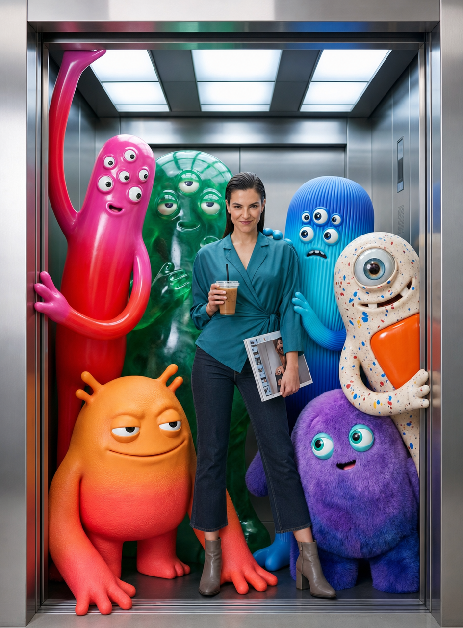
Teal fashion editorial in monster-filled lift
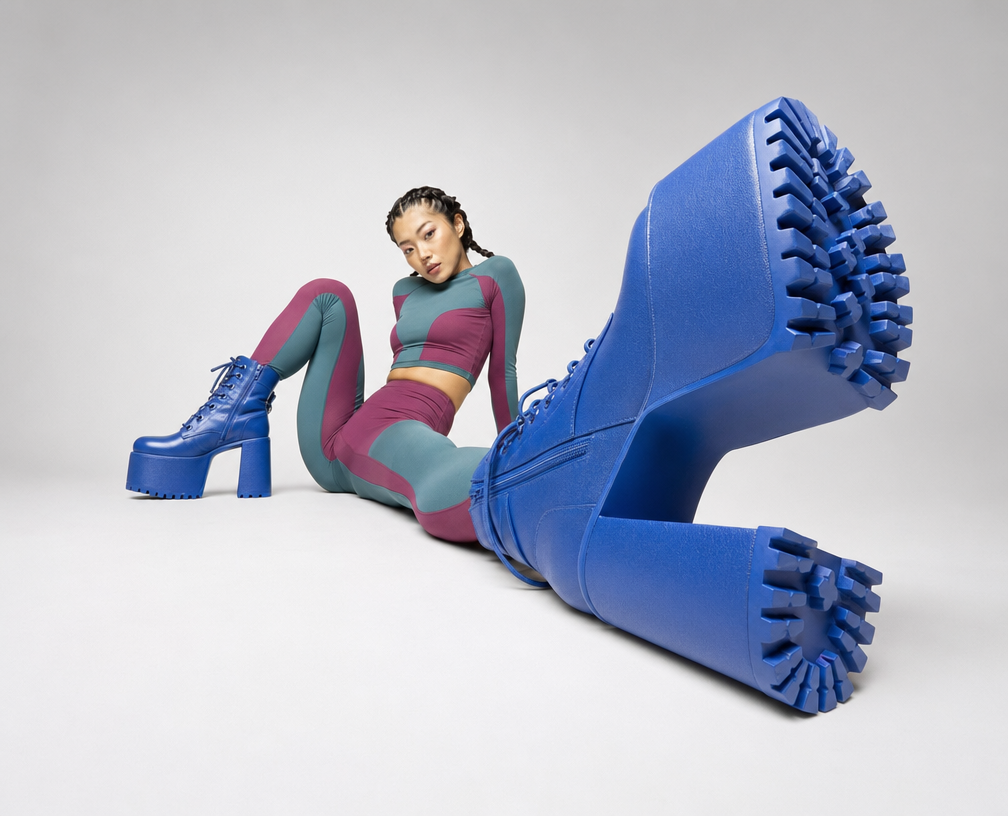
Cobalt Boots in Sleek Studio Edit
Silhouette Influencer by Sunlit Window
Sunlit editorial on striped beach towel