Why this works
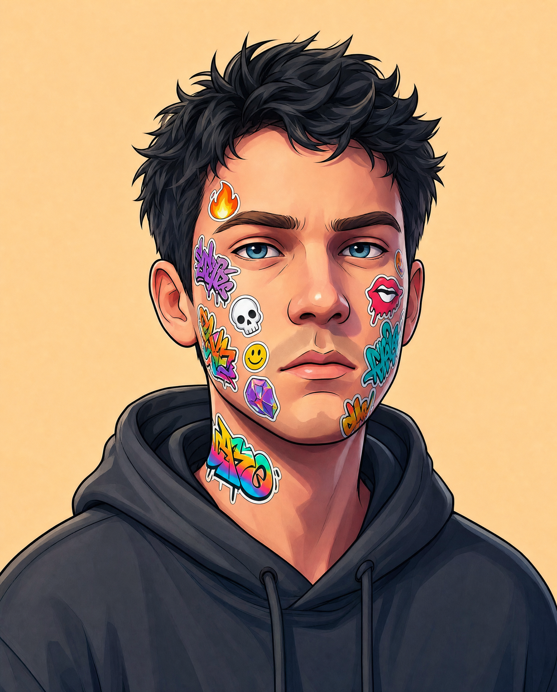
The tight head-and-shoulders framing keeps the decal-covered face and upper neck dominant, while “sticker cluster concentrated more on the cheeks and jawline” gives the closeup a deliberate visual path instead of distributing detail evenly. “Warm light peach background” separates the charcoal-gray hoodie and messy black hair through beige-black contrast, and “bright flat studio lighting with soft shadows” preserves the graphic readability of the bold outlines without making the portrait harsh. The rebellious, playful tone comes from “colorful sticker decals,” “graffiti-style icon motifs,” “vibrant, punchy saturation,” and the “contemporary urban streetwear aesthetic,” while “neutral, calm expression” keeps the image controlled rather than aggressive.
FAQ
→How do I make the portrait feel darker and more rebellious?
Replace “warm light peach background” with “deep concrete-gray or near-black studio background,” change “bright flat studio lighting with soft shadows” to “hard directional side-lighting with deep facial shadows,” and replace “neutral, calm expression” with “defiant narrowed eyes and a slight crooked smirk.” Keep “bold outlines” and “graffiti-style icon motifs” to preserve the street-art character.
→How do I make the stickers more central and visually prominent?
Replace “a slightly cleaner sticker cluster concentrated more on the cheeks and jawline” with “dense layered sticker decals covering the forehead, cheeks, nose, jawline, and upper neck.” Add “largest high-contrast decals centered across the eyes and cheekbones,” and change “tight head-and-shoulders framing” to “extreme face closeup” so the decals occupy more of the composition.
→How do I create a coordinated series of variations from this portrait?
Keep “stylized young male portrait,” “tight head-and-shoulders framing,” “bright flat studio lighting with soft shadows,” “bold outlines,” and “vibrant, punchy saturation” unchanged. For each variation, swap only “warm light peach background” and the decal description, using options such as “pale mint background with botanical stickers,” “lavender background with holographic tech icons,” or “sunny yellow background with hand-drawn smiley motifs,” while retaining “charcoal-gray hoodie” for consistent character identity.
Learn the technique behind this
- Why can't AI spell, and how do I get readable text in an image? — Older diffusion models had no character-level representation of text, so they produced letterform-shaped texture instead of words.
- How do I keep one consistent style across a whole set of images? — Style consistency is more achievable than character consistency because style lives in describable attributes.
- Why does AI get hands and faces wrong, and how do I fix it? — Hands fail because they're small in frame, extremely variable in pose, and self-occluding — the model has less usable signal per pixel than for any other body part.
Related prompts
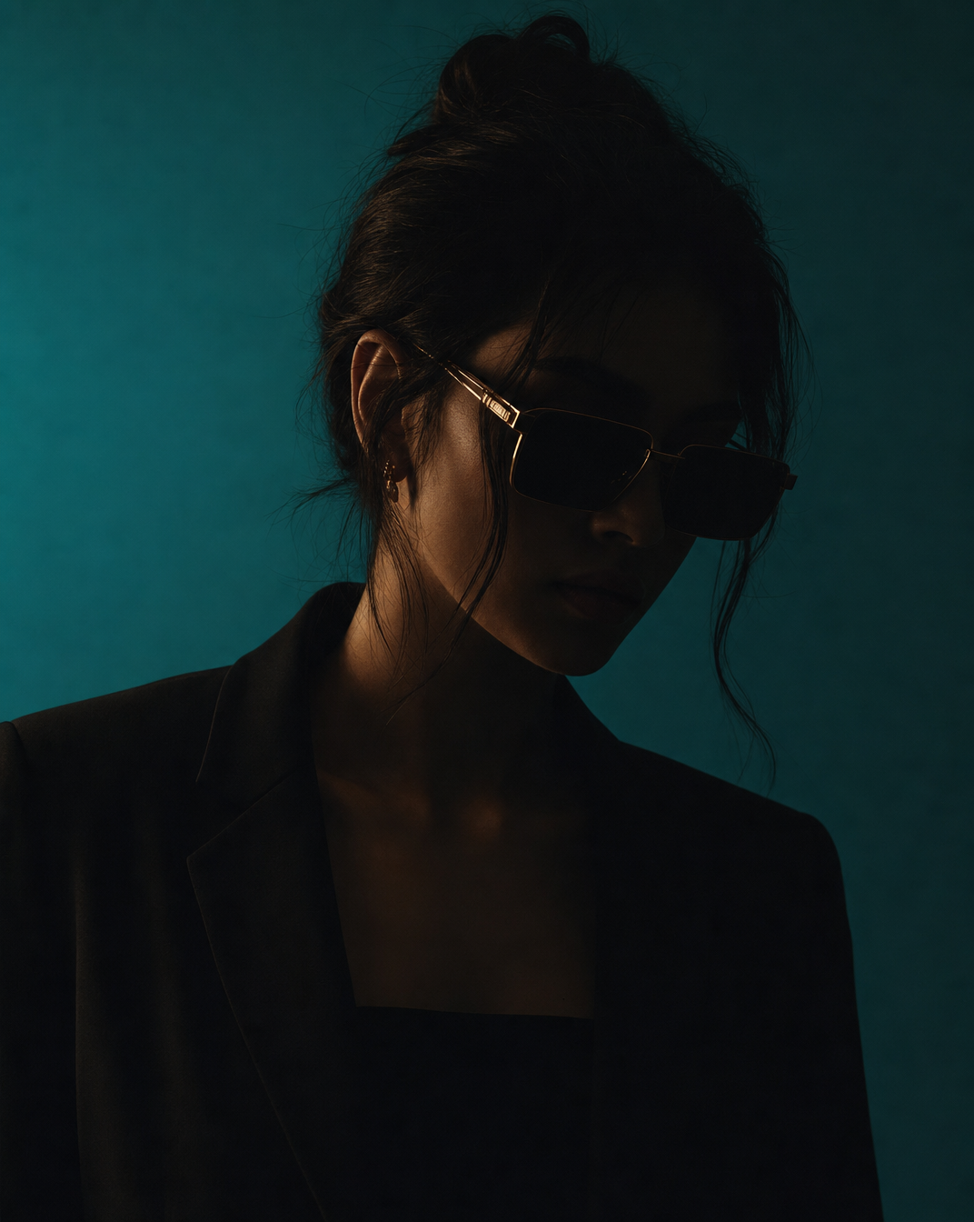
Woman in Teal Light, Shadowed Fashion Portrait
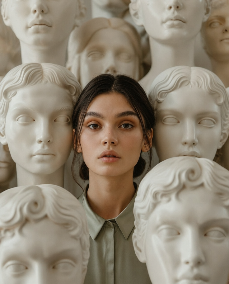
Eerie Elegance Among Marble Busts
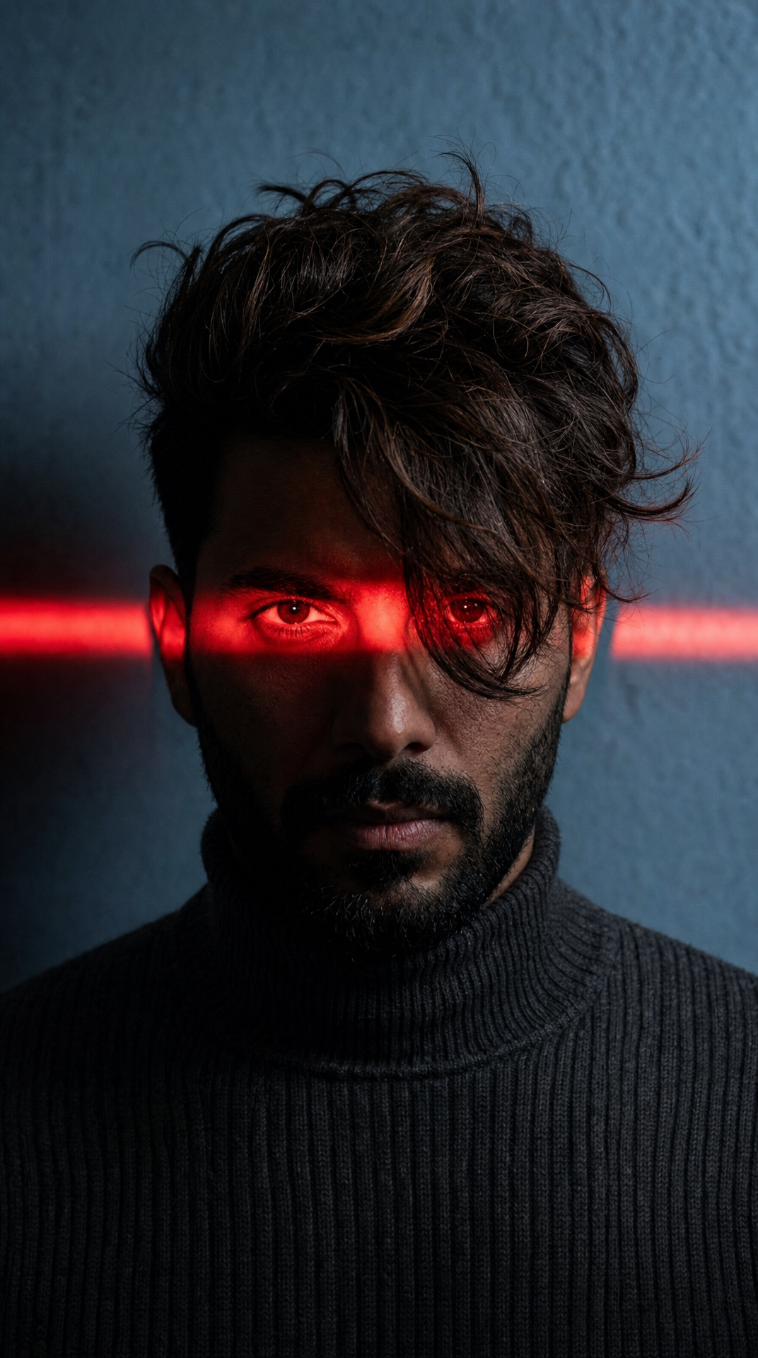
Charcoal turtleneck with red eye-beam

Dreamy Macro Portrait in Cool Water