Why this works
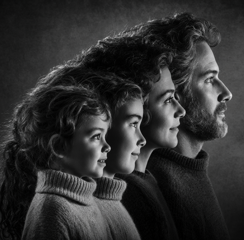
The phrase “same person across life stages, layered from left to right” makes the portrait read as a visual timeline, while the symmetrical arrangement keeps the comparison orderly rather than narrative or chaotic. “Black-and-white” and “cooler, higher-contrast studio lighting” restrict the palette to black and white and give the image its severe, timeless tone; “crisp rim light outlining each profile against a textured, dark background” separates the silhouettes and supplies the dramatic edge definition. “Sharp, realistic facial detail” and “realistic facial texture” keep the conceptual composite grounded in recognizable features, while the salt-and-pepper beard, tousled medium-length hair, and soft knit turtleneck provide specific adult and child-stage distinctions.
FAQ
→How do I make one life stage more prominent than the others?
Replace “layered from left to right” with “the central adult profile enlarged and dominant, with smaller childhood and later-life profiles receding on either side.” Change “symmetrical” to “asymmetrical composition with the adult centered slightly right” if you want a less evenly weighted arrangement, and add “shallow depth of field isolating the adult profile.”
→How do I make the portrait feel warmer and less severe?
Replace “cooler, higher-contrast studio lighting” with “soft warm studio lighting with gentle tonal transitions,” and change “crisp rim light” to “subtle amber edge light.” Replace “black-and-white” with “muted sepia monochrome” while keeping “realistic facial texture” to preserve the documentary quality without the stark black-and-white contrast.
→How do I turn this into a series of different identity-through-time variations?
Keep “same person across life stages” and “layered from left to right,” then substitute the appearance details for each version, such as “short curly hair and round glasses,” “long braided hair and a linen shirt,” or “shaved head and a high-collared coat.” Keep “textured dark studio backdrop” and “crisp rim light outlining each profile” unchanged so the series retains the same visual structure while the subject styling varies.
Learn the technique behind this
- Why can't AI spell, and how do I get readable text in an image? — Older diffusion models had no character-level representation of text, so they produced letterform-shaped texture instead of words.
- Why does the model ignore parts of my prompt? — Ignored instructions are almost always conflicts, counts, or spatial relationships — three things current models handle badly — rather than the model failing to read you.
- How do I keep the same character across multiple images? — Text prompts alone won't hold a face across images — a description defines a type, not a person.
Related prompts
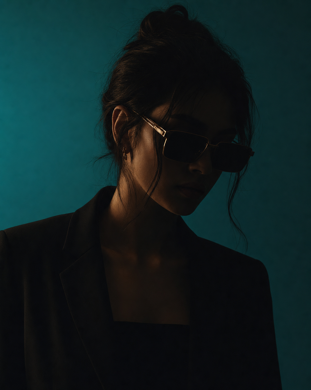
Woman in Teal Light, Shadowed Fashion Portrait
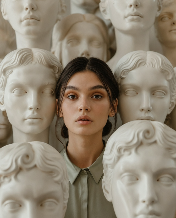
Eerie Elegance Among Marble Busts
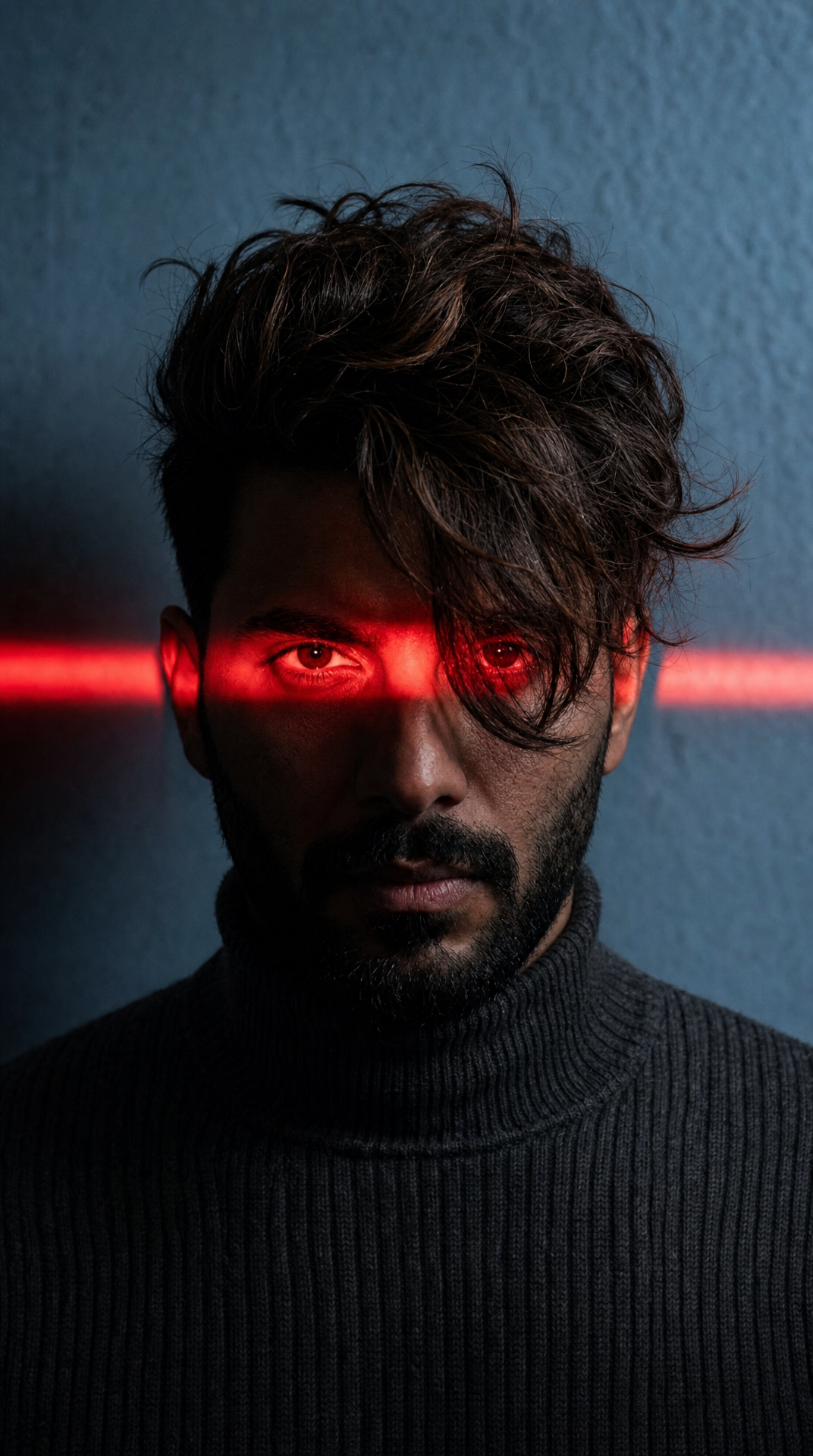
Charcoal turtleneck with red eye-beam
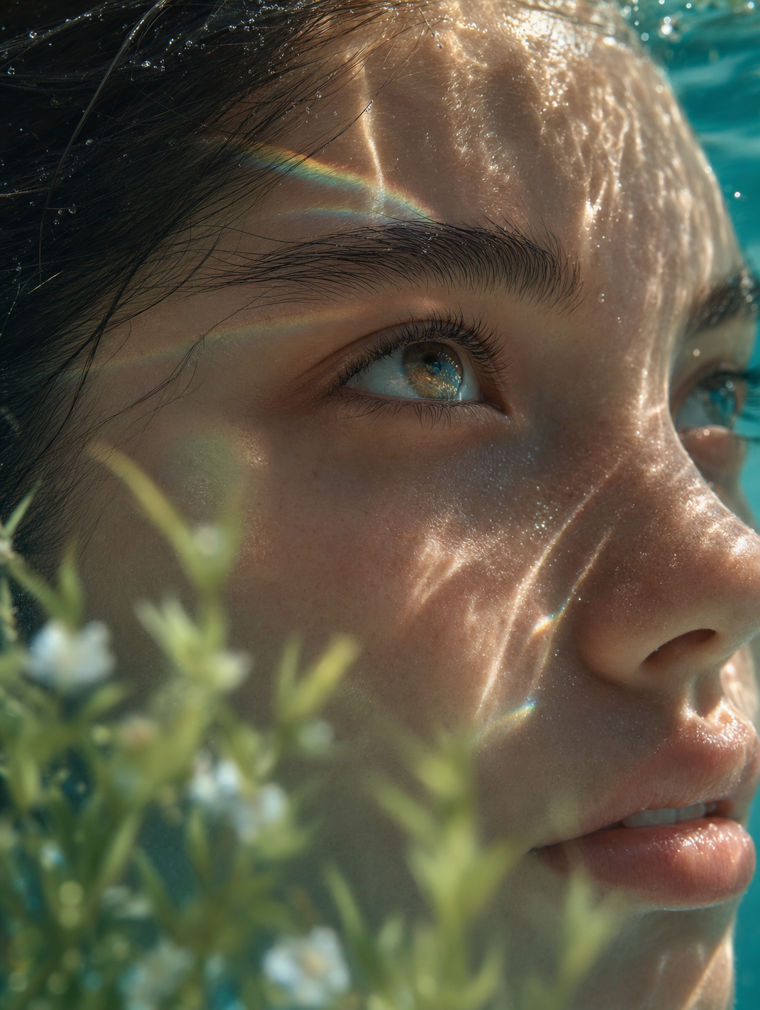
Dreamy Macro Portrait in Cool Water