Why this works
The phrase “centered, slightly elevated product-shot perspective” makes the landmark cluster read as a deliberate, symmetrical travel-poster composition, while “emerging from a torn antique map sheet” supplies the main visual transition from flat paper to miniature depth. “Soft diffused studio lighting” and “shallow shadows around the map tear” keep the white backdrop clean and make the paper fibers, crisp diorama materials, and scale cues legible without harsh contrast. The blue-gray modern towers against brown antique paper establish a restrained color harmony, while “elegant, nostalgic, aspirational, sophisticated mood” directs the image toward premium heritage travel rather than a playful model scene.
FAQ
→How do I make Tower Bridge the dominant focal point?
Change “featuring Tower Bridge, St. Paul’s Cathedral, the London Eye, and Big Ben” to “Tower Bridge as the large central foreground landmark, with St. Paul’s Cathedral, the London Eye, and Big Ben reduced in scale behind it.” Keep “centered” but replace “accurate scale” with “intentional focal-size hierarchy,” so the bridge can be larger than its real-world relationship to the other landmarks.
→How do I make the image feel darker and more cinematic instead of clean and sophisticated?
Replace “clean white studio backdrop” with “deep charcoal studio backdrop,” and change “soft diffused lighting with subtle shadows” to “directional late-evening side lighting with long shadows and restrained warm highlights.” Replace “shallow shadows around the map tear” with “pronounced shadows inside the torn paper edge,” while keeping “realistic paper fiber texture” to preserve the tactile diorama surface.
→How do I build a series of city variations from this prompt?
Keep the structural phrases “photorealistic miniature cityscape diorama,” “emerging from a torn antique map sheet,” and “centered, slightly elevated product-shot perspective,” then replace the London-specific subject list with a matched landmark set such as “the Eiffel Tower, Arc de Triomphe, Notre-Dame, and modern Paris towers.” Swap “blue, gray, brown” only when needed for the city’s identity, such as “ochre, cream, and slate” for Paris or “terracotta, turquoise, and warm gray” for Lisbon.
Learn the technique behind this
- Why can't AI spell, and how do I get readable text in an image? — Older diffusion models had no character-level representation of text, so they produced letterform-shaped texture instead of words.
- How should a prompt be structured, and does word order matter? — A prompt that behaves predictably names one subject first, then what it is doing, then where, then the light, then the lens or medium, then the style.
- Do negative prompts work, and what should go in one? — Negative prompts work on models that support a separate negative conditioning channel — mainly Stable Diffusion and FLUX-family models.
Related prompts
Tiny wanderer in pastel sunrise meadow
Quiet desk on a cliff terrace
Luxury yacht near chalk cliffs at dusk
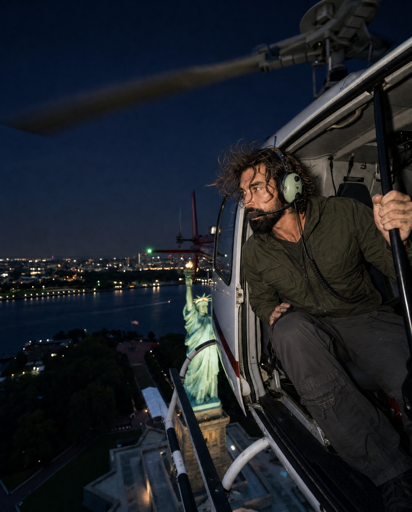
Night Helicopter Escape Over New York