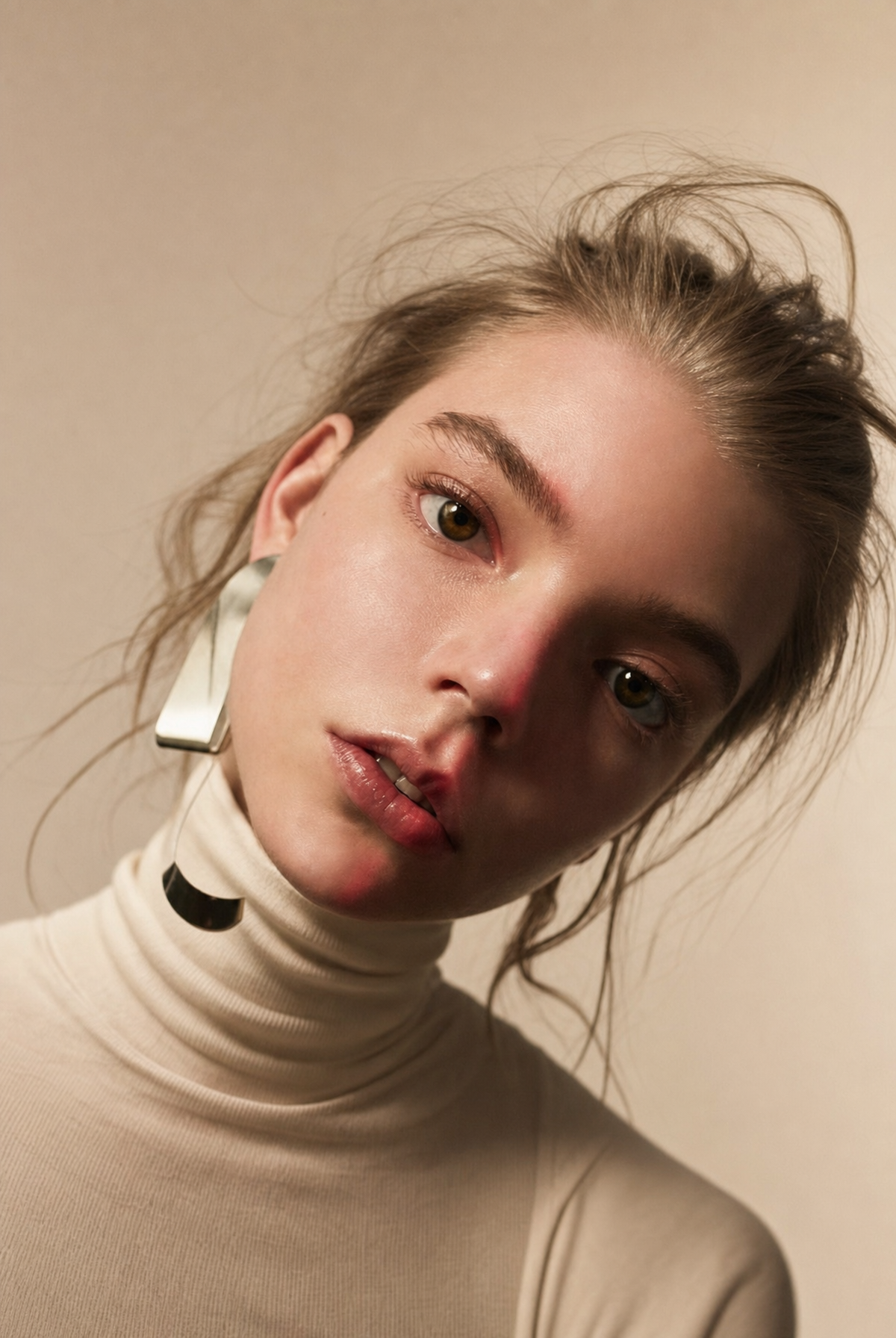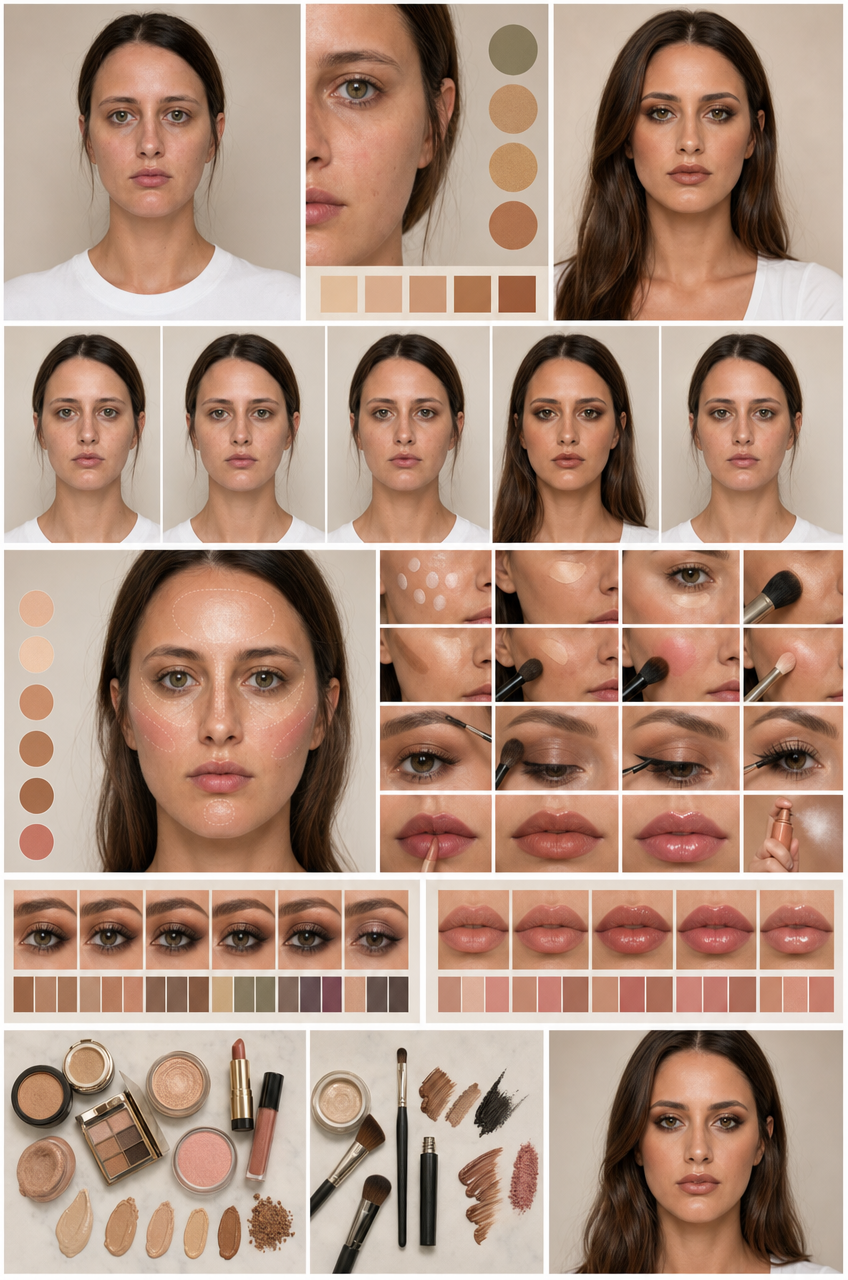
Why this works
The “straight-on editorial infographic framing” and “clean structured grid layout” make the centered portrait and comparison panels read as an organized consultation board rather than a conventional beauty close-up. “Soft diffused studio lighting,” “warm neutral color grading,” and the warm greige/cream background produce the restrained brown, tan, white, and gray palette while preserving “ultra-detailed skin texture” and “controlled makeup highlights.” “Crisp panel borders,” “elegant color swatches,” and the “luxury cosmetics magazine aesthetic” supply the polished, informative mood without letting decorative graphics overpower the portrait.
FAQ
→How do I make the eye-makeup comparison the main focal point?
Replace “centered” and “female portrait” with “eye-makeup comparison as the dominant central feature, enlarged cropped eye portraits,” and change “skin undertone guide, eye makeup options, and lip finish comparison portraits” to “multiple large eye-makeup variations with smaller undertone and lip panels.” Keep “straight-on editorial infographic framing” to retain the board-like structure.
→How do I shift this from warm luxury editorial to a cooler clinical consultation style?
Replace “modern warm greige and cream background” with “cool white and pale blue-gray background,” and replace “warm neutral color grading” with “neutral cool color grading with restrained clinical contrast.” Change “luxury fashion magazine aesthetic” to “minimal dermatology consultation aesthetic,” while keeping “soft diffused studio lighting” and “ultra-detailed skin texture” for clear, natural portraits.
→How do I create a coordinated series of boards for different makeup styles?
Keep the fixed structure, including “clean structured grid layout,” “crisp panel borders,” and “straight-on editorial infographic framing,” then replace “polished cosmetics editorial look” with a named variation such as “soft rose monochrome makeup editorial” or “graphic berry evening makeup editorial.” Swap “warm neutral color grading” and the swatch areas for matching phrases such as “dusty rose swatches” or “deep berry and plum swatches,” while changing the panel label concept to “day look, transition look, and evening look” with no readable text.
Learn the technique behind this
- Why can't AI spell, and how do I get readable text in an image? — Older diffusion models had no character-level representation of text, so they produced letterform-shaped texture instead of words.
- How do I keep one consistent style across a whole set of images? — Style consistency is more achievable than character consistency because style lives in describable attributes.
- How should a prompt be structured, and does word order matter? — A prompt that behaves predictably names one subject first, then what it is doing, then where, then the light, then the lens or medium, then the style.
Related prompts
Woman in Teal Light, Shadowed Fashion Portrait
Eerie Elegance Among Marble Busts
Charcoal turtleneck with red eye-beam
Dreamy Macro Portrait in Cool Water