Why this works
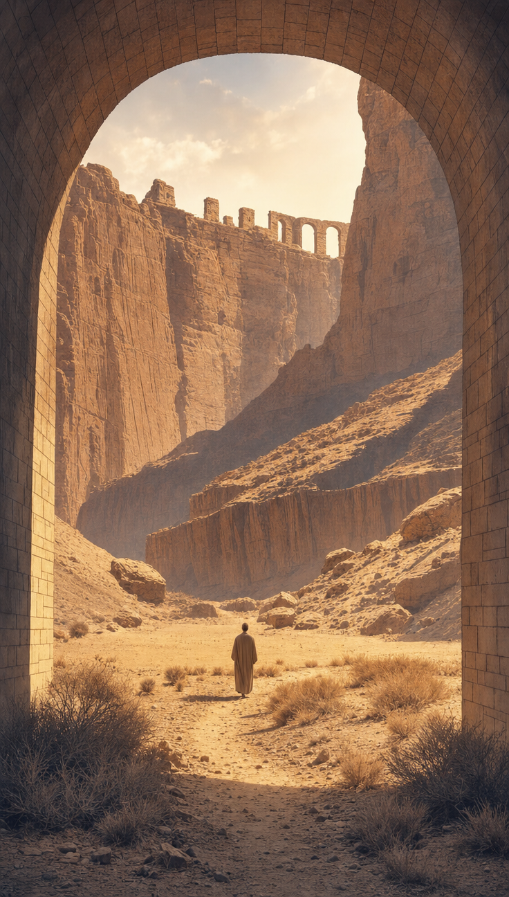
The scale contrast comes straight from 'a massive arched stone passage' framing 'a solitary traveler' - that size mismatch is what makes the figure feel small against the world, not the desert itself. 'Golden afternoon sunlight' against 'deep violet shadows' is the actual color-harmony instruction driving the brown/beige dominant palette with violet accents, and it's doing more work than 'warm ochre and terracotta tones' alone. The 'interior perspective looking outward' is the load-bearing camera phrase - it's what turns this into a framed, tunnel-vision composition instead of a wide establishing shot, funneling the eye toward 'a crumbling ancient aqueduct' in the distance. 'Soft watercolor illustration style' softens all those hard rock edges into the atmospheric, painterly haze that reads as 'cinematic scale and atmospheric depth' rather than a sharp photo.
FAQ
→How do I make the traveler feel more central or heroic instead of small and solitary?
Drop or shrink 'massive arched stone passage' language so the archway doesn't dwarf the figure, and change 'a solitary traveler in a weathered tan tunic walks along a rocky path' to something like 'a traveler stands boldly at the threshold, tunic catching the light' - also swap 'viewed from inside looking toward' for a closer three-quarter shot description so the framing pulls in tighter on the figure.
→How do I shift the mood from serene to more ominous or foreboding?
Replace 'golden afternoon light' with 'blood-red dusk light' or 'sickly green twilight,' and change 'deep violet shadows' to 'pitch-black shadows' or 'creeping shadows.' Swap 'crumbling ancient aqueduct' and 'dry scrubland and twisted vegetation' for language like 'skeletal dead trees' and 'jagged broken ruins' to push the setting toward menace rather than quiet awe.
→How do I build a series of variations using this same prompt structure?
Keep the camera phrase 'interior perspective looking outward from within a large arched stone passage' and the 'soft watercolor illustration style' constant across versions, then just swap the setting noun phrase - try 'toward a frozen tundra' or 'toward a dense jungle canopy' in place of 'toward an expansive desert plateau,' and change 'rust-colored rock formations' to match, like 'ice-blue glacial formations' or 'deep green moss-covered cliffs.' That keeps the composition and mood consistent while the environment changes.
Learn the technique behind this
- Why can't AI spell, and how do I get readable text in an image? — Older diffusion models had no character-level representation of text, so they produced letterform-shaped texture instead of words.
- Which aspect ratio should I use, and how does it change the image? — Aspect ratio determines what the model composes, not how it's cropped afterwards.
- How do I keep one consistent style across a whole set of images? — Style consistency is more achievable than character consistency because style lives in describable attributes.
Related prompts
Young girl with dog in tornado
Headless sitter atop a giant head
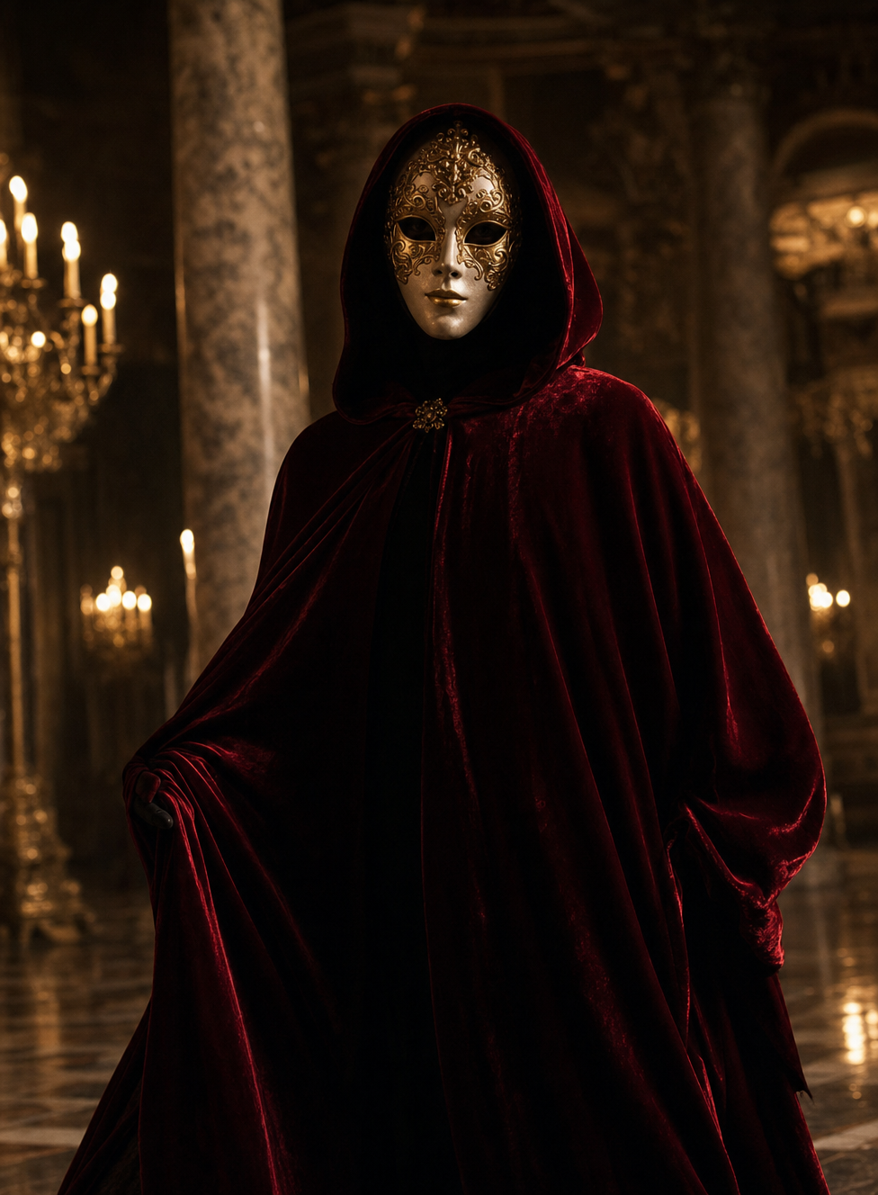
Crimson-Cloaked Specter in Candlelit Ballroom

Violet Holographic Hands Almost Touching