Why this works
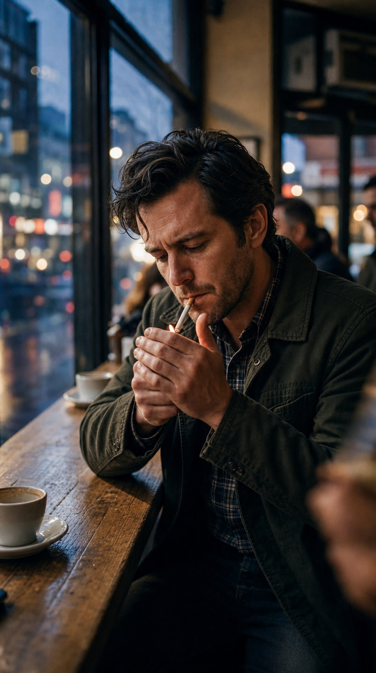
“Photorealistic cinematic editorial close-up” and the “portrait-closeup” composition keep attention on the man, while “50mm look (f/2.8)” isolates his face, jacket, and match against a softened cafe background. The cooler mood comes specifically from “cooler evening light coming through the large windows” and the dominant black, gray, and blue palette, while “candid intimate atmosphere” and “natural skin texture” preserve the contemplative human quality. “Subtle motion blur around the hand and match area” directs visual energy toward the cigarette-lighting gesture, and “gentle reflections across the wood tabletop and window glass” adds depth without competing with the subject.
FAQ
→How do I change this prompt for a warmer, more nostalgic cafe mood?
Replace “cooler evening light coming through the large windows” with “late-afternoon golden window light with warm amber highlights,” and replace “a softer, more neutral color palette” and “warm-to-neutral filmic color grading” with “rich warm browns, muted orange highlights, and nostalgic tungsten film grading.” Keep “natural skin texture” if you want the warmth to remain realistic rather than stylized.
→How do I make the match and cigarette-lighting gesture more prominent?
Replace “editorial close-up” with “tight hand-and-face close-up,” change “subtle motion blur around the hand and match area” to “crisp focus on the hand, match flame, and cigarette tip,” and add “match flame as the brightest point in the frame.” Change “f/2.8 shallow depth of field” to “f/4 moderate depth of field” so the hand and face remain readable together.
→How do I build a variation series while keeping this image’s visual identity?
Keep “photorealistic cinematic editorial,” “50mm look,” “f/2.8,” “natural skin texture,” and “filmic color grading” unchanged, then swap only the setting and action: use “rain-streaked Brooklyn diner window, man stirring coffee,” “dim record shop, man browsing vinyl,” or “quiet apartment kitchen, man lighting a candle.” Preserve “cool evening window light” and “black, gray, and blue” for a consistent series palette.
Learn the technique behind this
- Why can't AI spell, and how do I get readable text in an image? — Older diffusion models had no character-level representation of text, so they produced letterform-shaped texture instead of words.
- How should a prompt be structured, and does word order matter? — A prompt that behaves predictably names one subject first, then what it is doing, then where, then the light, then the lens or medium, then the style.
- How do I keep one consistent style across a whole set of images? — Style consistency is more achievable than character consistency because style lives in describable attributes.
Related prompts
Woman in Teal Light, Shadowed Fashion Portrait
Eerie Elegance Among Marble Busts
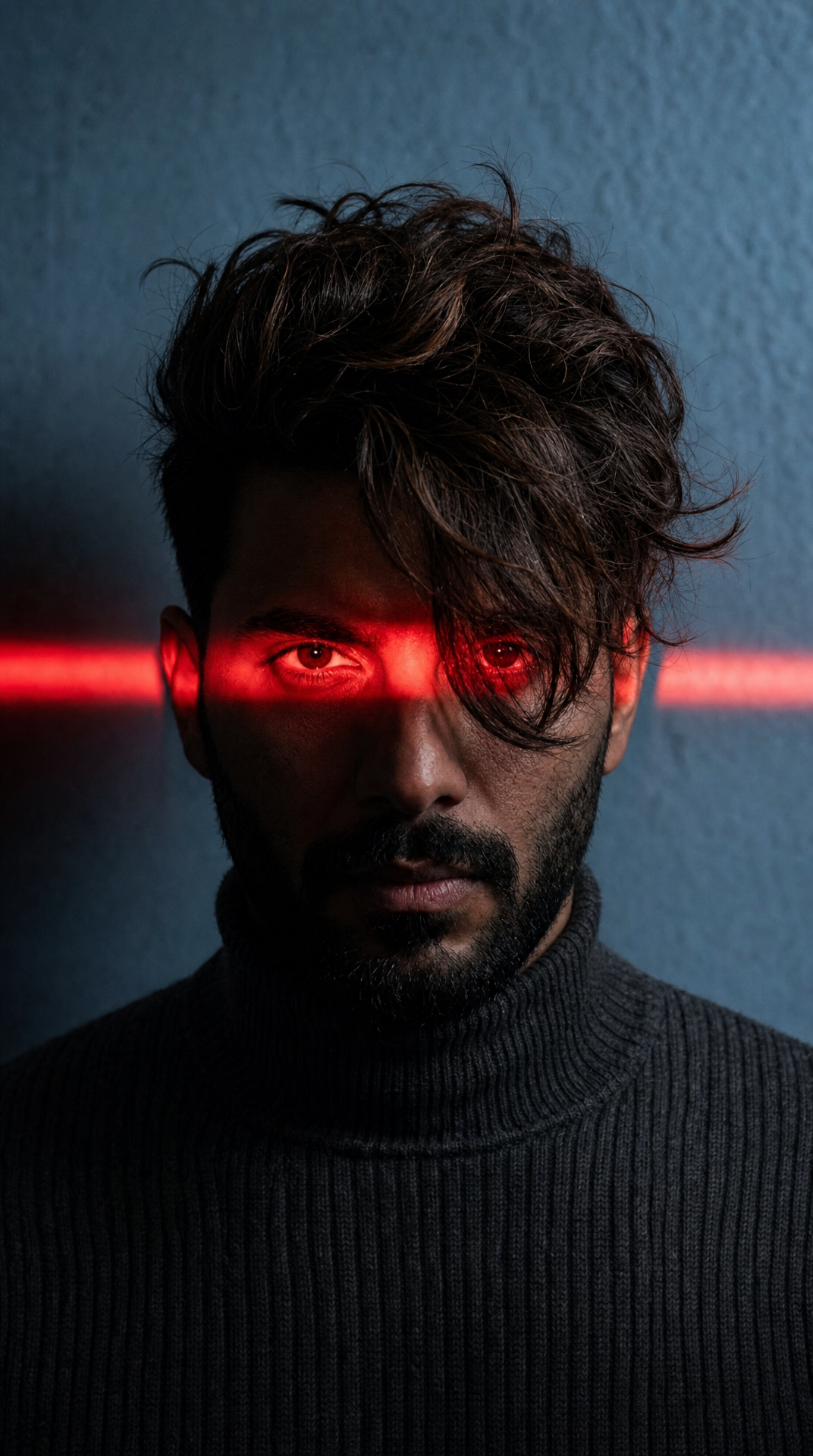
Charcoal turtleneck with red eye-beam
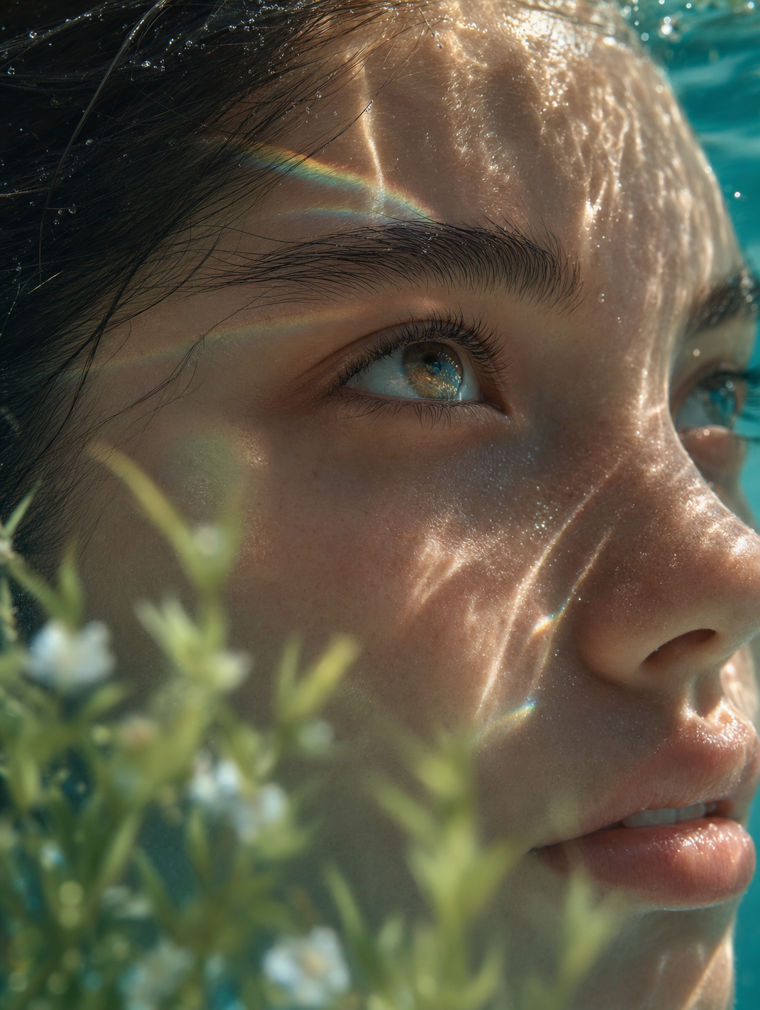
Dreamy Macro Portrait in Cool Water