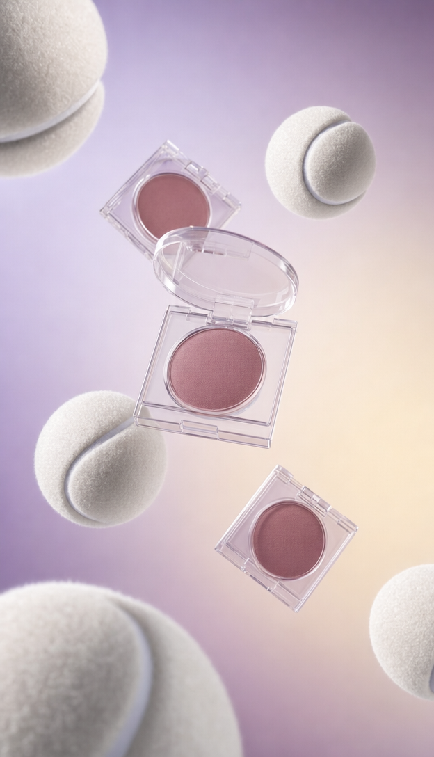
Why this works
The centered product-focused framing makes the open dusty rose compact the natural anchor, while the floating white tennis balls add a playful sports cue without disrupting the minimal composition. “Smooth lavender-to-cream gradient studio background” supplies the soft beige-pink color harmony, and “glossy clear acrylic-style packaging with subtle internal reflections” plus “soft specular highlights” gives the transparent compacts a polished commercial finish. “One compact opened to reveal a dusty rose powder pan” creates the clearest focal detail because it contrasts the white balls and closed packaging with a visible interior surface.
FAQ
→How do I make the open blush compact more prominent than the tennis balls?
Replace “floating white tennis balls and transparent mauve blush compacts” with “a large foreground transparent mauve blush compact, one compact opened wide to reveal a dusty rose powder pan, with two small white tennis balls receding into the background.” Keep “centered minimal composition with product-focused framing” so the scale change strengthens the compact’s priority.
→How do I change the polished playful mood into a darker, luxury editorial tone?
Replace “playful sports-meets-cosmetics concept” and “smooth lavender-to-cream gradient studio background” with “quiet luxury cosmetics editorial” and “deep plum-to-charcoal gradient studio background.” Change “clean high-end studio lighting with soft specular highlights” to “controlled low-key lighting with narrow highlights and gentle shadows” for a more dramatic finish.
→How do I turn this prompt into a series of coordinated color variations?
Keep “photorealistic CGI beauty product advertisement,” “centered minimal composition,” and “glossy clear acrylic-style packaging” unchanged, then replace “mauve blush compacts” and “dusty rose powder pan” with a repeatable color slot such as “transparent [color] blush compacts” and “a [matching color] powder pan.” Swap “lavender-to-cream gradient” for coordinated pairs such as “peach-to-ivory,” “mint-to-cream,” or “sky blue-to-white,” while retaining the white tennis balls as a consistent visual motif.
Learn the technique behind this
- Why can't AI spell, and how do I get readable text in an image? — Older diffusion models had no character-level representation of text, so they produced letterform-shaped texture instead of words.
- How do I keep one consistent style across a whole set of images? — Style consistency is more achievable than character consistency because style lives in describable attributes.
- How should a prompt be structured, and does word order matter? — A prompt that behaves predictably names one subject first, then what it is doing, then where, then the light, then the lens or medium, then the style.
Related prompts

Playful brunette beauty ad portrait

Red Lip Balm with Lychee Freshness

Premium wellness pouch with golden spices

Teal-Accented Bunny Toy Studio Portrait
