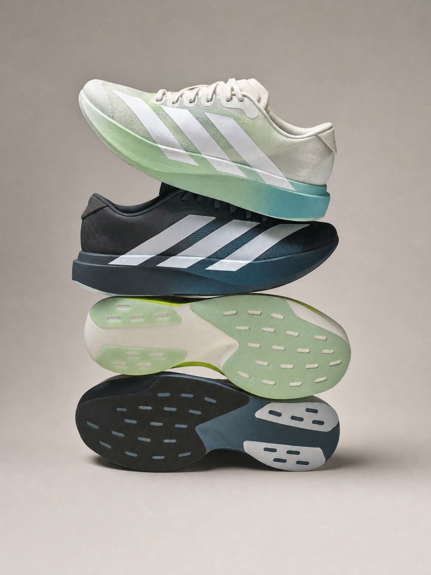
Why this works
The phrase “two stacked Adidas running shoes arranged in a balanced vertical composition” establishes the centered, orderly framing, while “slight top-down angle for clear sole detail” makes the outsoles a readable secondary focal point. “Light mint-to-aqua gradient” and “charcoal-grey to teal fade” supply the green, teal, black, and white color structure, with the “warm light-gray studio background” separating the shoes without competing with them. “Soft diffused lighting,” combined with “crisp sharp edges” and “clean, polished, sporty aesthetic,” produces a controlled commercial look rather than a dramatic or lifestyle mood.
FAQ
→How do I make the upper mint-to-aqua shoe more prominent?
Replace “two stacked Adidas running shoes arranged in a balanced vertical composition” with “the light mint-to-aqua Adidas running shoe centered as the dominant foreground subject, with the charcoal-grey to teal shoe smaller and receding behind it.” Keep “slight top-down angle for clear sole detail” if the outsole must remain visible, or change it to “three-quarter front angle” to prioritize the upper and color gradient.
→How do I change the clean commercial mood into a darker, more performance-focused image?
Replace “warm light-gray clean studio background” with “deep graphite studio background” and “soft diffused lighting” with “directional cool rim lighting with controlled shadows.” Retain “crisp sharp edges,” but change “clean, polished, sporty aesthetic” to “technical performance campaign aesthetic with high contrast and dramatic separation.”
→How do I create a matching series with different colorways?
Keep “balanced vertical composition,” “slight top-down angle for clear sole detail,” and “warm light-gray studio background” unchanged for consistency, then replace the two gradient descriptions with pairs such as “white-to-cobalt blue gradient pair” and “black-to-electric orange fade pair.” For repeatable variations, also replace the fixed color phrases with “two stacked Adidas running shoes in a new coordinated two-color gradient colorway.”
Learn the technique behind this
- Why can't AI spell, and how do I get readable text in an image? — Older diffusion models had no character-level representation of text, so they produced letterform-shaped texture instead of words.
- Which aspect ratio should I use, and how does it change the image? — Aspect ratio determines what the model composes, not how it's cropped afterwards.
- How should a prompt be structured, and does word order matter? — A prompt that behaves predictably names one subject first, then what it is doing, then where, then the light, then the lens or medium, then the style.
Related prompts

Playful brunette beauty ad portrait

Red Lip Balm with Lychee Freshness

Premium wellness pouch with golden spices

Teal-Accented Bunny Toy Studio Portrait
