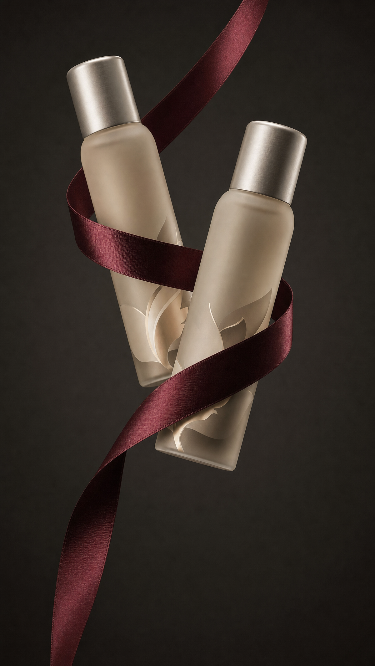
Why this works
The centered, balanced diagonal composition comes directly from “one bottle slightly forward and the other slightly behind,” giving the pair depth without disrupting the clean minimal scene. “Deep burgundy satin ribbon” supplies the crimson focal accent against the “rich charcoal background with subtle warm undertones,” while “frosted beige bottles” and “brushed silver caps” create a restrained beige-gray palette. The polished luxury mood is anchored by “premium studio product photograph,” “soft studio lighting,” and “realistic reflections and tactile materials,” with “shallow depth of field” separating the forward bottle from the rear one while “crisp edges” preserve legibility.
FAQ
→How do I make the burgundy ribbon more central and visually dominant?
Replace “elegantly wrapped by a flowing deep burgundy satin ribbon” with “a wide deep burgundy satin ribbon as the dominant foreground element, sweeping across the bottle fronts in a bold S-curve,” and change “balanced diagonal composition” to “ribbon-led diagonal composition.” Keep the charcoal background so the crimson remains the strongest contrast.
→How do I shift this from warm luxury to a cooler, more clinical cosmetics mood?
Replace “subtle warm undertones” with “cool blue-gray undertones,” change “soft studio lighting” to “bright diffused white studio lighting,” and replace “deep burgundy satin ribbon” with “cool slate-blue satin ribbon.” Retain “frosted beige” only if you want a slight neutral warmth; for a fully clinical result, change it to “frosted ivory-white.”
→How do I create a series of variations while keeping the same product campaign look?
Keep “premium studio product photograph,” “high-end cosmetics branding aesthetic,” “realistic reflections and tactile materials,” and “clean minimal scene” unchanged. Make controlled swaps to the subject and accent: replace “deep burgundy satin ribbon” with “forest-green velvet cord,” “burnt-orange silk scarf,” or “black satin ribbon,” then match the background phrase with “deep charcoal with cool green undertones,” “warm graphite with amber undertones,” or “matte black with neutral undertones.”
Learn the technique behind this
- Why can't AI spell, and how do I get readable text in an image? — Older diffusion models had no character-level representation of text, so they produced letterform-shaped texture instead of words.
- How do I keep one consistent style across a whole set of images? — Style consistency is more achievable than character consistency because style lives in describable attributes.
- How should a prompt be structured, and does word order matter? — A prompt that behaves predictably names one subject first, then what it is doing, then where, then the light, then the lens or medium, then the style.
Related prompts

Playful brunette beauty ad portrait

Red Lip Balm with Lychee Freshness

Premium wellness pouch with golden spices

Teal-Accented Bunny Toy Studio Portrait
