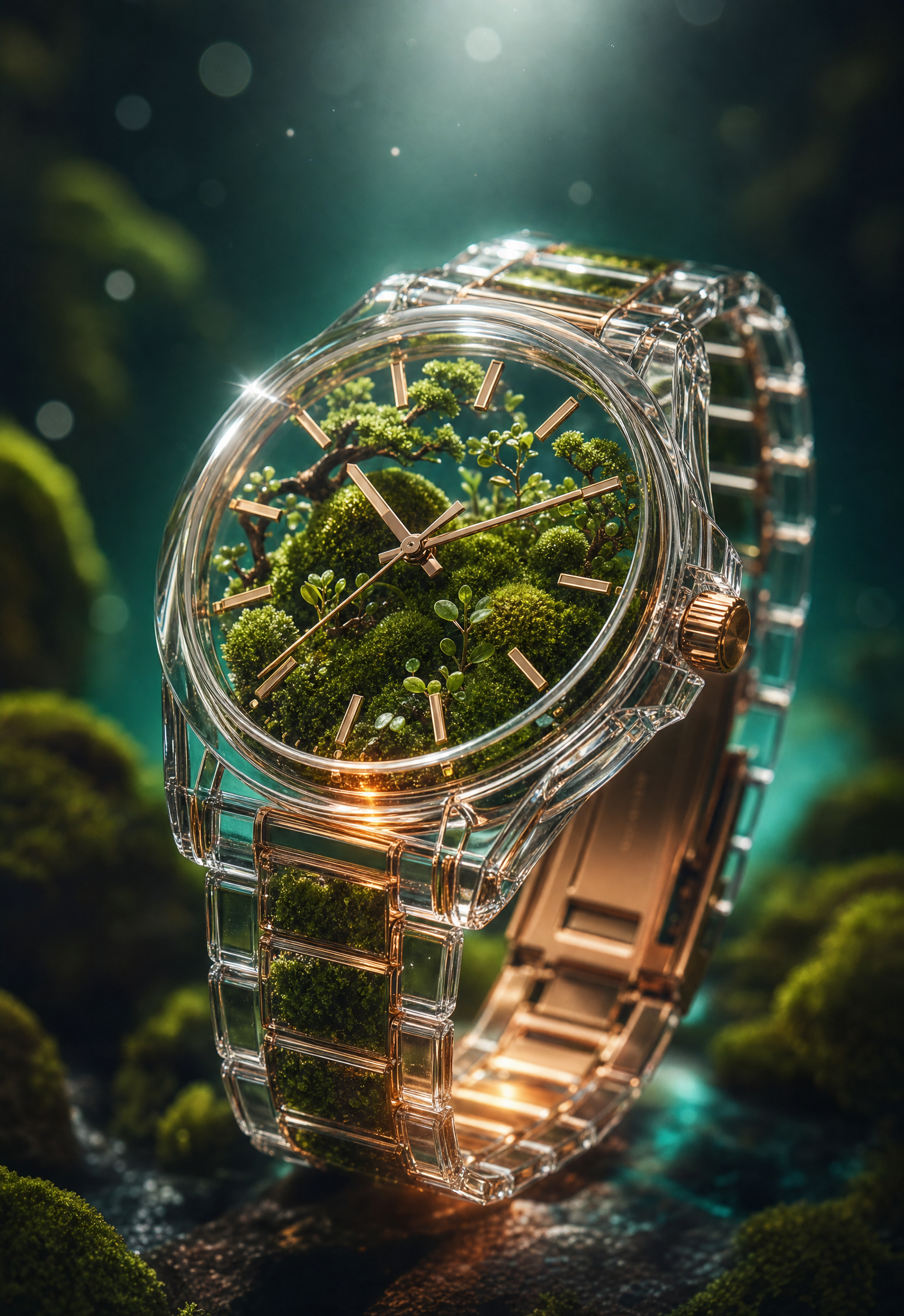
Why this works
The centered framing and “sharp focus on the watch center” make the transparent watch the immediate focal point, while “shallow depth of field” and “soft bokeh” push the dark studio background into a supporting role. “Deep emerald moss,” “teal-green ambient glow,” and polished “rose-gold metal details” create the teal, green, gold, black, and gray harmony visible in the image. The futuristic premium mood comes from the collision of “crystal glass case,” “reflective surfaces,” “cinematic low-key lighting,” and “sparkling specular highlights,” while “tiny seedling stems and fine micro-leaves” provide the scale contrast that makes the interior feel miniature and intricate.
FAQ
→How do I make the moss garden more prominent than the watch mechanics?
Replace “the watch face clearly shows metallic hour and minute hands and crisp markers” with “the moss garden dominates the dial, with only partially visible hour markers beneath the foliage,” and change “sharp focus on the watch center” to “sharp focus on the miniature plants and moss canopy inside the case.” Keep “transparent luxury wristwatch” so the object remains recognizable.
→How do I change the dreamy premium mood into a darker, more mysterious image?
Replace “teal-green ambient glow” with “deep blue-green rim light with faint pools of shadow,” and replace “sparkling specular highlights” with “restrained, narrow reflections on the crystal.” Add “heavy black negative space and subtle atmospheric haze” after “dark background” to reduce the polished showroom feeling without losing the transparent case.
→How do I build a series of related variations from this prompt?
Keep the fixed phrases “ultra-detailed hyperrealistic commercial product photo,” “centered,” and “razor-sharp focus,” then swap “deep emerald moss and miniature bonsai-like plants” for themed interiors such as “tiny desert succulents with pale sand,” “bioluminescent blue mushrooms,” or “delicate coral branches.” Match each variation by replacing “teal-green ambient glow” with a coordinated color phrase such as “warm amber glow,” “violet-blue glow,” or “cool cyan glow.”
Learn the technique behind this
- Why can't AI spell, and how do I get readable text in an image? — Older diffusion models had no character-level representation of text, so they produced letterform-shaped texture instead of words.
- How should a prompt be structured, and does word order matter? — A prompt that behaves predictably names one subject first, then what it is doing, then where, then the light, then the lens or medium, then the style.
- Why does AI get hands and faces wrong, and how do I fix it? — Hands fail because they're small in frame, extremely variable in pose, and self-occluding — the model has less usable signal per pixel than for any other body part.
Related prompts

Playful brunette beauty ad portrait

Red Lip Balm with Lychee Freshness

Premium wellness pouch with golden spices

Teal-Accented Bunny Toy Studio Portrait
