Why this works
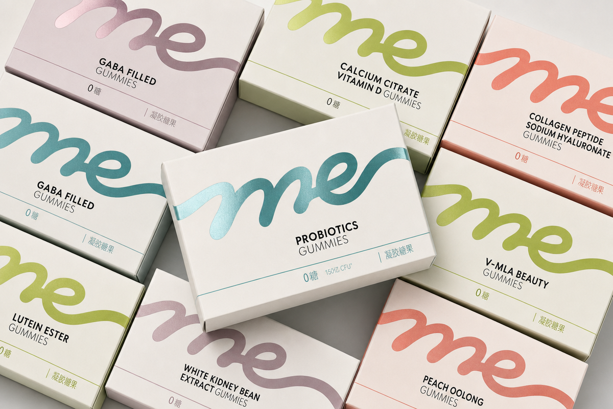
“Top-down overhead product photography, straight-on angle” locks the composition into a readable overhead flat lay, while “tightly overlapped boxes arranged diagonally” gives the stack controlled direction and prevents the packaging from feeling scattered. The palette phrase “teal, soft mauve, lime, coral, and warm white” supplies restrained pastel contrast against the “neutral light-gray studio surface,” reflected in the image’s beige-gray base with teal and olive accents. “Clean studio lighting with crisp highlights” and “subtle realistic reflections on the plastic window areas” create the polished commercial mood, while “sharp die-cut edges” and “ultra-detailed texture and labeling cues” keep the boxes legible and tactile.
FAQ
→How do I make one supplement box more central and prominent?
Replace “stacked pastel supplement packaging boxes” with “one large foreground supplement box centered in frame, with smaller boxes partially overlapping behind it,” and change “tightly overlapped boxes arranged diagonally” to “a shallow diagonal arrangement radiating from the hero box.” Add “hero product in sharpest focus” if you want a clearer hierarchy.
→How do I shift this from a bright polished retail image to a softer, warmer mood?
Replace “clean bright polished mood” and “clean studio lighting with crisp highlights” with “soft warm daylight, gentle diffused shadows, and a calm wellness mood.” Change “neutral light-gray studio surface” to “warm ivory stone surface” and reduce “sharp reflections” to “subtle diffused reflections” for less clinical contrast.
→How do I create a coordinated series of variations from this packaging prompt?
Keep “photorealistic commercial product photography,” “top-down overhead product photography,” and “modern retail aesthetic” unchanged, then swap the palette phrase “teal, soft mauve, lime, coral, and warm white” for one controlled set per image, such as “cobalt, sky blue, lavender, and white.” Vary the layout phrase with replacements like “symmetrical grid,” “loose scattered flat lay,” or “single-file diagonal row” while preserving the same neutral studio surface and lighting.
Learn the technique behind this
- Why can't AI spell, and how do I get readable text in an image? — Older diffusion models had no character-level representation of text, so they produced letterform-shaped texture instead of words.
- How do I keep one consistent style across a whole set of images? — Style consistency is more achievable than character consistency because style lives in describable attributes.
- How should a prompt be structured, and does word order matter? — A prompt that behaves predictably names one subject first, then what it is doing, then where, then the light, then the lens or medium, then the style.
Related prompts

Playful brunette beauty ad portrait

Red Lip Balm with Lychee Freshness

Premium wellness pouch with golden spices

Teal-Accented Bunny Toy Studio Portrait
