Why this works
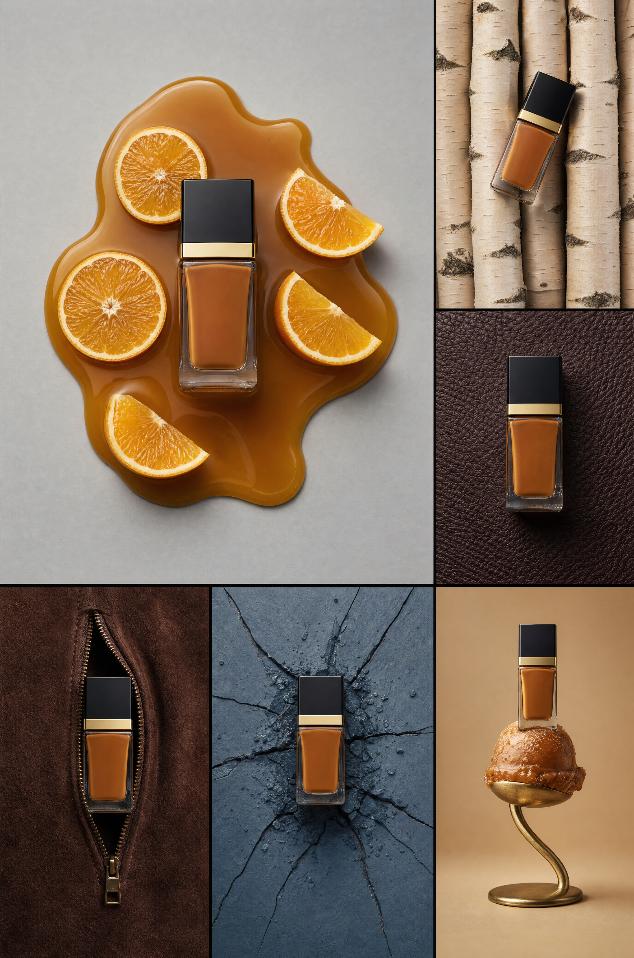
The centered layout and “commercial product photography framing” keep the Tom Ford bottle legible across six distinct editorial vignettes instead of letting the collage become a loose still life. “Glossy amber caramel-like liquid,” “fresh orange citrus slices,” and “brushed-gold pedestal” supply the dominant orange and beige warmth, while “deep brown pebbled leather,” “dark espresso suede,” and “weathered slate-blue surface” anchor it with black, brown, and gray contrast. “Clean high-end studio lighting with sharp reflections” and “crisp reflections” create the polished luxury mood by defining the glass, liquid, metal, and textured materials with controlled highlights.
FAQ
→How do I make the perfume bottle more prominent than the surrounding vignettes?
Replace “arranged in multiple editorial scenes” with “one dominant central hero bottle with six smaller supporting vignettes,” and add “the Tom Ford bottle occupies 60% of the image height, sharply focused, unobstructed, and visually brighter than every background scene.” Keep “centered” but change the supporting elements to “receding around the bottle” so the collage has a clear hierarchy.
→How do I shift this from warm luxury to a cooler, more clinical campaign?
Replace “glossy amber caramel-like liquid and fresh orange citrus slices” with “clear ice, silver citrus peels, and translucent water droplets,” and change “dramatic warm neutral and slate color palette” to “cool white, silver, charcoal, and desaturated blue palette.” Replace “warm tan textured base” with “matte white stone base” and “warm tan” with “cool gray” to remove the remaining amber cast.
→How do I turn this collage into a consistent series of seasonal variations?
Keep “Tom Ford luxury perfume bottle,” “centered,” and “high-end commercial product photography” unchanged, then replace the six scene descriptions as a group for each season. For autumn use “copper leaves, smoked amber glass, dark walnut, and burnt-orange velvet”; for winter use “frosted slate, white birch, clear ice, and brushed silver”; preserve “clean studio lighting with sharp reflections” so the bottle and campaign style remain consistent across the set.
Learn the technique behind this
- Why can't AI spell, and how do I get readable text in an image? — Older diffusion models had no character-level representation of text, so they produced letterform-shaped texture instead of words.
- How do I keep one consistent style across a whole set of images? — Style consistency is more achievable than character consistency because style lives in describable attributes.
- How should a prompt be structured, and does word order matter? — A prompt that behaves predictably names one subject first, then what it is doing, then where, then the light, then the lens or medium, then the style.
Related prompts

Playful brunette beauty ad portrait

Red Lip Balm with Lychee Freshness

Premium wellness pouch with golden spices

Teal-Accented Bunny Toy Studio Portrait
