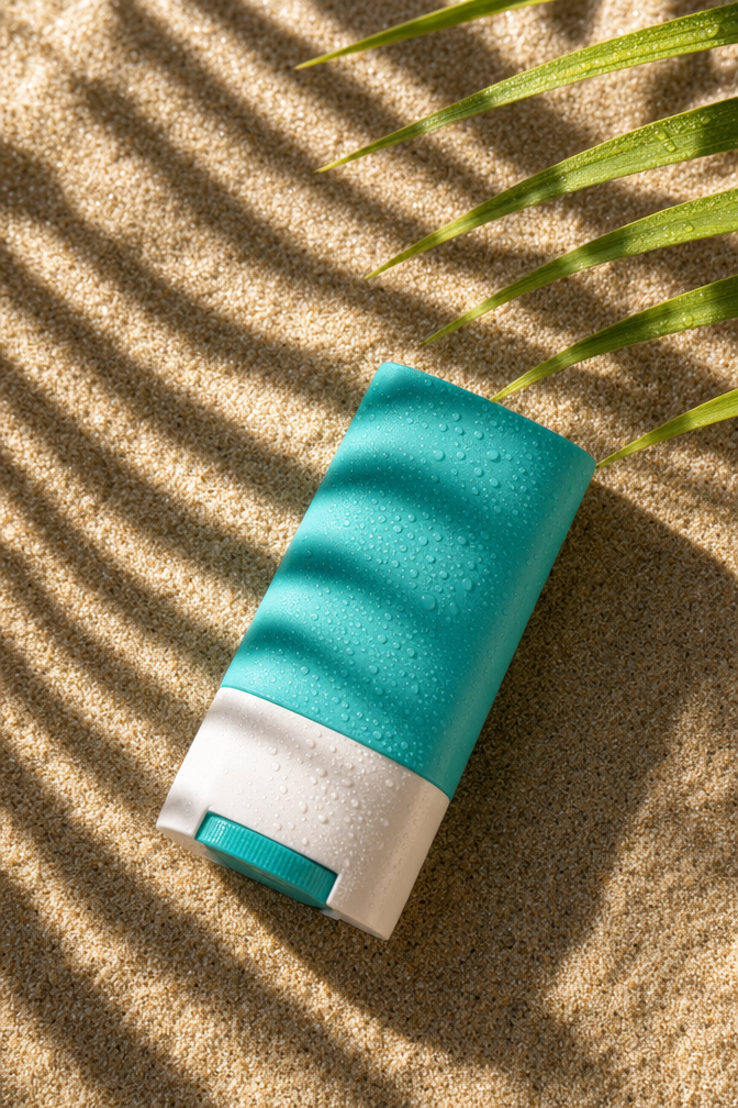
Why this works
The diagonal bottle placement and “top-down composition with a slight angle” create a clear overhead-flatlay structure, while “product fills most of the frame” makes the teal package the immediate focal point. “Bright late-afternoon natural sunlight” paired with “crisp diagonal striped shadows” gives the wet sand graphic contrast, and “scattered water droplets” plus “tack-sharp textures” make the surface feel tactile. The teal, white, and green palette stays clean and summery because the prompt limits visual accents to the teal bottle, pale sand, and sparse grass stems rather than adding competing colors.
FAQ
→How do I make the sunscreen stick feel more luxurious and less beach-casual?
Replace “clean summery look” with “luxury skincare campaign, refined editorial styling,” and change “a few dry sandy grass stems entering from the top right” to “minimalist white linen and a small sculptural stone entering from the top right.” Keep “ultra-high detail” and “tack-sharp textures” to preserve the premium product finish.
→How do I make the bottle more prominent and readable?
Replace “product fills most of the frame with high sharpness” with “product fills 80 percent of the frame, centered label facing camera, unobstructed branding, razor-sharp package details.” Change “lying diagonally” to “lying at a shallow diagonal with the front label fully visible,” while retaining “top-down composition with a slight angle.”
→How do I create a series of coordinated variations from this prompt?
Keep the fixed language “photorealistic product photography,” “top-down composition with a slight angle,” and “ultra-high detail,” then swap only the setting and accent colors. For example, replace “rippled wet sand” with “pale travertine beside a shallow pool,” “dry sandy grass stems” with “white seashell fragments,” and “teal sunscreen stick bottle” with “coral sunscreen stick bottle” to produce a distinct but consistent summer campaign frame.
Learn the technique behind this
- Why can't AI spell, and how do I get readable text in an image? — Older diffusion models had no character-level representation of text, so they produced letterform-shaped texture instead of words.
- Do negative prompts work, and what should go in one? — Negative prompts work on models that support a separate negative conditioning channel — mainly Stable Diffusion and FLUX-family models.
- Which aspect ratio should I use, and how does it change the image? — Aspect ratio determines what the model composes, not how it's cropped afterwards.
Related prompts

Playful brunette beauty ad portrait

Red Lip Balm with Lychee Freshness

Premium wellness pouch with golden spices

Teal-Accented Bunny Toy Studio Portrait
