Why this works
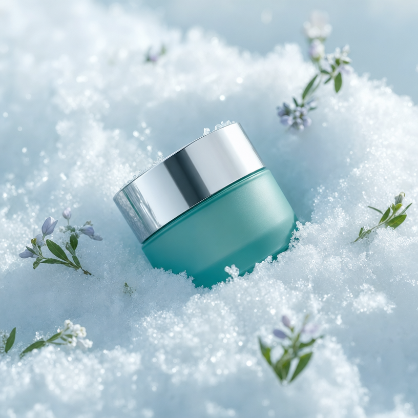
The phrase “jar placed diagonally and partially embedded in fresh white snow” gives the centered composition a controlled product angle while adding depth around the teal container. “Satin chrome lid,” “icy crystals on the rim,” and “subtle frost” supply crisp material contrasts, while “soft teal-and-lavender color palette” connects the jar, sky-blue snow cast, gray metal, and pale blossoms into a restrained premium harmony. “Shallow depth of field” keeps the jar and its micro-detail dominant, allowing the surrounding white blossoms and lavender petals to soften without losing the clean commercial mood established by “cool winter lighting.”
FAQ
→How do I make the jar feel warmer and more luxurious instead of cool and wintery?
Replace “Cool winter lighting” with “warm diffused studio lighting with soft golden highlights,” and change “soft teal-and-lavender color palette” to “deep emerald, ivory, and muted gold palette.” Keep “satin chrome lid” only if you want a restrained finish; replace it with “brushed champagne-gold lid” for a stronger luxury signal.
→How do I make the blossoms more central and prominent?
Replace “Scattered around are tiny white blossoms with a few pale lavender petals” with “a small foreground cluster of white blossoms and pale-lavender petals framing the jar,” and change “Product-focused photorealism with shallow depth of field” to “balanced focus on the jar and foreground blossoms.” Retain “jar placed diagonally” so the flowers frame rather than flatten the product composition.
→How do I build a coordinated variation with a different product and setting?
Replace “a teal cosmetic cream jar” with the new container, such as “an amber glass serum bottle with a matte ivory dropper,” and replace “fresh white snow” with “a pale travertine surface beside soft green moss.” Swap “icy crystals on the rim” for a setting-specific detail such as “tiny water droplets on the glass,” while preserving “clean premium commercial styling,” “crisp detail,” and “shallow depth of field” to maintain the series identity.
Learn the technique behind this
- Why can't AI spell, and how do I get readable text in an image? — Older diffusion models had no character-level representation of text, so they produced letterform-shaped texture instead of words.
- Do negative prompts work, and what should go in one? — Negative prompts work on models that support a separate negative conditioning channel — mainly Stable Diffusion and FLUX-family models.
- How do I keep one consistent style across a whole set of images? — Style consistency is more achievable than character consistency because style lives in describable attributes.
Related prompts

Playful brunette beauty ad portrait

Red Lip Balm with Lychee Freshness

Premium wellness pouch with golden spices

Teal-Accented Bunny Toy Studio Portrait
