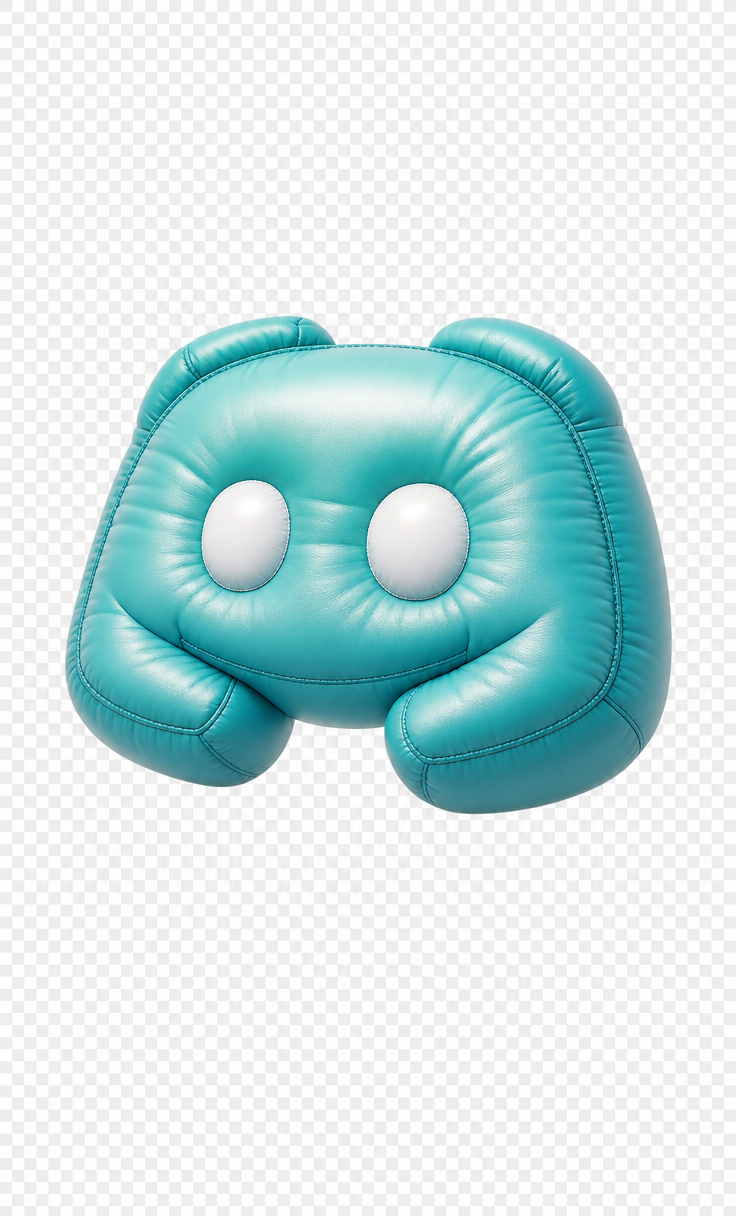
Why this works
The “original recognizable icon-like shape and overall silhouette” keeps the mascot legible, while “more pronounced rounded edges,” “deeper gentle folds,” and “slightly higher visible air-pressure bulging” turn it into a soft, tactile object. “Teal-to-aqua gradient with darker teal seams” supplies the intended color structure, although the generated image’s dominant white appearance suggests the matte vinyl and bright studio treatment are overpowering that gradient. “Centered composition,” “floating slightly angled for depth,” and “transparent background” create an isolated product-icon frame, while “soft diffused illumination,” “smooth shadowing,” and “slightly darker rim shading” define the volume without adding a setting.
FAQ
→How do I make the teal-to-aqua color more prominent than the current white-dominant result?
Replace “teal-to-aqua gradient” with “saturated teal-to-aqua gradient covering the entire visible surface, no white areas,” and replace “matte finish” with “colored satin vinyl with controlled highlights.” Add “neutral white rim light only, not white body coloration” to keep the studio lighting from washing out the mascot.
→How do I make the mascot feel softer and more visibly squashed?
Replace “slightly higher visible air-pressure bulging” with “strongly overinflated, visibly squashed pillow volume with compressed lower edges,” and change “deeper gentle folds” to “deep soft compression folds around the sides and underside.” Add “low-pressure cushion deformation” if you want a less rigid inflatable silhouette.
→How do I build a consistent series of alternate mascot icons from this prompt?
Keep “centered composition,” “transparent background,” “studio product lighting,” and the same camera wording unchanged, then replace only “inspired by a chat-platform character” with a new subject phrase such as “inflatable cloud mascot icon” or “inflatable game-controller mascot icon.” Preserve “soft vinyl-like surface with fine grain,” “darker teal seams,” and the same angle, then vary the palette phrase to “coral-to-peach gradient” or “violet-to-lilac gradient” for controlled iterations.
Learn the technique behind this
- Why can't AI spell, and how do I get readable text in an image? — Older diffusion models had no character-level representation of text, so they produced letterform-shaped texture instead of words.
- How do I keep one consistent style across a whole set of images? — Style consistency is more achievable than character consistency because style lives in describable attributes.
- How should a prompt be structured, and does word order matter? — A prompt that behaves predictably names one subject first, then what it is doing, then where, then the light, then the lens or medium, then the style.
Related prompts

Playful brunette beauty ad portrait

Red Lip Balm with Lychee Freshness

Premium wellness pouch with golden spices

Teal-Accented Bunny Toy Studio Portrait
