Why this works
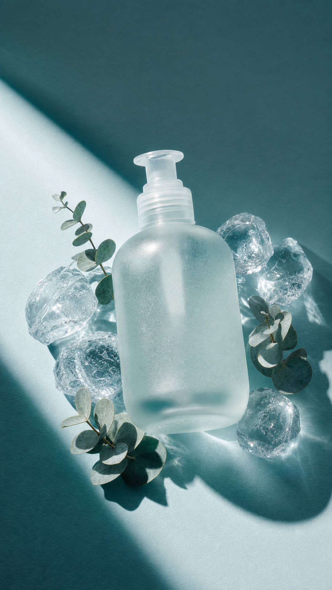
The centered frosted glass moisturizer bottle gives the image a controlled product-shot hierarchy, while “macro close-up emphasizing fine glass texture and droplet detail” makes condensation and surface grain carry the visual interest. “Natural-looking clear ice stones” and “eucalyptus sprigs scattered nearby instead of mint leaves” establish a crisp botanical setting, and the “teal-to-silver color palette with brighter highlights” supports the cool white-and-gray dominant image without overpowering the bottle. “Soft directional lighting,” “gentle specular glares,” “minimal shadows,” and “subtle haze” combine for the airy premium finish, with the glare phrase specifically defining how the frosted surface catches light.
FAQ
→How do I make the eucalyptus and ice more prominent while keeping the bottle as the product subject?
Replace “centered” with “bottle slightly off-center in the right third,” and expand “eucalyptus sprigs scattered nearby” to “larger eucalyptus sprigs framing the foreground and overlapping the lower corners.” Change “macro close-up emphasizing fine glass texture” to “medium macro composition showing the full bottle, foreground ice, and eucalyptus leaves in equal detail.”
→How do I shift this from an airy premium mood to a darker, more dramatic skincare campaign?
Replace “soft directional lighting” and “minimal shadows” with “hard directional side-lighting with deep controlled shadows,” and change “airy premium and refreshing atmosphere” to “moody nocturnal luxury atmosphere.” Swap “teal-to-silver color palette with brighter highlights” for “deep blue, charcoal, and silver palette with narrow white highlights,” while retaining “gentle specular glares” if you want the frosted glass to remain legible.
→How do I build a matching variation using a different product and botanical?
Replace “frosted glass moisturizer bottle” with a specific substitute such as “amber glass facial serum dropper bottle,” and replace “eucalyptus sprigs scattered nearby instead of mint leaves” with “rosemary sprigs scattered nearby.” Keep “natural-looking clear ice stones,” “macro close-up,” and “teal-to-silver color palette,” or change the palette to “amber, cream, and muted sage” so the new bottle and botanical become the series variation’s defining colors.
Learn the technique behind this
- Why can't AI spell, and how do I get readable text in an image? — Older diffusion models had no character-level representation of text, so they produced letterform-shaped texture instead of words.
- How should a prompt be structured, and does word order matter? — A prompt that behaves predictably names one subject first, then what it is doing, then where, then the light, then the lens or medium, then the style.
- Do negative prompts work, and what should go in one? — Negative prompts work on models that support a separate negative conditioning channel — mainly Stable Diffusion and FLUX-family models.
Related prompts

Playful brunette beauty ad portrait

Red Lip Balm with Lychee Freshness

Premium wellness pouch with golden spices

Teal-Accented Bunny Toy Studio Portrait
