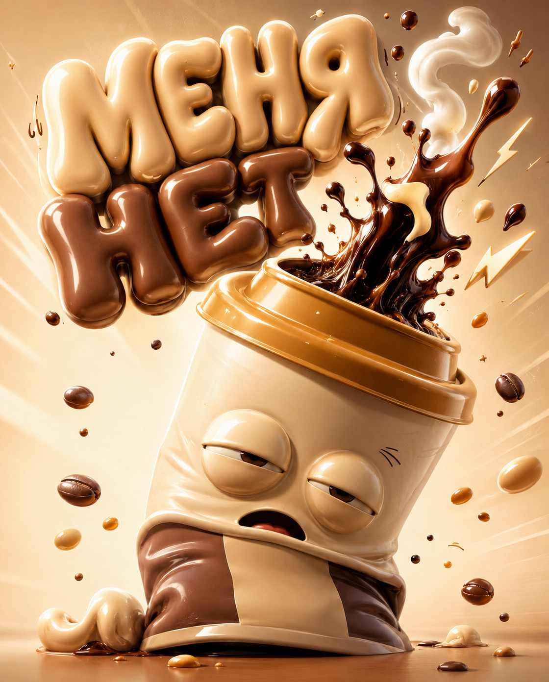
Why this works
The centered poster framing comes directly from “poster-style, centered composition with a slightly angled view,” keeping the tilted cup as the immediate focal point. “Drowsy half-closed eyes” and “groggy, comically sleepy expression” establish the playful, whimsical mood, while “dramatic coffee splash” and “fast, arcing burst” supply the strongest sense of motion. The beige, tan, and white harmony is anchored by the “warm sand-beige gradient background,” “pale caramel and cocoa tones,” and “light vanilla body,” with “warm glossy highlights and soft reflections” making the plastic-and-foam surface read as polished and photorealistic.
FAQ
→How do I make the coffee splash and cup feel more energetic?
Replace “sleepy” and “groggy, comically sleepy expression” with “wide-eyed, delighted expression” and change “dramatic coffee splash” to “explosive coffee splash with sharp droplets and a high sweeping arc.” Add “dynamic diagonal composition” in place of “centered composition” to push the motion beyond the cup’s current tilt.
→How do I make the lettering more central than the cup?
Replace “large puffy 3D bubble-style letters ... hover ... over” with “oversized foreground headline occupying the upper half of the poster, with the cup smaller beneath it.” Change “centered composition” to “typographic-led composition” and specify “high-contrast cocoa lettering with the cup positioned in the lower third.”
→How do I turn this into a series of related coffee-character posters?
Keep “3D photorealistic commercial poster,” “warm sand-beige gradient background,” and “clean studio lighting” unchanged, then swap the subject phrase for variants such as “energetic anthropomorphic espresso cup,” “sleepy matcha takeaway cup,” or “cheerful iced latte cup.” Replace the current expression and splash wording for each character, such as “bright alert eyes with a confident grin” and “matcha foam ribbon,” while retaining “pale caramel and cocoa tones” only when it matches the new drink’s palette.
Learn the technique behind this
- Why can't AI spell, and how do I get readable text in an image? — Older diffusion models had no character-level representation of text, so they produced letterform-shaped texture instead of words.
- How should a prompt be structured, and does word order matter? — A prompt that behaves predictably names one subject first, then what it is doing, then where, then the light, then the lens or medium, then the style.
- Do negative prompts work, and what should go in one? — Negative prompts work on models that support a separate negative conditioning channel — mainly Stable Diffusion and FLUX-family models.
Related prompts

Playful brunette beauty ad portrait

Red Lip Balm with Lychee Freshness

Premium wellness pouch with golden spices

Teal-Accented Bunny Toy Studio Portrait
