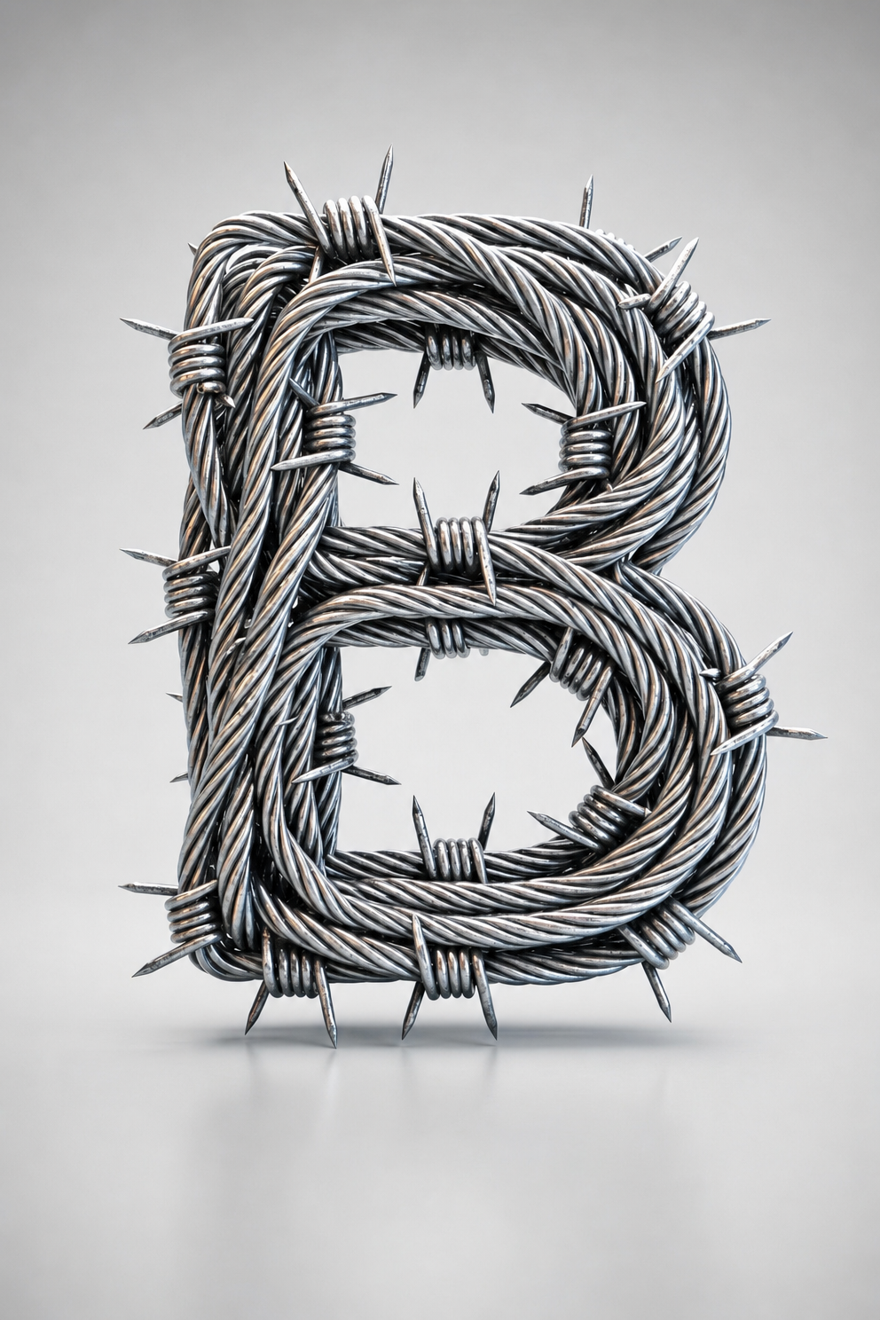
Why this works
The phrase “capital letter ‘B’ constructed from twisted silver barbed wire” makes the letterform immediately legible while “sharp metallic spikes protrude organically around the wire loops” supplies the dark, aggressive texture. “Centered minimalist composition” and “square product-style framing” create the stable, icon-like presentation, with the “smooth charcoal studio background with soft vignette” isolating the predominantly white-silver object. “Dramatic side lighting with high-contrast directional reflections and clean, grounded shadows” provides the sharp tonal separation and dimensionality, while “cool gunmetal-silver with subtle iridescent edge sheen” adds restrained color variation without disrupting the monochrome focus.
FAQ
→How do I make the barbed-wire B feel more menacing and gothic?
Replace “occasional copper-like highlights” with “deep oxidized copper and dark rust accents,” and change “subtle iridescent edge sheen” to “cold blue-black reflective edges.” Strengthen the lighting phrase to “hard, low-angle side lighting with severe shadows and narrow specular highlights” for a harsher tone.
→How do I make the spikes and wire texture more prominent than the overall letter shape?
Replace “sharp focus on the letterform” with “macro focus on the barbed spikes, twisted cable strands, and micro-scratches,” and change “maintaining a crisp industrial-gothic structure” to “irregular, densely tangled barbs partially obscuring the letterform.” Add “shallow depth of field with the nearest spikes dominating the foreground” to shift visual priority forward.
→How do I create a coordinated series of letters from this prompt?
Replace “capital letter ‘B’” with each target letter while keeping “twisted silver barbed wire,” “smooth charcoal studio background,” “square product-style framing,” and the same lighting phrase unchanged. For consistent variations, use “identical scale, centered placement, camera angle, material treatment, and shadow direction” so only the letterform changes.
Learn the technique behind this
- Why can't AI spell, and how do I get readable text in an image? — Older diffusion models had no character-level representation of text, so they produced letterform-shaped texture instead of words.
- How should a prompt be structured, and does word order matter? — A prompt that behaves predictably names one subject first, then what it is doing, then where, then the light, then the lens or medium, then the style.
- Do negative prompts work, and what should go in one? — Negative prompts work on models that support a separate negative conditioning channel — mainly Stable Diffusion and FLUX-family models.
Related prompts

Playful brunette beauty ad portrait

Red Lip Balm with Lychee Freshness

Premium wellness pouch with golden spices

Teal-Accented Bunny Toy Studio Portrait
