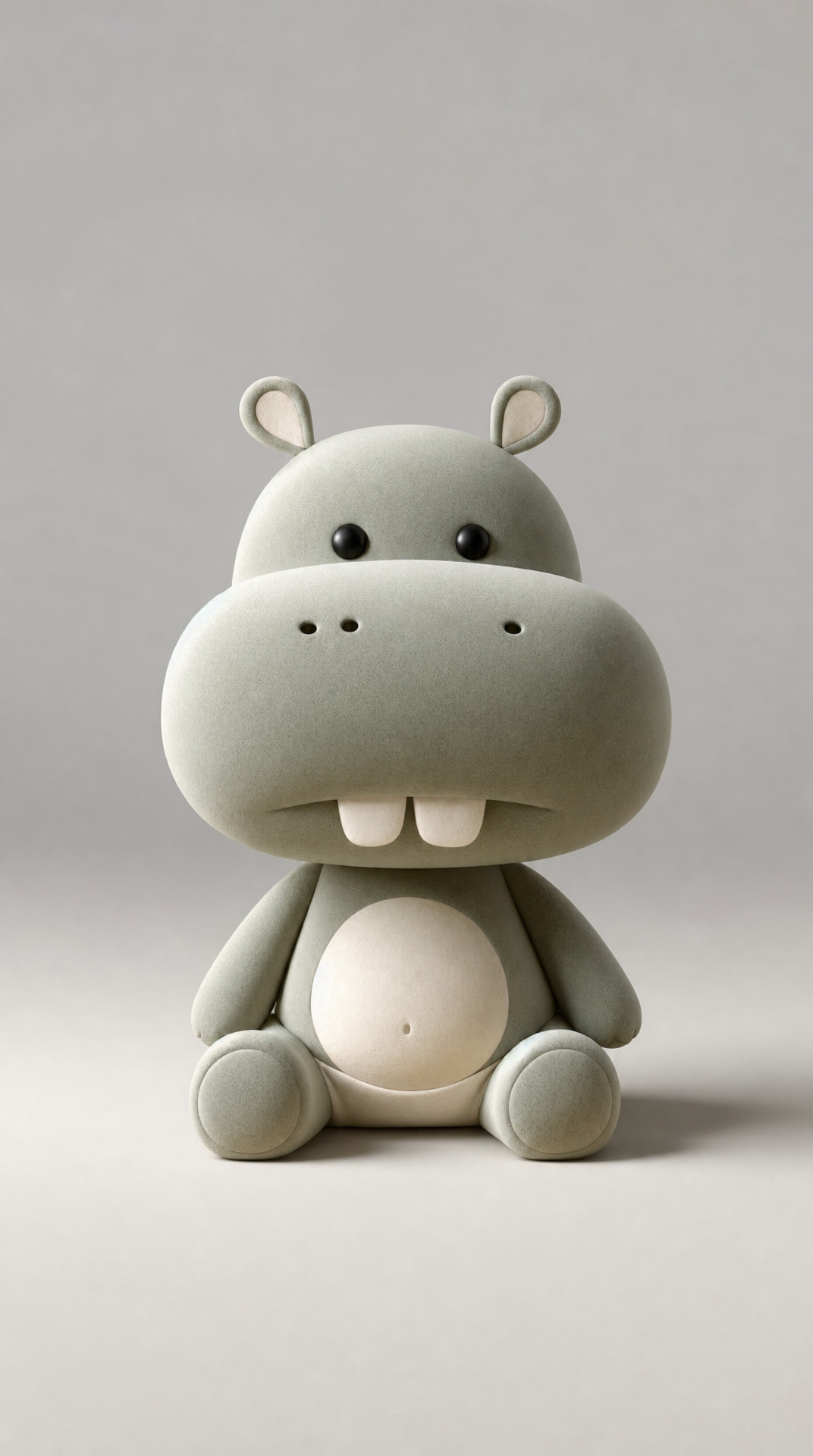
Why this works
The centered, front-facing seated pose and “centered composition” make the baby hippo read immediately as a collectible product, while the “oversized snout,” “tiny ears,” and “soft rounded forms” carry the playful proportions. “Smooth matte ceramic-like surface,” “faint micro-texture,” and “soft diffused lighting” create the quiet tactile finish; the “cool light-gray studio background with a faint vignette” keeps the frame clean and concentrates attention on the white-dominant subject. The “sage green and warm ivory” palette with “gentle pastel gradients” is specified, but the generated image’s dominant white suggests those colors are currently reading as restrained accents rather than a strong overall shift.
FAQ
→How do I make the sage green and warm ivory palette more visibly dominant?
Replace “Change the color palette to sage green and warm ivory, with gentle pastel gradients on the body” with “body primarily sage green, warm ivory muzzle and belly, clearly separated opaque color blocks, minimal white.” You can also replace “cool light-gray studio background” with “deep muted sage-gray studio background” to reduce the image’s overall white balance and strengthen the hippo’s color contrast.
→How do I make the hippo’s face and oversized snout the main focal point?
Replace “front-facing seated pose” with “tight front-facing portrait crop from the chest upward, face filling most of the frame,” and replace “Centered composition” with “centered close-up with oversized snout as the dominant foreground feature.” Keep “small dark pupils” and “tiny ears,” but add “sharpest detail on the eyes and snout, gently softened body edges” to shift attention forward.
→How do I create a consistent series of variations from this toy design?
Keep the load-bearing identity phrases “cute minimalist baby hippo toy,” “soft rounded forms,” “tiny ears,” “small dark pupils,” and “oversized snout” unchanged. Swap only the palette and setting, such as replacing “sage green and warm ivory” with “powder blue and butter yellow,” or replacing “cool light-gray studio background” with “warm cream studio background with a faint vignette,” while retaining “centered product-style composition” and “soft diffused studio lighting” across every image.
Learn the technique behind this
- Why can't AI spell, and how do I get readable text in an image? — Older diffusion models had no character-level representation of text, so they produced letterform-shaped texture instead of words.
- How do I keep one consistent style across a whole set of images? — Style consistency is more achievable than character consistency because style lives in describable attributes.
- How should a prompt be structured, and does word order matter? — A prompt that behaves predictably names one subject first, then what it is doing, then where, then the light, then the lens or medium, then the style.
Related prompts

Playful brunette beauty ad portrait

Red Lip Balm with Lychee Freshness

Premium wellness pouch with golden spices

Teal-Accented Bunny Toy Studio Portrait
