Why this works
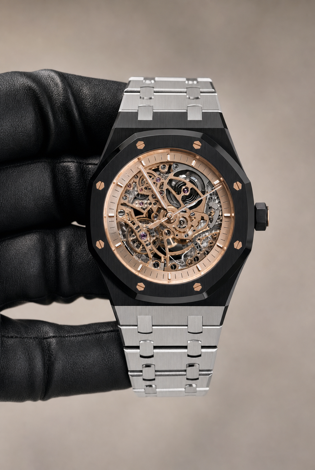
“Close-up photorealistic studio product photo” and “crisp macro-like detail” make the watch the immediate focal point, while “shallow depth of field” suppresses the smooth light taupe/gray gradient behind it. The combination of a “black DLC coated octagonal case,” black leather glove, and brushed stainless steel bracelet gives the portrait close-up a strong black-and-brown visual weight, while “premium studio lighting,” “high dynamic range reflections,” and “realistic micro-scratches” keep the metal surfaces dimensional rather than flat. “Sharp engraved details” and the exposed mechanical movement supply the refined, technical luxury mood more directly than the background color does.
FAQ
→How do I make the exposed mechanical movement more central and prominent?
Replace “Close-up framing” with “extreme macro framing centered on the skeleton dial and exposed mechanical movement,” and add “movement fills most of the frame, case edges partially cropped.” Keep “crisp macro-like detail” and “sharp engraved details,” but change “shallow depth of field” to “deep focus across the dial and movement” so the gears remain legible.
→How do I shift this from dark, dramatic luxury to a brighter editorial product image?
Replace “black DLC coated octagonal case” with “polished rose-gold toned octagonal case,” and change “black leather-gloved hand” to “clean bare hand with warm neutral skin tone” or “cream leather glove.” Replace “smooth light taupe/gray gradient” with “bright warm ivory gradient” and “controlled highlights” with “soft diffuse studio lighting with gentle reflections.”
→How do I create a coordinated series of variations from this watch prompt?
Keep “luxury skeleton wristwatch,” “exposed mechanical movement,” “octagonal case,” “close-up framing,” and “photorealistic product photography” fixed as the series anchors. Make controlled swaps such as “black DLC coated” to “brushed titanium,” “polished ceramic,” or “deep navy enamel,” and replace “light taupe/gray gradient” with “cool slate gradient,” “warm ivory gradient,” or “deep charcoal gradient” while preserving “sharp engraved details” and “realistic HDR reflections.”
Learn the technique behind this
- Why can't AI spell, and how do I get readable text in an image? — Older diffusion models had no character-level representation of text, so they produced letterform-shaped texture instead of words.
- How should a prompt be structured, and does word order matter? — A prompt that behaves predictably names one subject first, then what it is doing, then where, then the light, then the lens or medium, then the style.
- Do negative prompts work, and what should go in one? — Negative prompts work on models that support a separate negative conditioning channel — mainly Stable Diffusion and FLUX-family models.
Related prompts

Playful brunette beauty ad portrait

Red Lip Balm with Lychee Freshness

Premium wellness pouch with golden spices

Teal-Accented Bunny Toy Studio Portrait
