Why this works
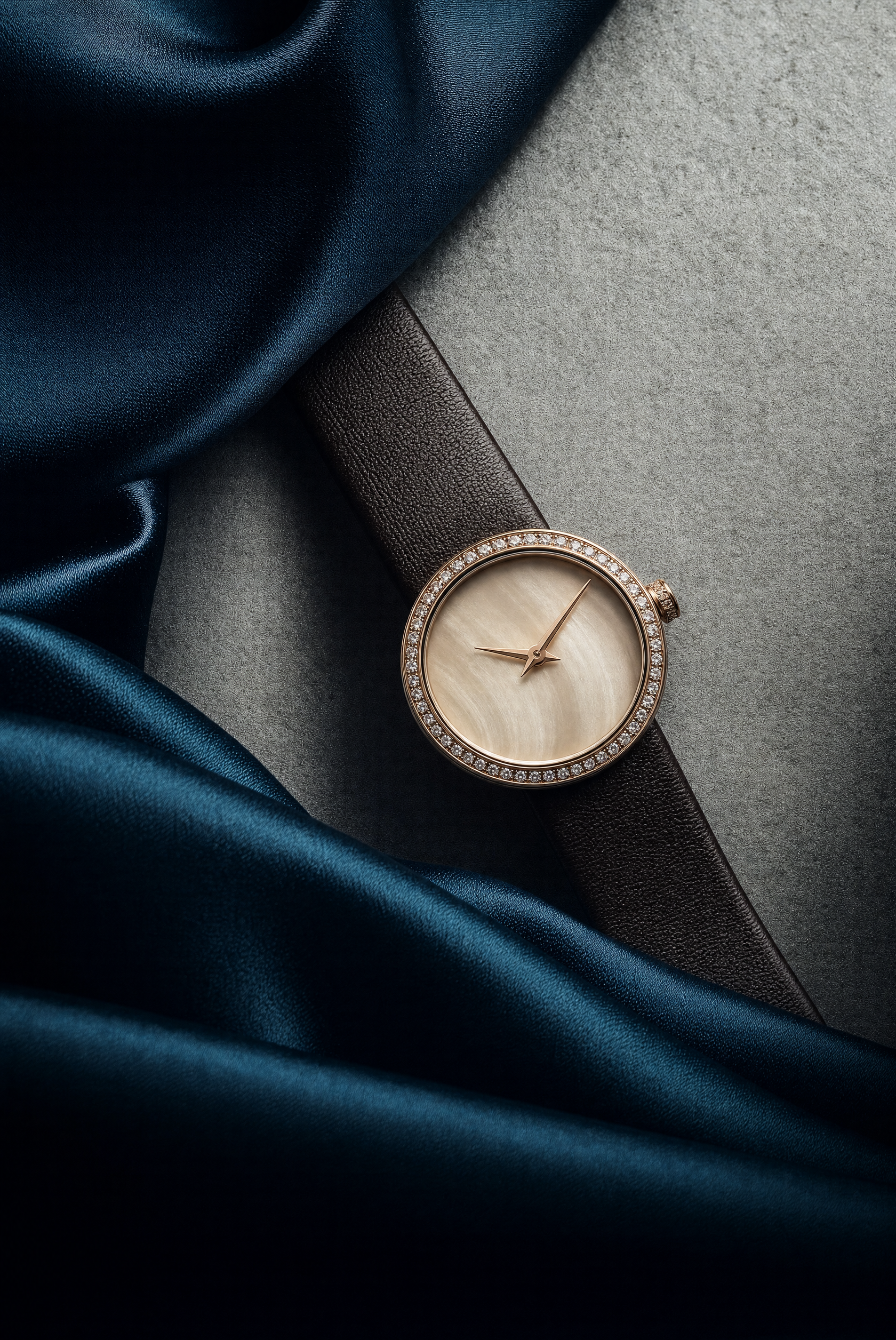
The premium mood comes from the concrete material contrast between the “champagne-gold watch dial,” “rose-gold hands,” “deep teal silk fabric,” and “cool, lightly marbled slate-gray surface,” while “dramatic studio lighting with crisp specular reflections” gives the metal and crystal a controlled luxury sheen. “Close-up product framing” makes the watch the clear subject, and “laid diagonally” supplies directional movement within the overhead-flatlay composition rather than leaving the strap and dial static. “Shallow depth of field” isolates the dial and bezel, while “ultra-realistic materials” and “high-detail composition” preserve the pearl texture, leather grain, silk folds, and slate veining.
FAQ
→How do I make the watch face more central and visually dominant?
Replace “The leather strap is laid diagonally across” with “The watch dial is centered and fills most of the frame, with the strap forming a restrained border around it,” and change “overhead-flatlay” to “centered straight-down macro product composition.” Keep “luminous diamond-studded bezel” and “crisp specular reflections” so the bezel remains the strongest detail.
→How do I shift this from elegant luxury to a darker, more dramatic tone?
Replace “champagne-gold” with “blackened gunmetal,” “rose-gold hands” with “polished steel hands,” and “deep teal silk fabric” with “black velvet fabric.” Change “cool, lightly marbled slate-gray surface” to “charcoal-black stone with subtle wet reflections,” while retaining “dramatic studio lighting” and adding “deep shadows with a narrow rim light.”
→How do I create a series of coordinated watch variations from this prompt?
Keep the fixed structure, including “close-up product framing,” “laid diagonally,” and “overhead-flatlay,” then swap only the palette and fabric: use “silver dial, navy silk, and pale gray marble,” “black ceramic dial, burgundy velvet, and dark basalt,” or “ivory dial, forest-green silk, and warm travertine.” Preserve “ultra-realistic materials,” “shallow depth of field,” and “crisp specular reflections” across every version for consistent editorial treatment.
Learn the technique behind this
- Why can't AI spell, and how do I get readable text in an image? — Older diffusion models had no character-level representation of text, so they produced letterform-shaped texture instead of words.
- Do negative prompts work, and what should go in one? — Negative prompts work on models that support a separate negative conditioning channel — mainly Stable Diffusion and FLUX-family models.
- Why does AI get hands and faces wrong, and how do I fix it? — Hands fail because they're small in frame, extremely variable in pose, and self-occluding — the model has less usable signal per pixel than for any other body part.
Related prompts

Playful brunette beauty ad portrait

Red Lip Balm with Lychee Freshness

Premium wellness pouch with golden spices

Teal-Accented Bunny Toy Studio Portrait
