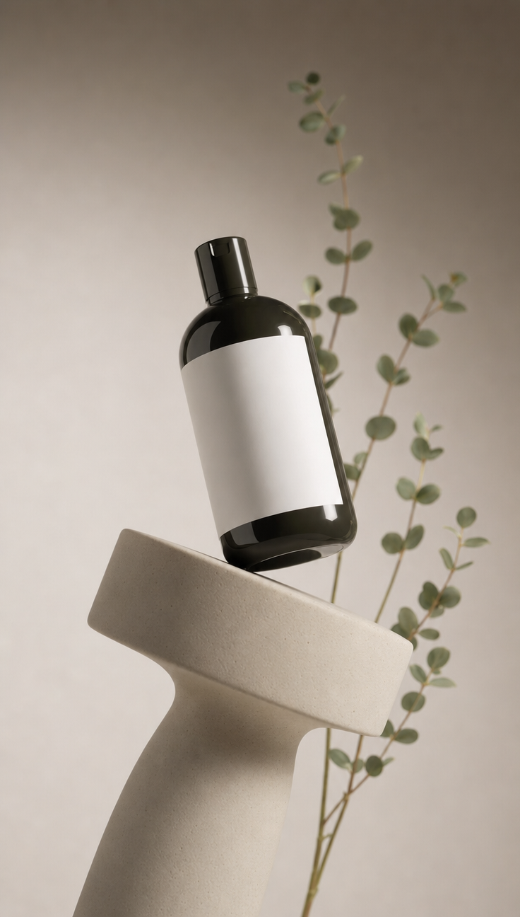
Why this works
The centered product-photography framing makes the two matte black bottles the immediate anchor, while the “smooth white label area” gives their dark silhouettes a clean visual break. Calm restraint comes from the “muted warm taupe to light gray gradient background,” “soft diffused studio lighting,” and “gentle natural-looking shadows,” with the pale sand ceramic pedestal adding a warm base beneath the cooler gray and black palette. The “eucalyptus-like green stems with small buds,” kept “slightly out of focus” through shallow depth of field, introduce an organic accent without competing with the products.
FAQ
→How do I make one bottle more prominent than the other?
Replace “two sleek black shampoo and body wash bottles” with “one larger shampoo bottle in the foreground and one smaller body wash bottle slightly behind,” and change “Centered composition” to “asymmetrical composition with the shampoo bottle centered and dominant.” Keep “shallow depth of field” to push the secondary bottle farther back.
→How do I shift this from calm premium styling to a darker, more dramatic mood?
Replace “soft diffused studio lighting” and “gentle natural-looking shadows” with “hard directional side-lighting with deep sculpted shadows,” and change “muted warm taupe to light gray gradient background” to “charcoal gray to black gradient background.” Retain “matte black” bottles, but replace “pale sand-colored ceramic pedestal” with “dark smoked stone pedestal” for a cooler, heavier base.
→How do I create a coordinated series with different botanical and product variations?
Keep “centered, photorealistic product photography framing,” “premium cosmetic advertising aesthetic,” and the “muted” background structure unchanged. For each variation, replace “eucalyptus-like green stems with small buds” with a specific botanical such as “lavender stems with violet flowers,” “olive branches with silver-green leaves,” or “rosemary sprigs,” and swap the product names and label accents while preserving “sleek matte black bottles” and the “smooth white label area.”
Learn the technique behind this
- Why can't AI spell, and how do I get readable text in an image? — Older diffusion models had no character-level representation of text, so they produced letterform-shaped texture instead of words.
- Why does the model ignore parts of my prompt? — Ignored instructions are almost always conflicts, counts, or spatial relationships — three things current models handle badly — rather than the model failing to read you.
- How do I keep one consistent style across a whole set of images? — Style consistency is more achievable than character consistency because style lives in describable attributes.
Related prompts

Playful brunette beauty ad portrait

Red Lip Balm with Lychee Freshness

Premium wellness pouch with golden spices

Teal-Accented Bunny Toy Studio Portrait
