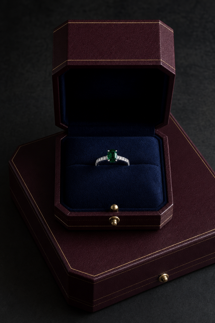
Why this works
The centered ring and “close-up product framing” make the gemstone the immediate focal point, while “crisp detail” and “realistic reflections” preserve the platinum and diamond’s catalog-level definition. “Dark studio background” and “dramatic low-key lighting” create the black-and-navy dominant palette and dramatic luxury mood; the “deep navy velvet” gives the green stone controlled color contrast without competing with it. “Open burgundy leather presentation box,” “subtle gold foil embossing,” and the “matching base box beneath it” add layered framing and premium packaging context around the jewelry.
FAQ
→How do I make the green gemstone more prominent than the box?
Replace “a platinum diamond ring with a deep green gemstone centered inside” with “a macro close-up of a platinum ring dominated by a large deep emerald-green gemstone, gemstone occupying most of the frame.” Also replace “centered” with “gemstone filling the central foreground, box softly receding behind it” and add “shallow depth of field focused on the gemstone.”
→How do I change the dramatic luxury mood into a brighter, clean catalog look?
Replace “dramatic low-key lighting” and “Dark studio background” with “bright, even diffused studio lighting” and “clean warm-white seamless background.” Change “elegant, luxurious, dramatic mood” to “minimal, refined, contemporary catalog mood,” while keeping “crisp detail” and “realistic reflections” for product definition.
→How do I build a coordinated series with different jewelry while keeping this presentation style?
Keep “Photorealistic luxury jewelry product shot,” “open burgundy leather presentation box,” “deep navy velvet,” “dramatic low-key studio lighting,” and “premium catalog photography,” then replace “platinum diamond ring with a deep green gemstone” with a specific variant such as “rose-gold pendant with a pear-shaped sapphire” or “white-gold earrings with matching diamonds.” Preserve “centered” and “matching base box beneath it” to maintain the same composition and packaging continuity.
Learn the technique behind this
- Why can't AI spell, and how do I get readable text in an image? — Older diffusion models had no character-level representation of text, so they produced letterform-shaped texture instead of words.
- How should a prompt be structured, and does word order matter? — A prompt that behaves predictably names one subject first, then what it is doing, then where, then the light, then the lens or medium, then the style.
- Do negative prompts work, and what should go in one? — Negative prompts work on models that support a separate negative conditioning channel — mainly Stable Diffusion and FLUX-family models.
Related prompts

Playful brunette beauty ad portrait

Red Lip Balm with Lychee Freshness

Premium wellness pouch with golden spices

Teal-Accented Bunny Toy Studio Portrait
