Why this works
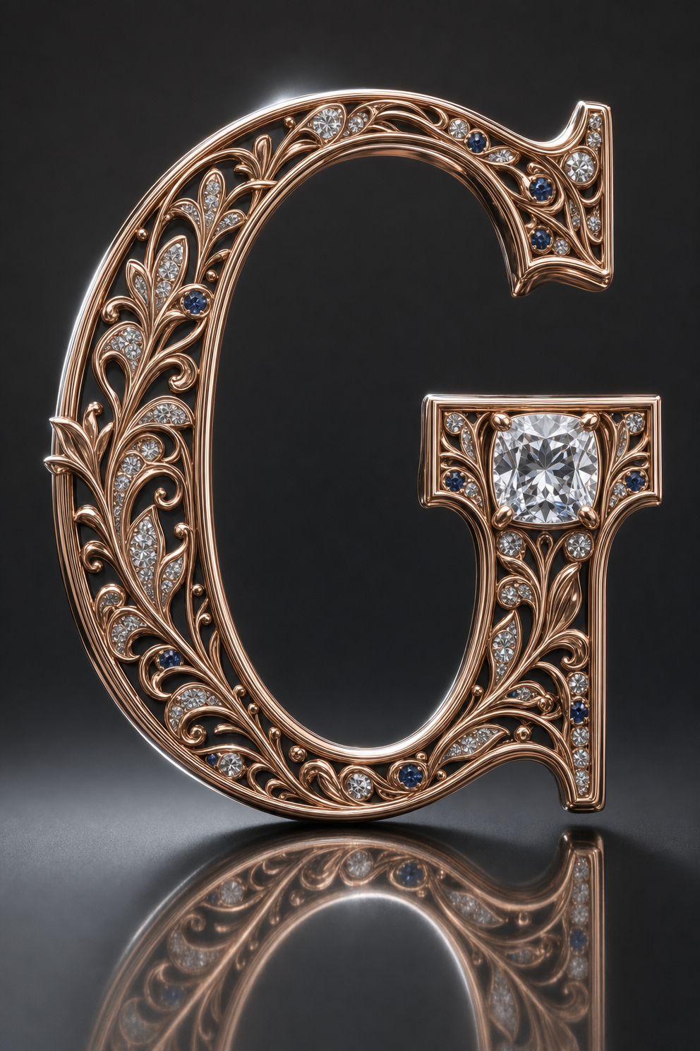
The centered macro framing and isolated capital letter G make the monogram the immediate focal point, while “deep beveled edges” and “intricate Art Nouveau filigree engraving covering the entire surface” give the close-up enough structure to reward inspection. “Solid polished 18K rose-gold finish” supplies the warm metallic base, but the image’s black, gray, white, and blue dominance comes from the “matte charcoal background,” “satin dark-gray surface,” “cool rim highlights,” and “white sapphire accents.” The opulent mood is specifically anchored by “embedded brilliant-cut diamonds,” “one larger cushion-cut gemstone accent on the right side,” and “premium heirloom-style craftsmanship,” with “controlled lens flares” and “subtle rainbow prismatic glints” adding drama without obscuring the engraving.
FAQ
→How do I make the right-side gemstone more prominent?
Replace “one larger cushion-cut gemstone accent on the right side” with “an oversized sapphire centerpiece dominating the upper-right curve of the G, with a halo of smaller diamonds.” Add “asymmetrical composition weighted toward the right” if you want the stone to pull the entire frame off center.
→How do I shift this from cool dramatic luxury to a warmer vintage heirloom mood?
Replace “cool rim highlights” with “warm amber key lighting and soft candlelike highlights,” and replace “subtle rainbow prismatic glints” with “muted golden reflections.” Changing “matte charcoal background” to “deep walnut velvet background” will also remove much of the black-blue modernity while preserving contrast.
→How do I create a coordinated series of monogram images from this prompt?
Keep the phrases “solid polished 18K rose-gold finish,” “intricate Art Nouveau filigree engraving,” “isolated on a matte charcoal background,” and “centered composition” unchanged, then replace “capital letter G” with each target letter. For controlled variations, swap “one larger cushion-cut gemstone accent on the right side” for “a matching gemstone accent positioned on the letter’s most open curve,” so each monogram adapts its ornament to its shape.
Learn the technique behind this
- Why can't AI spell, and how do I get readable text in an image? — Older diffusion models had no character-level representation of text, so they produced letterform-shaped texture instead of words.
- How should a prompt be structured, and does word order matter? — A prompt that behaves predictably names one subject first, then what it is doing, then where, then the light, then the lens or medium, then the style.
- Why does the model ignore parts of my prompt? — Ignored instructions are almost always conflicts, counts, or spatial relationships — three things current models handle badly — rather than the model failing to read you.
Related prompts

Playful brunette beauty ad portrait

Red Lip Balm with Lychee Freshness

Teal-Accented Bunny Toy Studio Portrait

Premium wellness pouch with golden spices