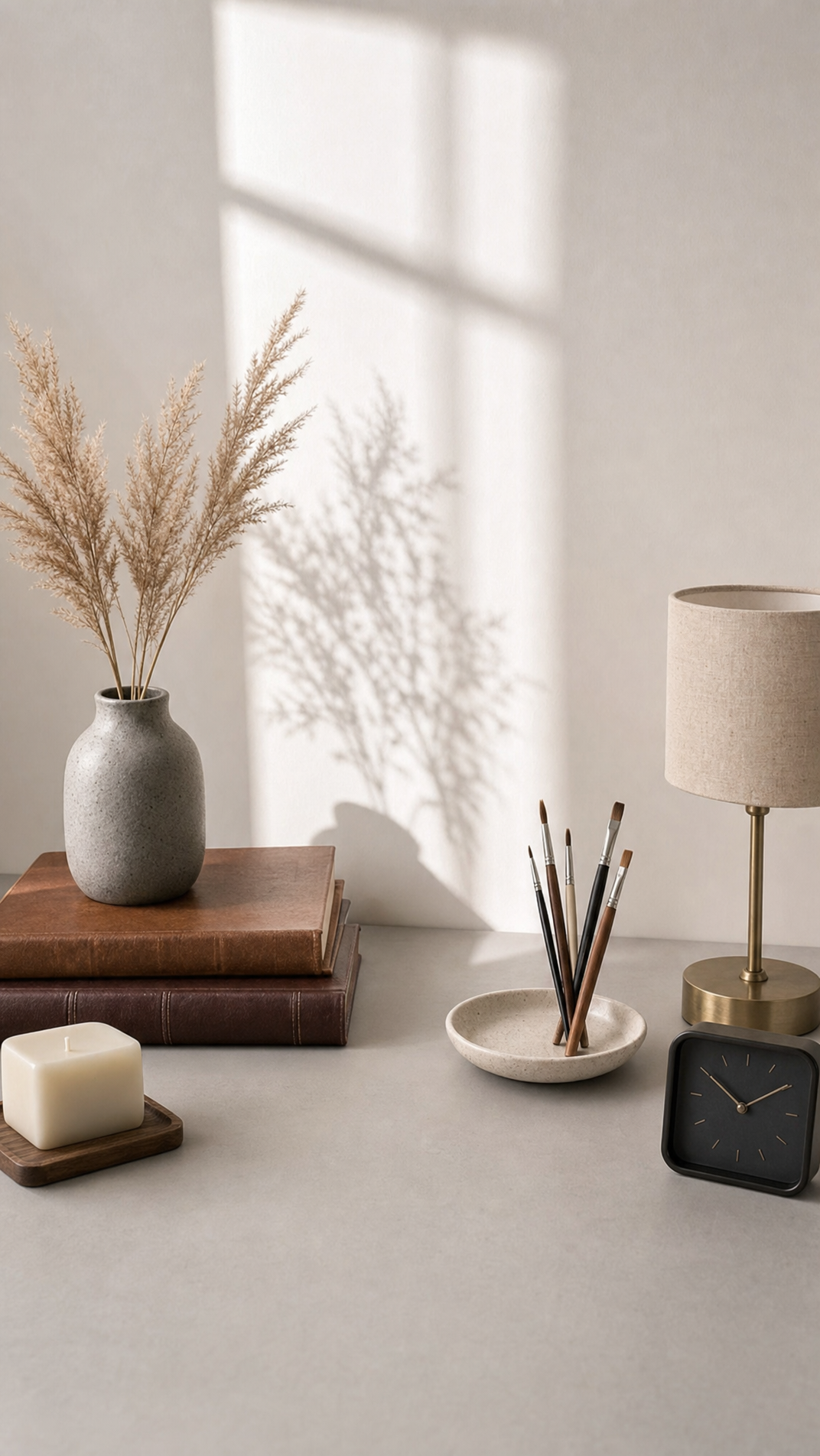
Why this works
The phrase 'soft afternoon sunlight streaming through a window, casting delicate shadows of plant stems on the wall' is doing the real work here, it's what puts those faint shadow lines into the frame and gives the flatlay a sense of a specific time of day rather than a studio setup. 'Shallow depth of field' softens the edges of the books and lamp so the eye settles on the pampas grass and vase first, and 'neutral grey and cream color palette' is exactly why the dominant colors come back as white, brown, and tan instead of anything saturated. Listing the objects in a stacked order, vase on books, candle on coaster, dish holding paintbrushes, mimics how a stylist would actually arrange a desk, which is why the overhead composition reads as curated rather than random clutter.
FAQ
→How do I make the lighting feel warmer or more golden instead of soft and neutral?
Swap 'soft afternoon sunlight streaming through a window' for 'warm golden-hour sunlight streaming through a window' and change 'casting delicate shadows' to 'casting long amber shadows'. That shifts the palette away from the current white/tan mix toward orange and gold without touching the object list.
→How do I make the pampas grass and vase the clear focal point instead of an even flatlay?
Add 'in sharp focus' right after 'grey ceramic vase with dried pampas grass' and increase the blur elsewhere by changing 'shallow depth of field' to 'very shallow depth of field, background objects softly blurred'. You could also move the vase description to the front of the object list so it reads first.
→How do I turn this into a series with different desk objects each time?
Keep the setting and lighting phrases fixed, 'pale grey desk by a window' and 'soft afternoon sunlight streaming through a window', and just rotate the object clause. Try swapping 'ceramic dish holding paintbrushes' for 'ceramic dish holding dried lavender' or replace the 'square minimalist wall clock in matte black' with a 'small brass hourglass' to vary the set while keeping the same mood and color palette.
Learn the technique behind this
- Why can't AI spell, and how do I get readable text in an image? — Older diffusion models had no character-level representation of text, so they produced letterform-shaped texture instead of words.
- How do I keep one consistent style across a whole set of images? — Style consistency is more achievable than character consistency because style lives in describable attributes.
- How should a prompt be structured, and does word order matter? — A prompt that behaves predictably names one subject first, then what it is doing, then where, then the light, then the lens or medium, then the style.
Related prompts

Playful brunette beauty ad portrait

Red Lip Balm with Lychee Freshness

Premium wellness pouch with golden spices

Teal-Accented Bunny Toy Studio Portrait
