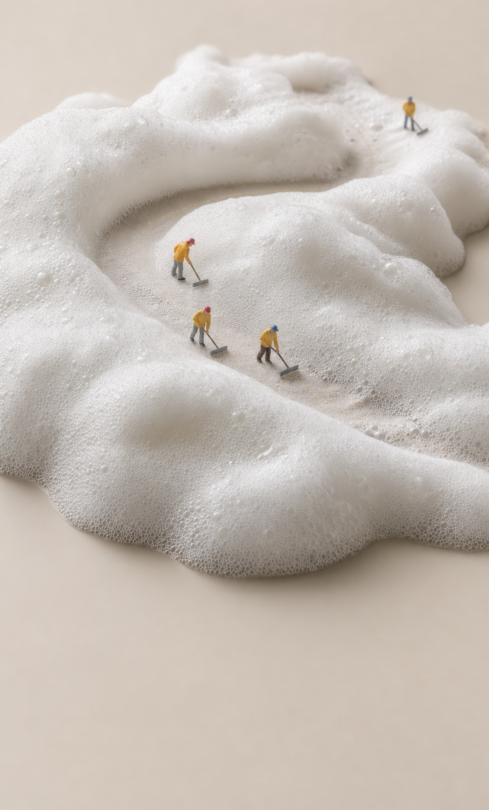
Why this works
The phrase “top-down view” and “photorealistic macro panorama” make the foam read as a landscape while keeping the centered winding path as the compositional anchor. “Bright white foamy landscape,” “creamy, translucent bubbles,” and “light neutral beige studio background” establish the clean beige-and-white harmony, while “miniature people” and “small gray water scrapers” create the playful sense of scale. “Minimalist, soft studio lighting with gentle shadows” preserves the calm mood, and “crisp micro-texture on the foam and bubbles” directs focus toward the tactile surface rather than the tiny figures.
FAQ
→How do I make the miniature people more prominent in the image?
Replace “miniature people move” with “a clearly visible group of miniature workers in colorful raincoats walking along the winding path,” and replace “small gray water scrapers” with “distinct, detailed hand tools.” Add “figures sharply resolved and visually dominant” after “ultra high realism,” while keeping “top-down view” so the path remains legible.
→How do I make the scene feel more energetic instead of calm?
Replace “Minimalist, soft studio lighting with gentle shadows” with “bright directional lighting with sharper shadows and energetic highlights.” Change “leaving subtle trails through the foam” to “carving dramatic sweeping trails and splashes through the foam,” and replace “clean, calm, playful surreal mood” with “lively, whimsical, kinetic surreal mood.”
→How do I build a series with different foam landscapes while preserving this composition?
Keep “top-down macro panorama view,” “centered,” and “a winding path” unchanged, then swap “bright white foamy landscape with creamy, translucent bubbles” for variants such as “pale blue shaving-cream landscape with glossy bubbles,” “lavender whipped-foam terrain with pearlescent bubbles,” or “warm golden soap-foam landscape with translucent bubbles.” Match each variation by replacing “light neutral beige studio background” with a nearby neutral tone and retaining “crisp micro-texture” for consistent detail.
Learn the technique behind this
- Why can't AI spell, and how do I get readable text in an image? — Older diffusion models had no character-level representation of text, so they produced letterform-shaped texture instead of words.
- Why does the model ignore parts of my prompt? — Ignored instructions are almost always conflicts, counts, or spatial relationships — three things current models handle badly — rather than the model failing to read you.
- How should a prompt be structured, and does word order matter? — A prompt that behaves predictably names one subject first, then what it is doing, then where, then the light, then the lens or medium, then the style.