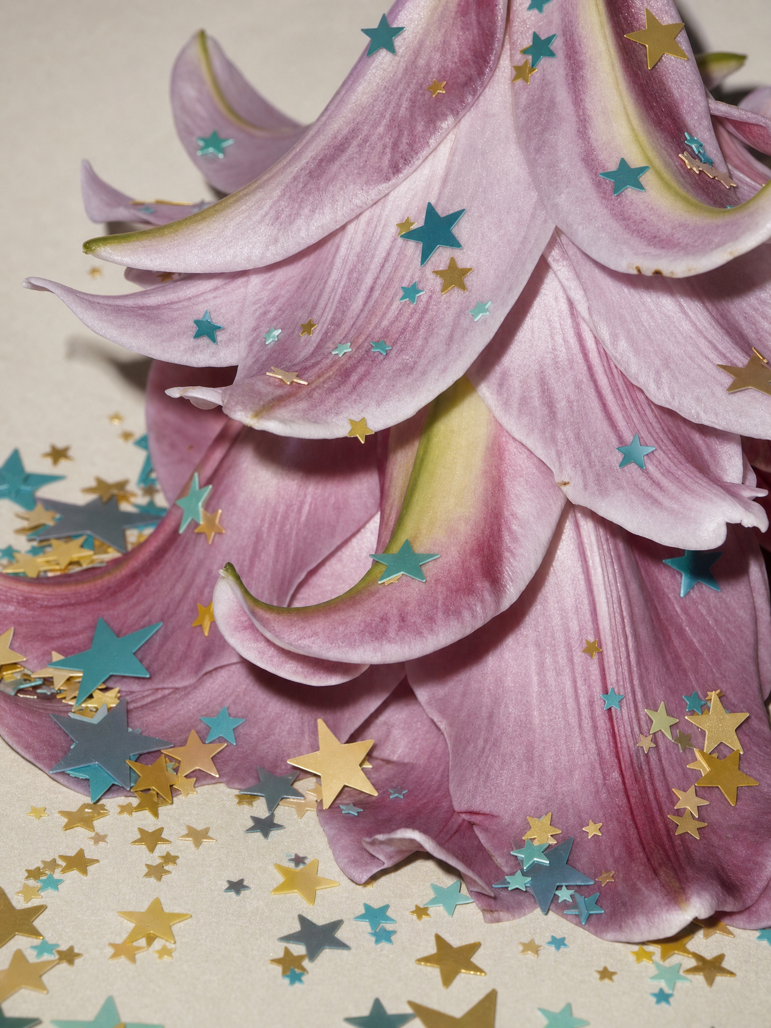
Same prompt, generated with each model separately — click one to see how it holds up.
Why this works
The phrase “close-up photorealistic macro” makes the layered petals and “delicate organic petal textures” the visual priority, while “shallow depth of field” isolates the crisp foreground detail from the nearby surface. The mauve-to-rose petals, “subtle blush undertones,” and “pale lavender edging” establish the purple-beige harmony, while “teal-and-gold star-shaped confetti” adds small, controlled color accents. “Soft, cool-toned” and “gentle diffused lighting” support the dreamy, delicate mood, and “whimsical decorative composition” explains why the confetti reads as intentional ornament rather than visual clutter.
FAQ
→How do I make the teal-and-gold stars more prominent than the petals?
Replace “small scattered teal-and-gold star-shaped confetti” with “large, sharply defined teal-and-gold star-shaped confetti concentrated across the center of the composition,” and change “shallow depth of field” to “moderate depth of field with both petals and confetti in crisp focus.”
→How do I shift this from dreamy and delicate to dark and dramatic?
Replace “dreamy pastel aesthetic,” “soft, cool-toned color palette,” and “gentle diffused lighting” with “moody gothic still-life aesthetic, deep plum and charcoal palette, and hard directional side-lighting with strong shadows.” Keep “photorealistic macro” to preserve the close texture detail while changing the emotional tone.
→How do I create a coordinated series with different flowers and accent colors?
Keep the fixed structure “close-up photorealistic macro still life,” “shallow depth of field,” and “soft diffused lighting,” then swap “layered mauve-to-rose flower petals with pale lavender edging” for a new subject such as “layered coral peony petals with cream edges.” Replace “teal-and-gold star-shaped confetti” with a recurring accent pairing such as “small scattered cobalt-and-silver crescent confetti,” keeping the same placement phrase “across the petals and the nearby surface.”
Learn the technique behind this
- Why can't AI spell, and how do I get readable text in an image? — Older diffusion models had no character-level representation of text, so they produced letterform-shaped texture instead of words.
- How do I keep one consistent style across a whole set of images? — Style consistency is more achievable than character consistency because style lives in describable attributes.
- How should a prompt be structured, and does word order matter? — A prompt that behaves predictably names one subject first, then what it is doing, then where, then the light, then the lens or medium, then the style.
Related prompts

Playful brunette beauty ad portrait

Red Lip Balm with Lychee Freshness

Premium wellness pouch with golden spices

Teal-Accented Bunny Toy Studio Portrait
